When it comes to making a memorable first impression on LinkedIn, your banner image plays a crucial role. This often-overlooked piece of real estate at the top of your profile can capture attention and communicate your professional identity instantly. But how do you ensure your banner is not only eye-catching but also fits perfectly? Let’s dive into the optimal dimensions for LinkedIn banner images and why they matter.
Importance of LinkedIn Banners
Your LinkedIn banner is more than just a pretty picture; it's a powerful branding tool that enhances your profile's visual appeal. Here’s why it’s essential:
- First Impressions Count: A well-designed banner can set the tone for your entire profile. It conveys professionalism and attention to detail, making a strong first impression on visitors.
- Branding Opportunity: This space allows you to showcase your personal brand or company. You can incorporate your logo, brand colors, or a tagline that represents you or your business.
- Visual Storytelling: Use the banner to tell a story about your career. Whether it's showcasing a project, your skills, or your industry, an image can communicate messages that text alone can't.
- Stand Out from the Crowd: Many users have bland or generic banners. A unique and well-crafted banner can make you stand out, attracting more profile views and networking opportunities.
- Professional Engagement: A captivating banner can encourage potential employers or connections to explore your profile further, leading to more networking and job opportunities.
In a competitive job market, taking the time to create an effective LinkedIn banner is not just a detail; it's a strategic move in showcasing who you are professionally!
Also Read This: How Much Money Can You Make from 500 Million YouTube Views
Standard Size for LinkedIn Banners
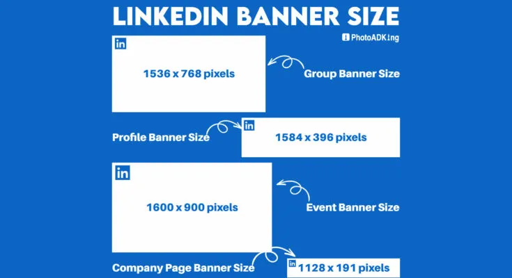
When it comes to creating an eye-catching LinkedIn banner, understanding the standard size is crucial. The recommended dimensions for a LinkedIn banner image are 1584 pixels wide by 396 pixels high. This size ensures that your banner looks sharp and professional across various devices, whether viewed on a desktop or a mobile device.
Using the right dimensions not only enhances the aesthetic appeal but also conveys professionalism. If your image is smaller than this recommended size, it may appear pixelated or stretched, which can detract from your profile’s overall look. So, here are some key points to remember:
- Aspect Ratio: The ideal aspect ratio for a LinkedIn banner is 4:1.
- Minimum Size: The minimum size to consider is 1192 pixels wide by 200 pixels high. While not optimal, this will ensure that your image isn't too small.
- Safe Zone: Important elements like text or logos should be centered to avoid being cut off on different devices.
Remember, a well-sized banner can make a lasting impression. So take a moment to ensure your image fits these specifications before uploading!
Also Read This: Curling Hair with Foil – A Step-by-Step Guide on Dailymotion
Recommended Image Format and Quality
The format and quality of your LinkedIn banner image play a significant role in how it is perceived. For the best results, use PNG or JPG formats. Both formats provide a balance between image quality and file size, which is essential for quick loading times without sacrificing clarity.
Here are some tips for image format and quality:
- PNG: Best for images with text or logos, as it supports transparent backgrounds.
- JPG: Ideal for photographs or images with gradients, providing a good balance of quality and file size.
In terms of quality, aim for a resolution of 300 DPI (dots per inch) for print quality, but for online use, ensure that your image is clear and sharp at the display size. Also, keep the file size below 8MB to ensure quick loading without compromising quality.
Ultimately, investing time in selecting the right format and quality for your LinkedIn banner will significantly enhance your profile’s visual appeal and professionalism.
Also Read This: How to View LinkedIn Profiles Anonymously
5. Tips for Designing an Effective LinkedIn Banner
Creating an eye-catching LinkedIn banner is essential for making a strong first impression. Here are some practical tips to help you design an effective banner:
- Keep it Simple: Avoid clutter. A clean and focused design speaks volumes. Use one or two key elements that represent your brand or professional identity.
- Use High-Quality Images: Ensure your images are high resolution and relevant. Blurry or pixelated images can detract from your professionalism.
- Incorporate Your Branding: Include your logo, brand colors, and fonts. This consistency strengthens brand recognition.
- Choose the Right Dimensions: Stick to LinkedIn’s recommended dimensions of 1584 x 396 pixels. This ensures your banner appears correctly across all devices.
- Utilize Contrast: Make your text stand out by using contrasting colors. A light text on a dark background (or vice versa) can enhance readability.
- Add a Call to Action: If appropriate, incorporate a subtle call to action, such as “Connect with me!” or “Visit my website!” This can engage viewers further.
- Test and Revise: Seek feedback from peers or mentors. Don’t hesitate to make adjustments based on their insights; sometimes, minor tweaks can have a significant impact.
Also Read This: How to Track Your Job Applications on LinkedIn
6. Common Mistakes to Avoid
While designing your LinkedIn banner, it's essential to be mindful of common pitfalls. Avoiding these mistakes can elevate your profile significantly:
- Ignoring LinkedIn's Guidelines: Always adhere to the platform's specifications for images. Using incorrect dimensions can lead to image distortion or cropping.
- Overloading with Text: Too much text can be overwhelming. Aim for a concise message; think of your banner as a visual introduction rather than a detailed description.
- Using Distracting Backgrounds: A busy background can overshadow your main message. Opt for subtle textures or gradients that complement rather than compete with your content.
- Neglecting Mobile View: With many users accessing LinkedIn via mobile devices, ensure your banner is eye-catching and effective on smaller screens.
- Not Updating Regularly: Your professional journey evolves, and so should your banner. Regular updates can reflect new skills, roles, or projects.
- Forgetting to Test Visibility: Always preview your banner on multiple devices to ensure nothing important gets cut off or misaligned.
Optimal Dimensions for LinkedIn Banner Images
LinkedIn is a powerful platform for professionals, and having an eye-catching banner image can greatly enhance your profile's appearance. Understanding the optimal dimensions for LinkedIn banner images is crucial for ensuring that your profile stands out and communicates your personal brand effectively. Below are the recommended dimensions and best practices for LinkedIn banner images:
| Type | Recommended Size (Pixels) | Aspect Ratio |
|---|---|---|
| Profile Banner | 1584 x 396 | 4:1 |
| Company Page Banner | 1536 x 768 | 2:1 |
Here are some *best practices* to consider when designing your LinkedIn banner:
- High-Quality Images: Use high-resolution images to avoid pixelation.
- Brand Consistency: Incorporate colors and logos that reflect your personal or company brand.
- Text Legibility: Ensure any text is easily readable, avoiding overly busy backgrounds.
- Mobile Optimization: Remember that many users access LinkedIn on mobile, so make sure your design looks good on smaller screens.
- Unique Design: Stand out by choosing a design that is unique to your professional identity.
In summary, choosing the right dimensions and adhering to best practices for your LinkedIn banner images will not only enhance your profile's appearance but also help in effectively communicating your professional brand to potential connections and employers.