Introduction
In the vibrant world of photography, harnessing the power of color theory can be the key to unlocking extraordinary results. "How to Use Color Theory in Your Photography for Better Results" is your gateway to understanding the profound impact of colors on your visual storytelling. Whether you're a budding photographer or a seasoned pro, this blog post will illuminate the techniques and strategies that can elevate your work.
Discover how to effectively use color palettes, contrasts, and harmonies to convey emotions, create compelling compositions, and breathe life into your images. Get ready to embark on a colorful journey that will transform your photography into an art form that truly captivates and resonates with your audience.
Also Read This: The Best Time to Post YouTube Shorts for Maximum Engagement
Choose a color scheme
There are several color schemes to choose from, and the best one will depend on the mood and tone you want to convey in your photograph. Here are some options:
- Complementary colors: Complementary colors are opposite each other on the color wheel, such as blue and orange or red and green. Using complementary colors can create a sense of contrast and vibrancy in your photograph.
- Analogous colors: Analogous colors are adjacent to each other on the color wheel, such as blue, green, and yellow. Using analogous colors can create a sense of harmony and unity in your photograph.
- Monochromatic colors: Monochromatic colors are different shades and tints of a single color, such as various shades of blue. Using monochromatic colors can create a sense of simplicity and elegance in your photograph.
- Triadic colors: Triadic colors are three colors that are evenly spaced on the color wheel, such as red, yellow, and blue. Using triadic colors can create a sense of balance and energy in your photograph.
Ultimately, the choice of color scheme will depend on the specific context and mood you want to create in your photograph.
[caption id="attachment_192659" align="alignnone" width="1500"] Choose a color scheme[/caption]
Also Read This: Mastering Image Editing with 123RF Tools for Your Projects
Use color to create mood
Colors can evoke different emotions and moods, so choosing the right colors can help you create the desired mood in your photograph. Here are some examples:
- Warm colors: Warm colors like red, orange, and yellow can create a sense of excitement, energy, and warmth. They can be used to create a lively and vibrant mood, or to convey a sense of passion or intensity.
- Cool colors: Cool colors like blue and green can create a sense of calmness, tranquility, and serenity. They can be used to create a peaceful and relaxing mood, or to convey a sense of distance or detachment.
- Earthy colors: Earthy colors like brown, beige, and green can create a sense of naturalness, grounding, and stability. They can be used to create a warm and inviting mood, or to convey a sense of stability and reliability.
- Bright colors: Bright colors like pink, purple, and turquoise can create a sense of playfulness, creativity, and fun. They can be used to create a youthful and energetic mood, or to convey a sense of whimsy or fantasy.
- Neutral colors: Neutral colors like gray, black, and white can create a sense of simplicity, elegance, and timelessness. They can be used to create a minimalist and sophisticated mood, or to convey a sense of neutrality and impartiality.
By using colors to create a specific mood, you can add depth and meaning to your photographs and evoke a certain emotion or feeling in your viewers.
[caption id="attachment_192660" align="alignnone" width="1500"] Use color to create mood[/caption]
Also Read This: The Top Video Production Tools for Creating Engaging Content
Pay attention to color balance
Yes, paying attention to color balance is also an important aspect of using color theory in photography. Color balance refers to the overall balance of colors in your photograph, and it is essential to ensure that the colors in your photograph look natural and pleasing to the eye.
An unbalanced color palette can result in photographs that look too warm or too cool, which can be distracting and take away from the overall impact of your image. To achieve good color balance, you can use tools such as white balance settings on your camera or editing software, which will help you adjust the color temperature and balance of your image.
In addition, it's important to pay attention to the lighting conditions when capturing your images. The quality and direction of light can greatly affect the color balance of your photograph, so be sure to adjust your camera settings accordingly to capture the right balance of colors.
By paying attention to color balance, you can ensure that your photographs have a natural and appealing color palette that enhances the overall impact and message of your image.
Also Read This: How to Make a Contract Template in ShootProof
Experiment with color temperature
Yes, experimenting with color temperature is another way to use color theory in your photography. Color temperature refers to the warmth or coolness of the colors in your photograph, and it is measured in degrees Kelvin (K).
Adjusting the color temperature of your photograph can greatly impact the mood and atmosphere of your image. Warmer colors (lower Kelvin values) can create a cozy and inviting mood, while cooler colors (higher Kelvin values) can create a more serene and calming mood.
To experiment with color temperature, you can adjust the white balance settings on your camera or editing software. For example, if you want to create a warm and inviting atmosphere, you can adjust the white balance to a lower Kelvin value, such as 3000K. If you want to create a cool and calming atmosphere, you can adjust the white balance to a higher Kelvin value, such as 8000K.
It's important to note that different light sources have different color temperatures, so be sure to adjust your white balance settings accordingly based on the lighting conditions of your scene.
By experimenting with color temperature, you can create unique and impactful photographs that evoke different moods and emotions in your viewers.
[caption id="attachment_192661" align="alignnone" width="1500"]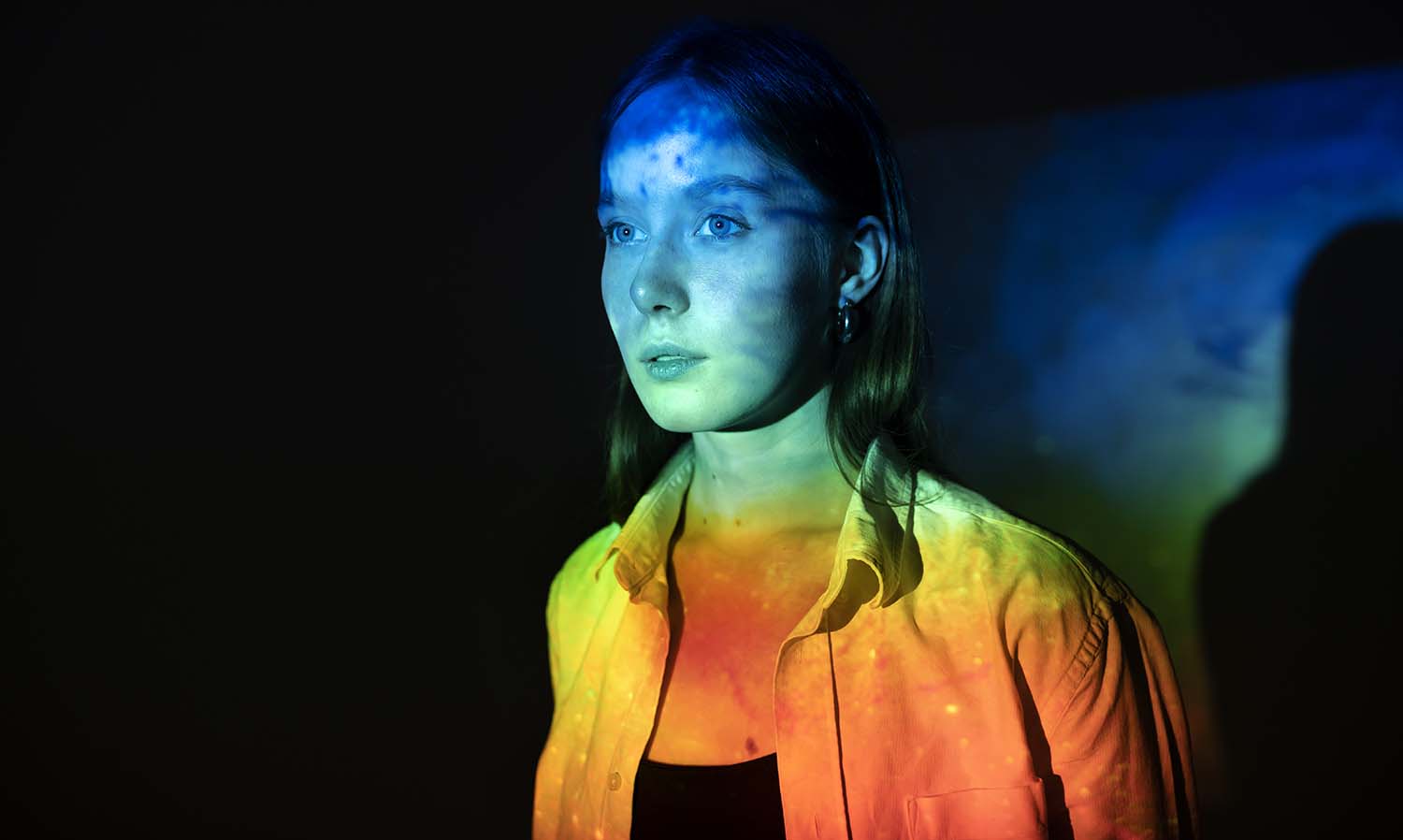 Experiment with color temperature[/caption]
Also Read This: How to Create a New Facebook Account on Dailymotion
Use color as a focal point
Yes, using color as a focal point is another way to use color theory in your photography. By using color as a focal point, you can draw the viewer's attention to a particular area of your photograph and create a sense of visual interest.
To use color as a focal point, you can choose a subject or object that stands out from its surroundings due to its color. This can be achieved by using contrasting colors or by using a bold and vibrant color that is different from the rest of the colors in your photograph.
For example, if you're photographing a landscape with a blue sky, you can use a red object in the foreground to create a strong focal point. The red object will stand out from the blue sky and draw the viewer's attention to that area of the photograph.
You can also use color as a focal point by placing the subject or object in the center of your photograph or by using selective focus techniques to isolate the subject or object from the rest of the scene.
By using color as a focal point, you can create visually interesting and dynamic photographs that capture the viewer's attention and leave a lasting impression. Here's a video that covers the fundamental principles of color theory that are essential for every photographer to understand.
Also Read This: Behance platform overview
Pros and Cons
Pros:
- Enhances the visual impact of your photographs: Using color theory can help you create visually appealing and dynamic photographs that capture the viewer's attention and leave a lasting impression.
- Conveys emotions and moods: Color theory can help you use colors to convey specific emotions and moods in your photographs, making them more impactful and memorable.
- Creates a sense of depth and dimension: By using warm colors in the foreground and cool colors in the background, you can create a sense of depth and dimension in your photographs.
- Makes your photographs stand out: Using color theory can help your photographs stand out from the crowd, making them more memorable and unique.
Cons:
- Can be overwhelming: Using too many colors or using colors incorrectly can overwhelm the viewer and take away from the overall impact of your photograph.
- Can be distracting: Using bold or bright colors can sometimes be distracting and take away from the subject or message of your photograph.
- Requires practice and experimentation: Using color theory effectively requires practice and experimentation to find the right color combinations and balance for each photograph.
- May not always be appropriate: In some cases, using color theory may not be appropriate or may not convey the intended message of your photograph. It's important to consider the subject and context of your photograph before incorporating color theory.
[caption id="attachment_192521" align="alignnone" width="1500"] Pros and Cons[/caption]
Also Read This: How to Find a Video Editor on Behance
Conclusion
In conclusion, using color theory in photography can greatly enhance the impact and appeal of your photographs. It can help you convey specific emotions and moods, create a sense of depth and dimension, and make your photographs stand out from the crowd. However, it's important to use color theory effectively and with consideration to the subject and context of your photograph. With practice and experimentation, you can learn to use color theory to create unique and impactful photographs that capture the viewer's attention and leave a lasting impression.
FAQs
What is color theory?
A: Color theory is the study of how colors interact with each other and how they can be used to create specific moods and emotions in art and design.
How can I use color theory in my photography?
A: You can use color theory in your photography by paying attention to color harmony, balance, and temperature, experimenting with color as a focal point, and using colors to convey specific emotions and moods.
What are some common color harmonies?
A: Some common color harmonies include complementary colors (colors that are opposite each other on the color wheel), analogous colors (colors that are next to each other on the color wheel), and triadic colors (three colors that are equally spaced on the color wheel).
What is color temperature?
A: Color temperature refers to the warmth or coolness of the colors in your photograph, and it is measured in degrees Kelvin (K). Adjusting the color temperature can greatly impact the mood and atmosphere of your image.
How can I ensure good color balance in my photographs?
A: You can ensure good color balance in your photographs by using tools such as white balance settings on your camera or editing software, paying attention to the lighting conditions, and adjusting the color temperature as needed.
Can using too much color be a bad thing?
A: Yes, using too much color or using colors incorrectly can overwhelm the viewer and take away from the overall impact of your photograph. It's important to use color theory effectively and with consideration to the subject and context of your photograph.