YouTube has always been at the forefront of digital media, and its branding reflects this dynamic environment. Over the years, the platform has undergone several changes to its logo, each representing a shift in its values, audience, or technology. The latest update, introduced in 2023, is part of this ongoing evolution—tailored to resonate with today’s digital landscape and user expectations. Let’s take a walk through YouTube’s branding journey and see how each logo tells a story of growth and adaptation.
The Significance of Logo Changes
Every time YouTube updates its logo, it’s more than just a cosmetic change; it’s a strategic decision rooted in marketing principles and audience connection. Here are some key reasons why logo changes matter:
- Reflecting Modern Trends: As design trends evolve, so must brands. YouTube’s previous logos had a more complex design, while the latest update emphasizes simplicity and versatility, echoing the minimalist trend in digital spaces.
- User Recognition: Consistent branding helps users recognize the platform across various channels. The updated logo maintains familiar elements like the play button but presents them in a fresh, modern context.
- Adapting to New Technologies: With the rise of mobile usage and social media, logos need to look good on small screens and be easily shareable. The latest YouTube logo is designed to be clean and easily identifiable, even when scaled down.
- Enhancing Brand Identity: A logo is a vital part of a brand’s identity. YouTube’s update strengthens its position as a leader in video content by showcasing innovation and staying relevant in a fast-paced industry.
In conclusion, YouTube's logo changes are significant markers of its journey, reflecting its adaptability and commitment to keeping its brand in line with user expectations and market trends.
Also Read This: How to Download Dailymotion Videos Step-by-Step Tutorial
Overview of the Latest Logo Design
The recent update to the YouTube logo has sparked plenty of conversations among fans and creators alike. At first glance, you might notice that the iconic red play button remains, but there are some subtle yet impactful changes. The design is more streamlined and modern, reflecting the platform's evolution in the digital landscape.
One of the standout features of the new logo is its simplified aesthetics. The play button is now cleaner, with sharper edges and a slightly more vibrant hue. This change enhances visibility, making it pop against various backgrounds. The text "YouTube" has been adjusted too; it's now bolder and uses a sans-serif font that conveys a fresh and approachable vibe.
Another noteworthy aspect is the logo's versatility. It's optimized for various screen sizes, ensuring that it looks great whether you're viewing content on a smartphone or a large monitor. The design is also adaptable for use in different contexts, such as thumbnails, merchandise, and social media. This flexibility is crucial as YouTube continues to expand its reach.
To summarize, the latest YouTube logo design is:
- Modern and Clean: A minimalist approach that appeals to a wider audience.
- Enhanced Visibility: A bolder play button and text for better recognition.
- Versatile: Adaptable for various platforms and screen sizes.
This fresh look aims to resonate with both long-time users and newcomers, ultimately reinforcing YouTube's identity as a leader in video content.
Also Read This: Can You Make Money Reposting Videos on YouTube
Factors Influencing the New Design
The evolution of the YouTube logo didn't happen in a vacuum. Several factors played a significant role in shaping the new design. Understanding these influences can help us appreciate the thought process behind the update.
First and foremost, the shifting landscape of digital media greatly impacted the logo's redesign. As more platforms emerge, YouTube needed a logo that felt relevant and contemporary. The clean, modern design aligns well with current design trends across social media platforms, making it instantly recognizable to users.
Secondly, user feedback has always been a cornerstone of YouTube's development. Many creators and viewers expressed a desire for a logo that felt more inclusive and approachable. The updated logo reflects this sentiment, with a friendlier font and a design that invites interaction.
Furthermore, the rise of mobile viewing has significantly influenced the logo's adaptability. With over 70% of YouTube's traffic coming from mobile devices, it's essential that the logo looks great on smaller screens. The new design is tailored for this, ensuring it's easily identifiable even in compact formats.
Lastly, brand consistency played a crucial role. YouTube aims to maintain cohesion across all its branding elements. The new logo fits seamlessly into its existing branding strategy, reinforcing YouTube as a reliable and innovative platform.
In summary, the factors influencing the new design include:
- Shifting Digital Landscape: Keeping pace with modern trends.
- User Feedback: A more inclusive and approachable look.
- Mobile Adaptability: Optimized for various screen sizes.
- Brand Consistency: Cohesion across branding elements.
These elements combine to create a logo that not only represents YouTube’s past but also embraces its future.
Also Read This: Can You Share YouTube TV with Family Members in Another Household
5. Audience Reception of the Updated Logo
The recent update to the YouTube logo has sparked quite a buzz across social media platforms and among its vast user base. Many users have taken to Twitter, Instagram, and Reddit to express their thoughts on the change, showcasing a mix of enthusiasm and skepticism.
*Positive Reactions:
- Some users appreciate the simplified design, finding it modern and fresh.
- Fans have noted how the new logo aligns more closely with contemporary graphic trends, fostering a sense of connection with a younger audience.
- The logo’s cleaner aesthetic is seen as an enhancement to the overall branding, making it more recognizable.
Critiques:
- On the flip side, a segment of the audience misses the iconic play button symbol integrated within the old design, feeling it represented the essence of video.
- Some users argue that the updated logo feels less distinctive, blending in with other tech brand logos.
- Concerns have also been raised about brand consistency, especially regarding its application across various platforms.
Overall, the reception has been a kaleidoscope of opinions, reflecting the diverse perspectives of YouTube’s global audience. It’ll be interesting to see how this logo update influences user interaction and brand loyalty in the long run.
Also Read This: Step by Step Guide to Breakdance Moves for Beginners on Dailymotion
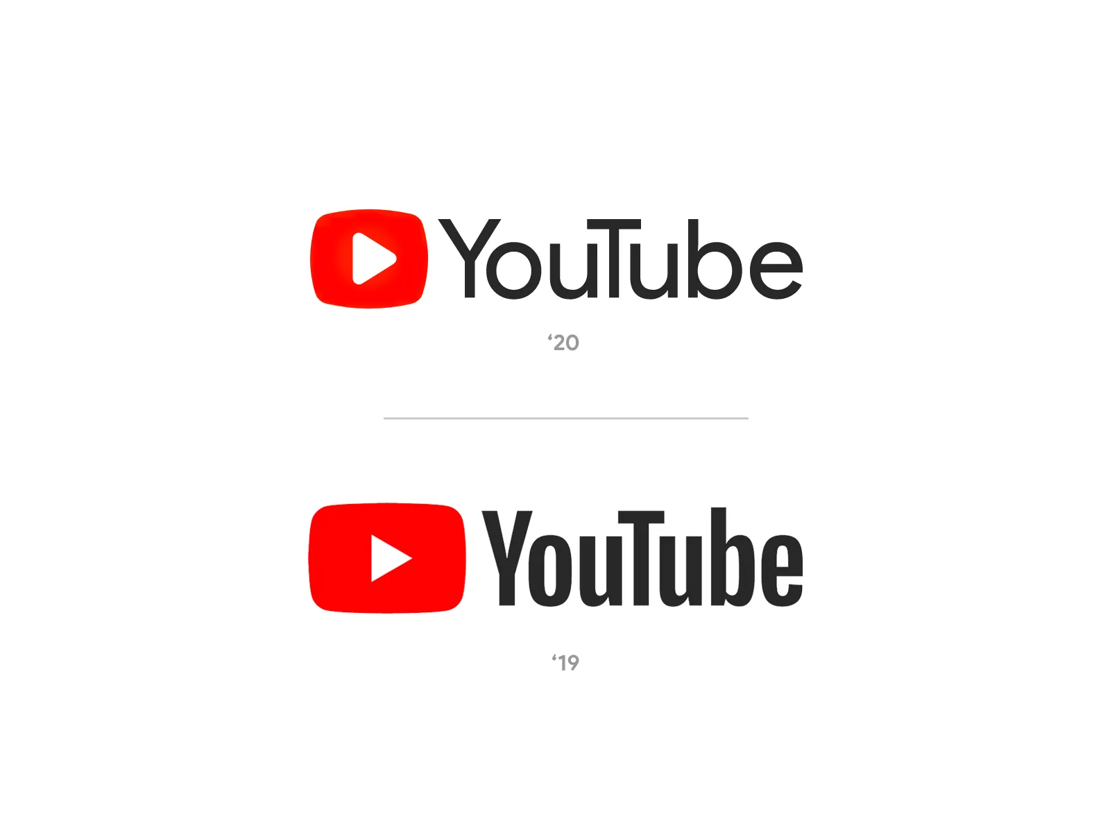
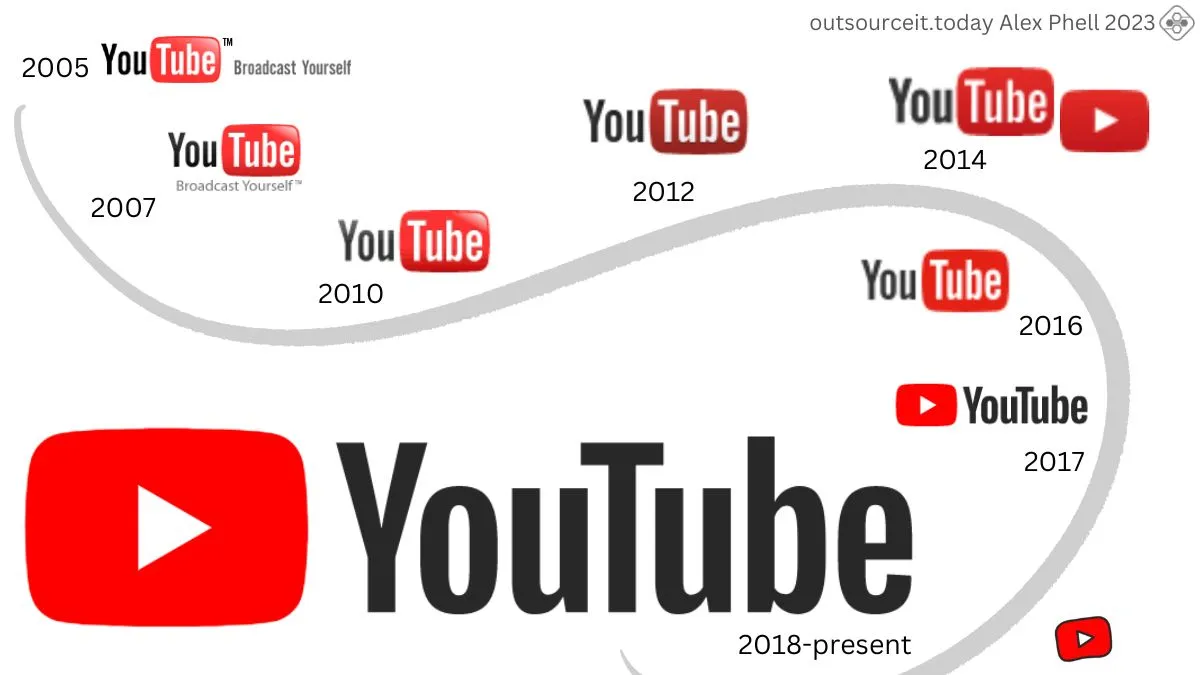
6. Comparative Analysis with Previous Logos
When analyzing the latest YouTube logo, it’s essential to understand how it stacks up against its predecessors. Let’s take a look at the evolution of the YouTube logo over the years.
| Logo Version | Year Introduced | Key Features |
|---|---|---|
| Original Logo | 2005 | Classic red play button with black text, full of character. |
| First Redesign | 2011 | Included a sleeker red play button and a more modern font. |
| Second Redesign | 2017 | Introduced a more minimalist style, maintaining the play button. |
| Latest Update | 2023 | Focus on simplicity; the play button is now a more subtle part of the logo. |
Key Differences:*
- The evolution shows a clear trend towards minimalism, moving from a more complex design to one that emphasizes simplicity.
- The latest logo drops the boldness of the play button, opting instead for a more understated approach.
- Font changes have also occurred, with each iteration striving for better readability and modernity.
In summary, the latest logo is a reflection of YouTube’s journey and adaptability in the ever-changing digital landscape, appealing to a new generation of users while trying to retain its heritage.
Understanding the Latest YouTube Logo Update
YouTube has undergone a significant logo update that reflects the platform's evolution and its commitment to staying relevant in the fast-paced digital landscape. The new logo not only modernizes the brand's appearance but also emphasizes YouTube's core mission: to provide a space for video sharing and creativity.
The most noticeable change in the logo is the simplification of its design. The previous logo featured a more complex arrangement of the word "YouTube" alongside a play button icon. In the latest update, the word "YouTube" is now more streamlined, accompanied by a bold red play button that stands out prominently. This minimalistic approach aligns with contemporary design trends, where simplicity and clarity are paramount.
Key elements of the updated logo include:
- Simplified Typography: The font has been modernized for better readability across various devices.
- Enhanced Play Button: The iconic play button is now larger, symbolizing the platform's focus on video content.
- Vibrant Color Palette: The red and white color scheme remains, but the shades have been adjusted for a fresher look.
Moreover, the refresh aligns with YouTube's broader branding strategy, which emphasizes community engagement and user-generated content. This evolution also reflects the platform's adaptability to new technologies and user preferences, ensuring it remains a leader in the video-sharing space.
| Old Logo Features | New Logo Features |
|---|---|
| Complex Typography | Simplified Typography |
| Smaller Play Button | Larger Play Button |
| Traditional Color Scheme | Updated Vibrant Colors |
In conclusion, the latest YouTube logo update signifies a shift towards a more modern, user-friendly brand identity that resonates with its diverse audience. As YouTube continues to evolve, this new branding will help reinforce its commitment to creativity and community engagement.