
Introduction
A website's user experience (UX) plays a critical role in determining its success. Good UX helps visitors easily find what they're looking for, complete actions on the website, and enjoy the overall experience. In contrast, poor UX can lead to frustration, confusion, and ultimately, a high bounce rate.
In this blog post, we will discuss 5 simple ways to improve your website's user experience, including navigation, page load time, responsive design, simplifying forms and checkouts, and implementing call-to-action buttons. By implementing these strategies, you can create a positive user experience for your website visitors, leading to increased engagement and conversions.
Also Read This: Effective Ways to Block YouTube on Your PC for Improved Productivity
Make Navigation Easy
One of the most important aspects of a website's user experience is its navigation. Visitors should be able to easily find what they're looking for on your website without having to search for it. Here are three simple ways to make navigation easy:
Clear and concise menu options:
Your website's menu should be easy to understand and navigate. Use clear and concise language to label your menu options and group related pages together. Avoid using industry-specific jargon or vague terms that may confuse your visitors.
Consistent navigation throughout the website:
Once your visitors understand how to navigate your website, they should be able to consistently do so across all pages. Keep the location of your menu consistent on all pages, and avoid changing the order or placement of menu options.
Search bar and filters:
In addition to a menu, provide a search bar and filters on your website. This will allow visitors to quickly find specific content or products that they're looking for, without having to navigate through your menu options. Make sure your search bar is prominently displayed and easy to use, and that your filters are clearly labeled and organized.
[caption id="attachment_182662" align="alignnone" width="1667"]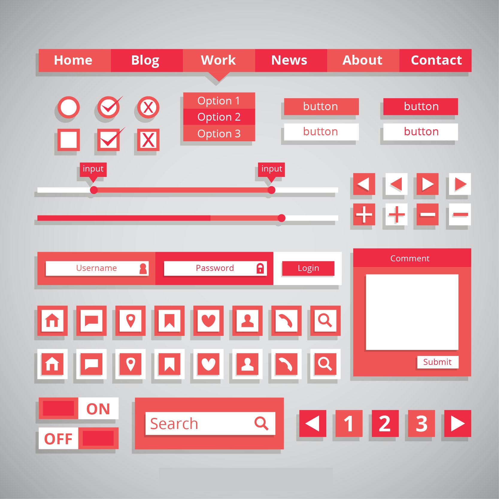 Make Navigation Easy[/caption]
Also Read This: How to Block People on LinkedIn for Enhanced Privacy
Improve Page Load Time
Page load time is another critical aspect of a website's user experience. Slow-loading pages can lead to frustration and a high bounce rate. Here are three simple ways to improve your website's page load time:
Use optimized images and videos:
Images and videos can significantly slow down page load times. To optimize them, compress their file size and reduce their dimensions without sacrificing quality. You can use tools like Photoshop or online image compressors to achieve this.
Minimizing HTTP requests:
Each HTTP request made by a visitor's browser to load a page slows down the page load time. You can minimize these requests by using CSS sprites, which combine multiple images into a single file, or by reducing the number of elements on a page, like reducing the number of plugins, scripts, and third-party integrations.
Use a Content Delivery Network (CDN):
A CDN is a network of servers that store copies of your website's files and distribute them to visitors based on their geographic location. This reduces the distance the data needs to travel to reach visitors and speeds up page load times. There are many CDN providers that you can choose from to improve your website's page load time.
[caption id="attachment_182663" align="alignnone" width="2560"]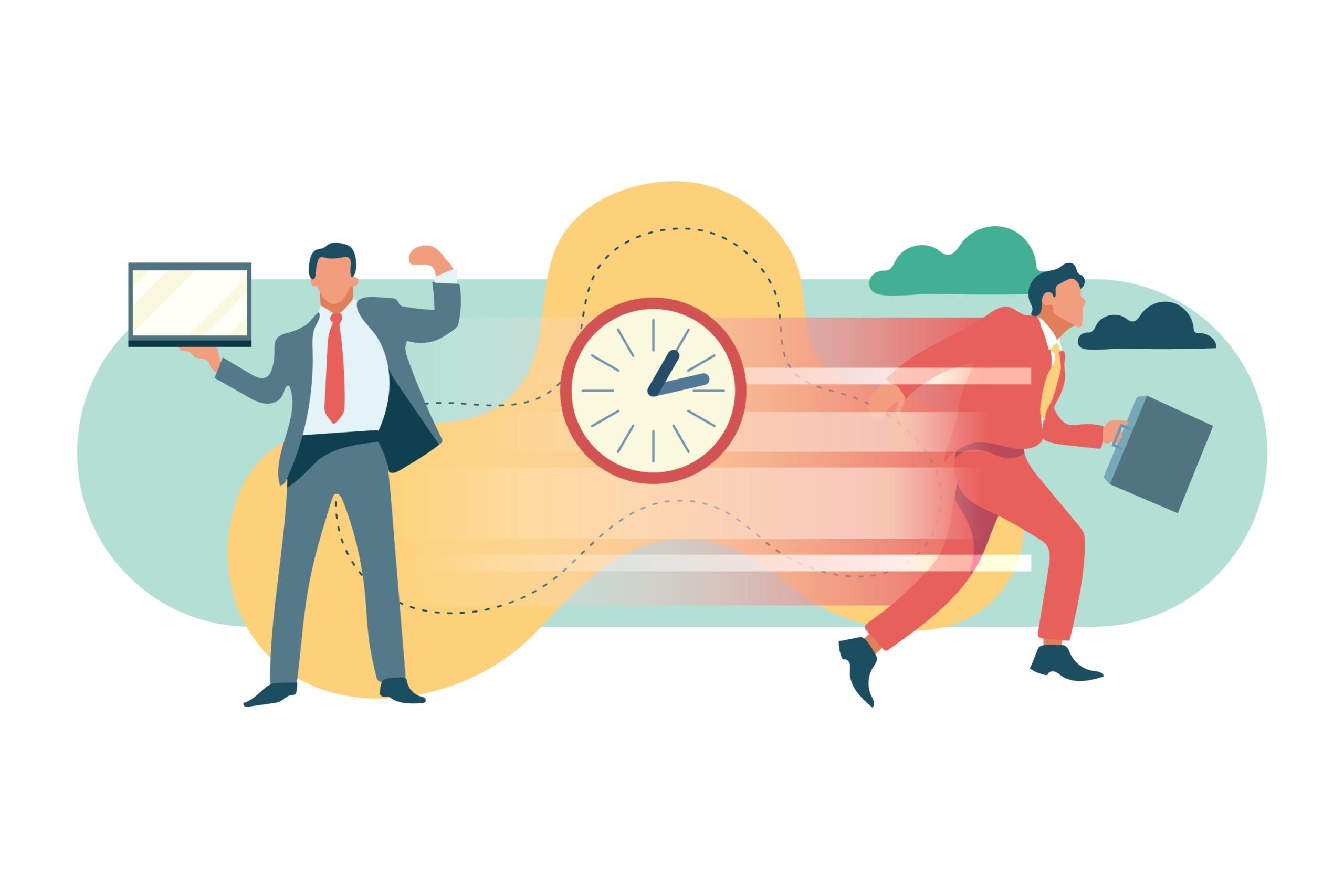 Improve Page Load Time[/caption]
Also Read This: How to Get More Traffic on Behance
Use Responsive Design
Responsive design is a design approach that ensures your website looks and functions well on different devices and screen sizes. Here are three simple ways to use responsive design to improve your website's user experience:
Explanation of responsive design:
Responsive design involves using flexible grids and CSS media queries to adapt your website's layout to different screen sizes. This means that your website will look good on any device, including smartphones, tablets, and desktops.
Importance of responsive design for mobile users:
More and more people are accessing the internet on their mobile devices, so it's essential that your website is mobile-friendly. Responsive design ensures that your website is easy to use and navigate on smaller screens, leading to a better user experience.
Use of flexible grids and CSS media queries:
To implement responsive design, use flexible grids that adjust the size and layout of your website's content based on screen size. CSS media queries allow you to apply different styles to your website based on the device being used, ensuring that your website looks and functions well on all devices. By using responsive design, you can provide a better user experience for all visitors to your website, regardless of the device they're using.
[caption id="attachment_182664" align="alignnone" width="2560"]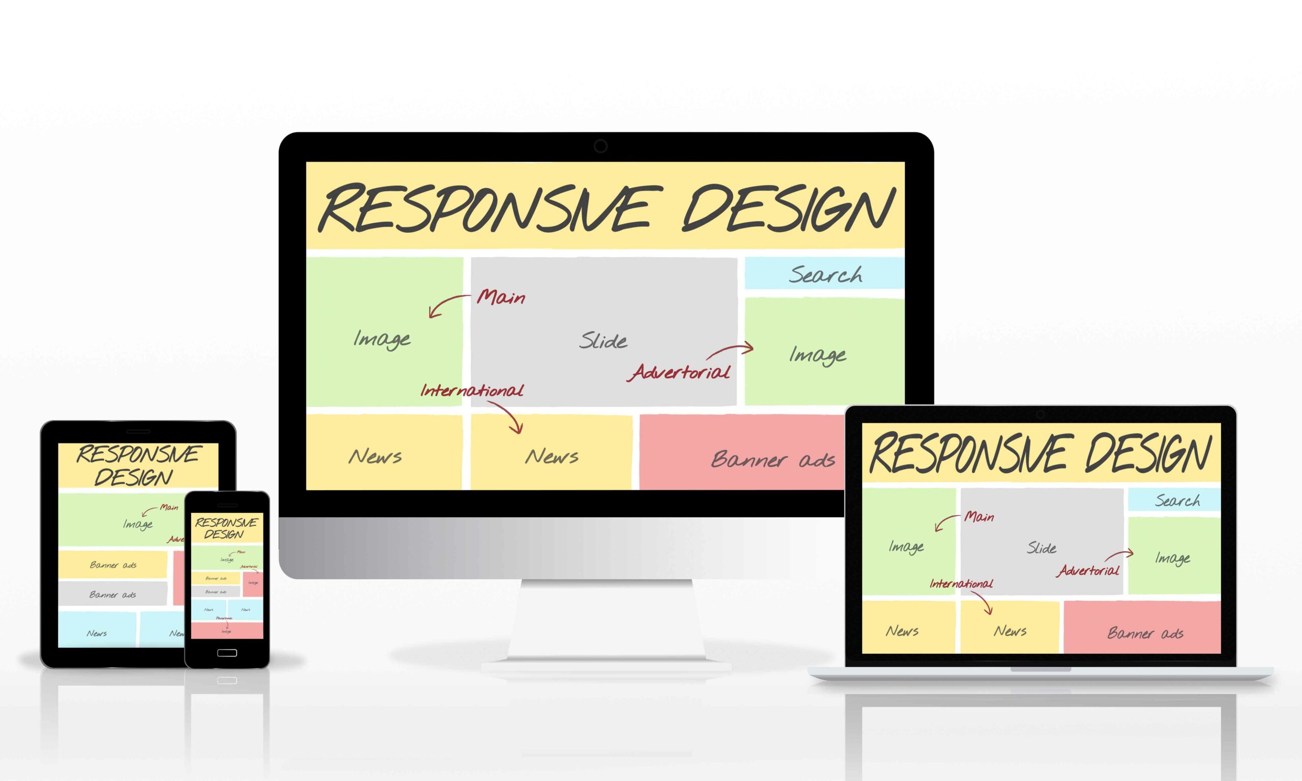 Use Responsive Design[/caption]
Also Read This: Is Storyblocks Free for All Users or Are There Limitations
Simplify Forms and Checkouts
Forms and checkouts are critical areas of your website where visitors interact with your business. Simplifying these areas of your website can significantly improve the user experience. Here are three simple ways to simplify forms and checkouts:
Explanation of common form and checkout issues:
Common issues with forms and checkouts include long, complicated forms, unclear instructions, and excessive information requirements. These issues can lead to frustration and abandoned forms and checkouts.
Use of form validation and autofill:
Use form validation to ensure that visitors fill in all required fields correctly. Additionally, use autofill features that automatically fill in known information for returning visitors, like their name or address. This saves visitors time and effort and makes the process more efficient.
Simplify the checkout process:
Simplify the checkout process by eliminating unnecessary steps and information requirements. Allow visitors to make purchases as guests or using a social media login rather than forcing them to create an account. Additionally, provide a clear summary of the purchase and payment options, and ensure that the checkout process is mobile-friendly. By simplifying forms and checkouts, you can reduce friction for your visitors, leading to a more positive user experience and increased conversions.
[caption id="attachment_182665" align="alignnone" width="2560"] Simplify Forms and Checkouts[/caption]
Also Read This: How Much Is Shutterstock Extended License
Implement Call-to-Action Buttons
Call-to-action (CTA) buttons are essential elements on your website that encourage visitors to take a specific action, such as signing up for a newsletter or making a purchase. Here are three simple ways to implement effective CTA buttons:
Use clear and concise language:
Your CTA button's language should be clear, concise, and action-oriented. Use active verbs that communicate what the visitor will do when they click the button, like "Subscribe" or "Buy Now."
Use contrasting colors and placement:
To make your CTA button stand out, use a contrasting color that complements your website's color scheme. Additionally, place the button in a prominent location, like above the fold or at the end of a blog post, where it's easy to see.
Use A/B testing:
A/B testing involves creating two versions of a web page, each with a different CTA button, to see which one performs better. This allows you to experiment with different CTA button designs, colors, and placements to find the most effective one. By implementing effective CTA buttons, you can encourage visitors to take action, leading to increased conversions and a better user experience.
[caption id="attachment_182666" align="alignnone" width="2560"]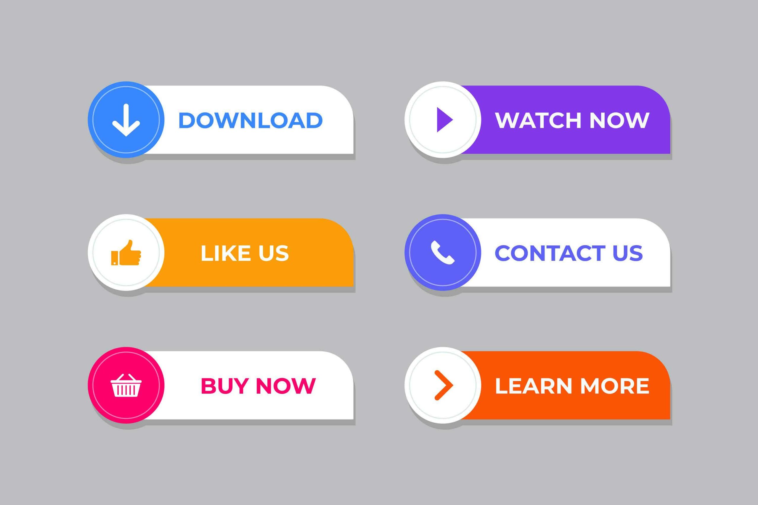 Implement Call-to-Action Buttons[/caption]
Also Read This: Effective Strategies for Rapid Weight Loss from Dailymotion Experts
Conclusion
In conclusion, there are many simple ways to improve your website's user experience. By implementing these tips, you can create a website that is easy to use, fast-loading, and optimized for different devices. Start by making navigation easy, improving page load times, using responsive design, simplifying forms and checkouts, and implementing effective call-to-action buttons.
These changes will not only improve your website's user experience, but they will also lead to increased engagement, conversions, and ultimately, the success of your business. Remember to continually evaluate your website's user experience and make changes as needed to ensure your website is always optimized for your visitors.
FAQs
What is user experience (UX)?
User experience (UX) refers to the overall experience a user has while interacting with a website, application, or product. It includes factors such as ease of use, visual design, page load times, and how well the website meets the user's needs.
Why is user experience important for websites?
A: User experience is important for websites because it directly impacts user engagement, conversions, and ultimately, the success of a business. A positive user experience can lead to increased engagement, conversions, and customer loyalty, while a negative user experience can result in high bounce rates, decreased engagement, and lost revenue.
What is responsive design?
A: Responsive design is an approach to web design that ensures a website looks and functions well on different devices and screen sizes. This is achieved by using flexible grids and CSS media queries to adapt the website's layout and design to different screen sizes.
How can I improve my website's page load times?
A: You can improve your website's page load times by using optimized images and videos, minimizing HTTP requests, and using a content delivery network (CDN) to distribute your website's files to visitors.
What are call-to-action (CTA) buttons?
A: Call-to-action (CTA) buttons are buttons on a website that encourage visitors to take a specific action, such as signing up for a newsletter or making a purchase. Effective CTA buttons use clear, concise language, contrasting colors, and prominent placement on the website.