
Introduction
In today's digital world, more and more people are accessing the internet through their mobile devices, which means it's crucial for businesses to ensure their website is optimized for mobile use. One of the most important aspects of mobile optimization is image optimization. Optimized images not only improve the user experience for mobile users but also improve website performance and search engine rankings.
In this blog post, we'll discuss why it's important to optimize your website images for mobile devices and provide tips and best practices to help you do so effectively.
Also Read This: How to Lock iPad Screen on YouTube to Prevent Accidental Touches
Why Optimize Your Images for Mobile Devices?
In this section, we'll discuss why it's important to optimize your website images for mobile devices. Some key points to cover in this section could include:
Mobile users expect fast loading times:
Mobile users have a shorter attention span than desktop users and expect fast loading times. Optimized images can help improve your website's loading speed, which is critical for a good user experience.
Improved user experience:
Optimized images can help improve the user experience for mobile users. Images that are too large or slow to load can frustrate users, leading to higher bounce rates and fewer conversions.
Improved website performance:
Optimized images can help improve website performance by reducing server load and bandwidth usage.
Improved search engine rankings:
Google takes website loading speed into account when ranking websites in search results. Optimized images can help improve your website's loading speed, which can in turn improve your search engine rankings.
[caption id="attachment_182543" align="alignnone" width="2560"]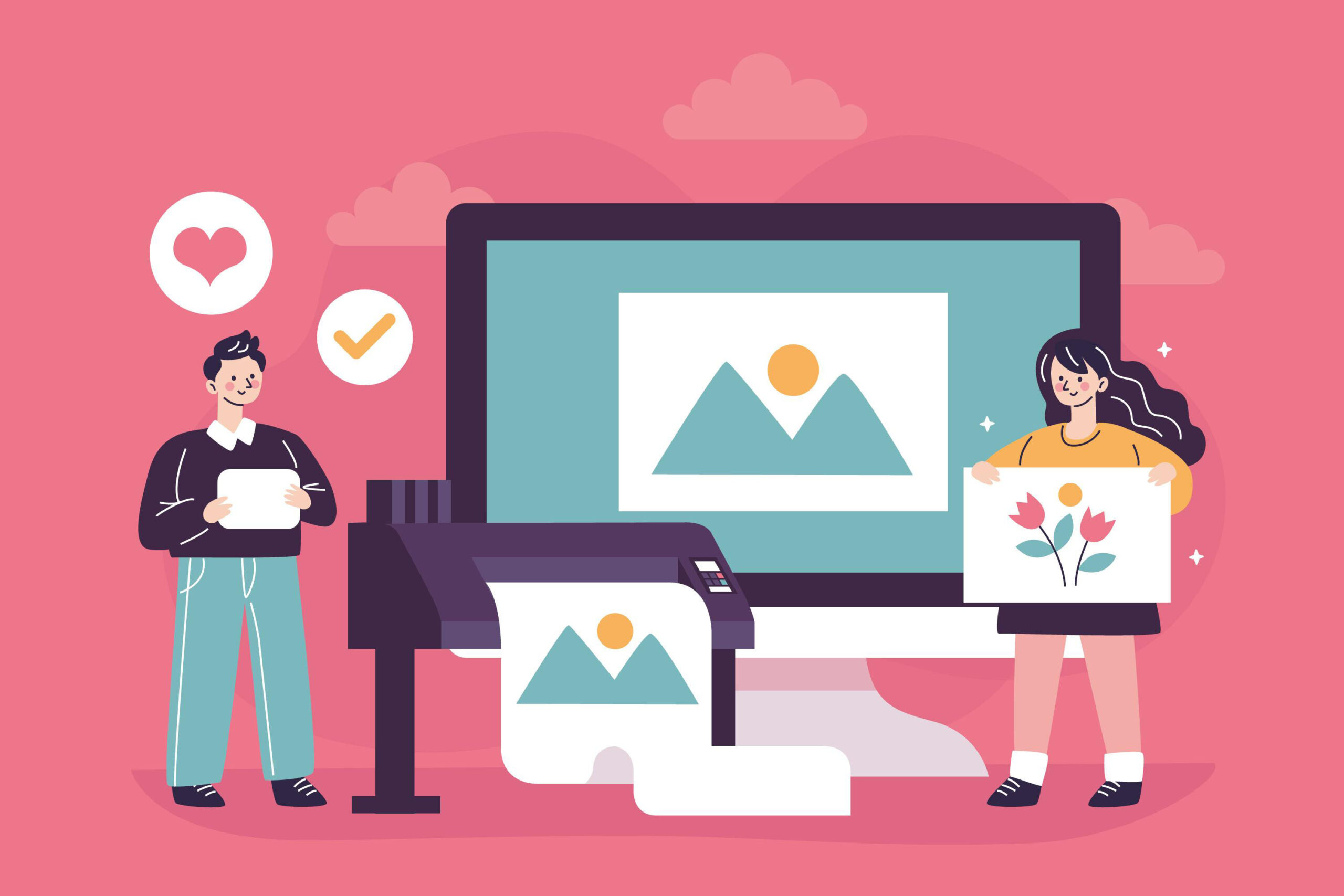 Why Optimize Your Images for Mobile Devices[/caption]
Also Read This: Simple Steps to Add a YouTube Video to Your Instagram Story
How to Optimize Your Images for Mobile Devices
In this section, we'll cover the steps you can take to optimize your website images for mobile devices. Some key points to cover in this section could include:
Choose the right image format:
Choosing the right image format can have a significant impact on the size and quality of your images. JPEG and PNG are the most common image formats for websites. JPEG is a good choice for photographs, while PNG is better for images with fewer colors and more transparency.
Compress your images:
Compressing your images can reduce their file size without compromising quality. There are several tools available for image compression, such as, IMGPANDA Compressing Tools, TinyPNG, Kraken.io, and Compressor.io.
Resize your images:
Resizing your images to the appropriate dimensions for mobile devices can also help improve loading times. Use a tool like Photoshop or GIMP to resize your images before uploading them to your website.
Use responsive design:
Responsive design allows your website to adapt to different screen sizes automatically. This means that your images will be resized and optimized for mobile devices without any extra work on your part.
Use lazy loading:
Lazy loading is a technique that only loads images when they're needed, rather than all at once. This can significantly improve your website's loading speed, particularly on mobile devices.
Optimize image metadata:
Optimizing the metadata of your images, such as alt tags and titles, can also help improve your website's SEO and accessibility.
Test your website's loading speed:
Use tools like, IMGPANDA Page Speed Checker, Google's PageSpeed Insights or GTmetrix to test your website's loading speed and identify areas for improvement.
[caption id="attachment_182544" align="alignnone" width="2560"]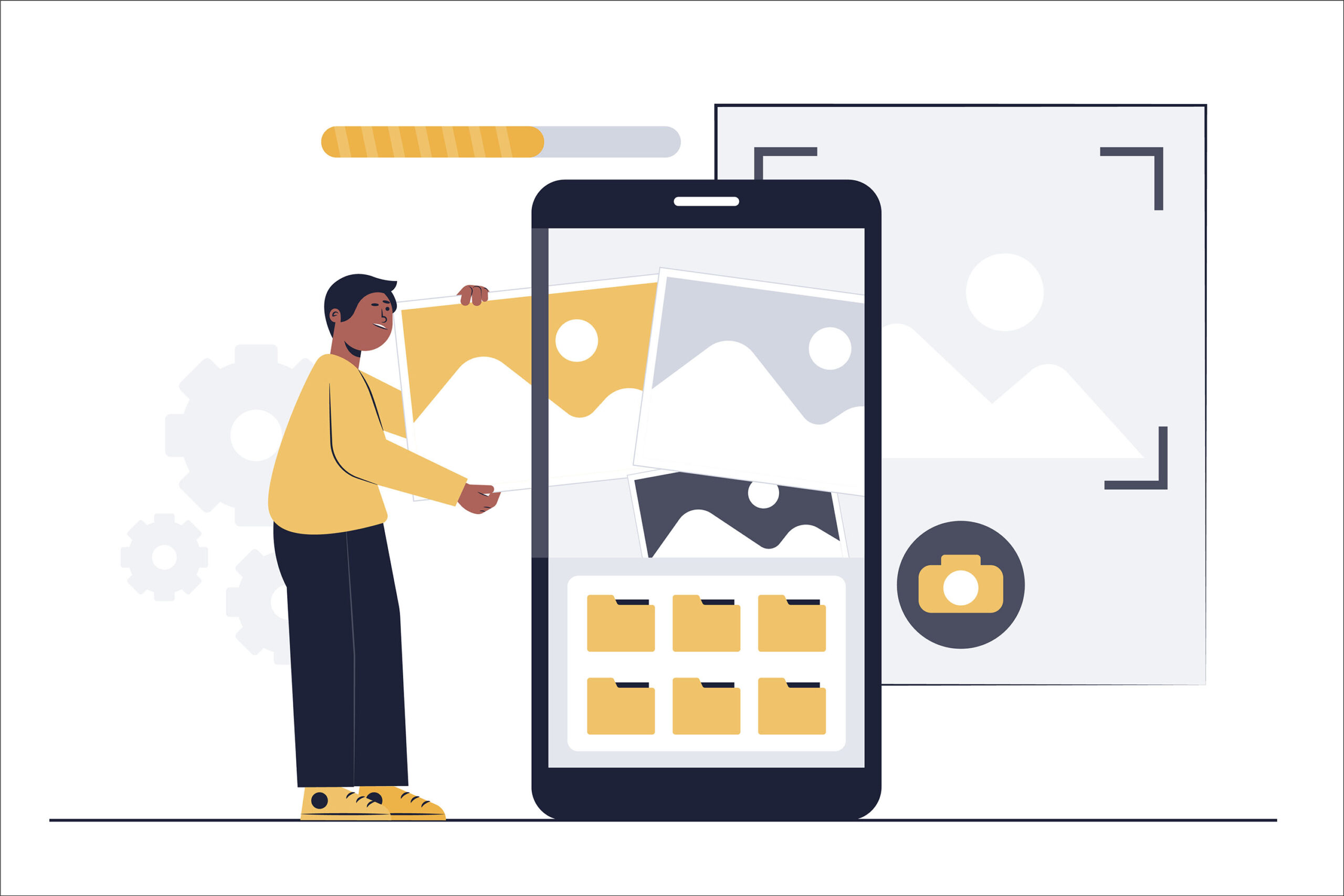 How to Optimize Your Images for Mobile Devices[/caption]
Also Read This: Is Dailymotion Facing Issues? A Guide to Troubleshooting Common Problems
Compress images
One of the most effective ways to optimize your website images for mobile devices is to compress them. Compressing your images reduces their file size, making them faster to load on mobile devices with limited bandwidth and slower internet connections.
There are several tools available for compressing images, including online tools like, IMGPANDA Compressing Tools, TinyPNG, JPEGmini, and Compressor.io, and offline tools like Adobe Photoshop and GIMP. These tools use different algorithms to reduce the file size of your images without significantly affecting their quality.
When compressing your images, keep in mind that you want to strike a balance between file size and image quality. You don't want to compress your images so much that they become blurry or pixelated, but you also don't want to leave them uncompressed and slow down your website's load time.
In addition to compressing your images, you can also resize them for smaller screens. This reduces the amount of data that needs to be loaded, further speeding up your website's load time on mobile devices.
[caption id="attachment_182545" align="alignnone" width="2560"] Compress images[/caption]
Also Read This: Creative Makeup Hacks for Using Lipstick as Blush
Choose the right file type
When it comes to image file types, not all are created equal, and each type serves a different purpose. Choosing the right file type for your images can have a significant impact on your website’s mobile performance. Here are the three most common file types to consider:
JPEG:
This file type is best suited for photographs or images with a lot of color gradients. It is a lossy compression, meaning that the image quality will be slightly degraded, but the file size will be significantly reduced. JPEGs are great for mobile because they load quickly and take up less space.
PNG:
This file type is best suited for images that require transparency or have large areas of the same color. PNGs are lossless compression, meaning that the image quality is not degraded, but the file size will be larger than a JPEG. PNGs are great for logos, icons, and other graphics.
SVG:
This file type is best suited for images that need to be scaled up or down without losing quality. SVGs are vector-based, meaning that the image is made up of lines and shapes rather than pixels. They are great for icons, logos, and other simple graphics.
Choosing the right file type for your images can make a big difference in your website’s mobile performance. Always consider the purpose of your image and choose the appropriate file type.
[caption id="attachment_182546" align="alignnone" width="2560"] Choose the right file type[/caption]
Also Read This: Removing Watermarks Made Easy: Say Goodbye to Shutterstock Watermarks
Use responsive design
Define image dimensions in CSS:
Use CSS to define the dimensions of your images, rather than using HTML tags. This allows your images to scale down or up based on the device they’re being viewed on.
Use fluid images:
Fluid images are images that are set to a percentage of the width of their parent container. This means that they’ll automatically adjust to the size of the screen they’re being viewed on, making them ideal for mobile devices.
Use adaptive images:
Adaptive images are images that are delivered to the user based on the size of their device. This means that a smaller image will be delivered to a mobile device, while a larger image will be delivered to a desktop computer. This can help to reduce the load time of your website on mobile devices.
[caption id="attachment_182547" align="alignnone" width="2560"]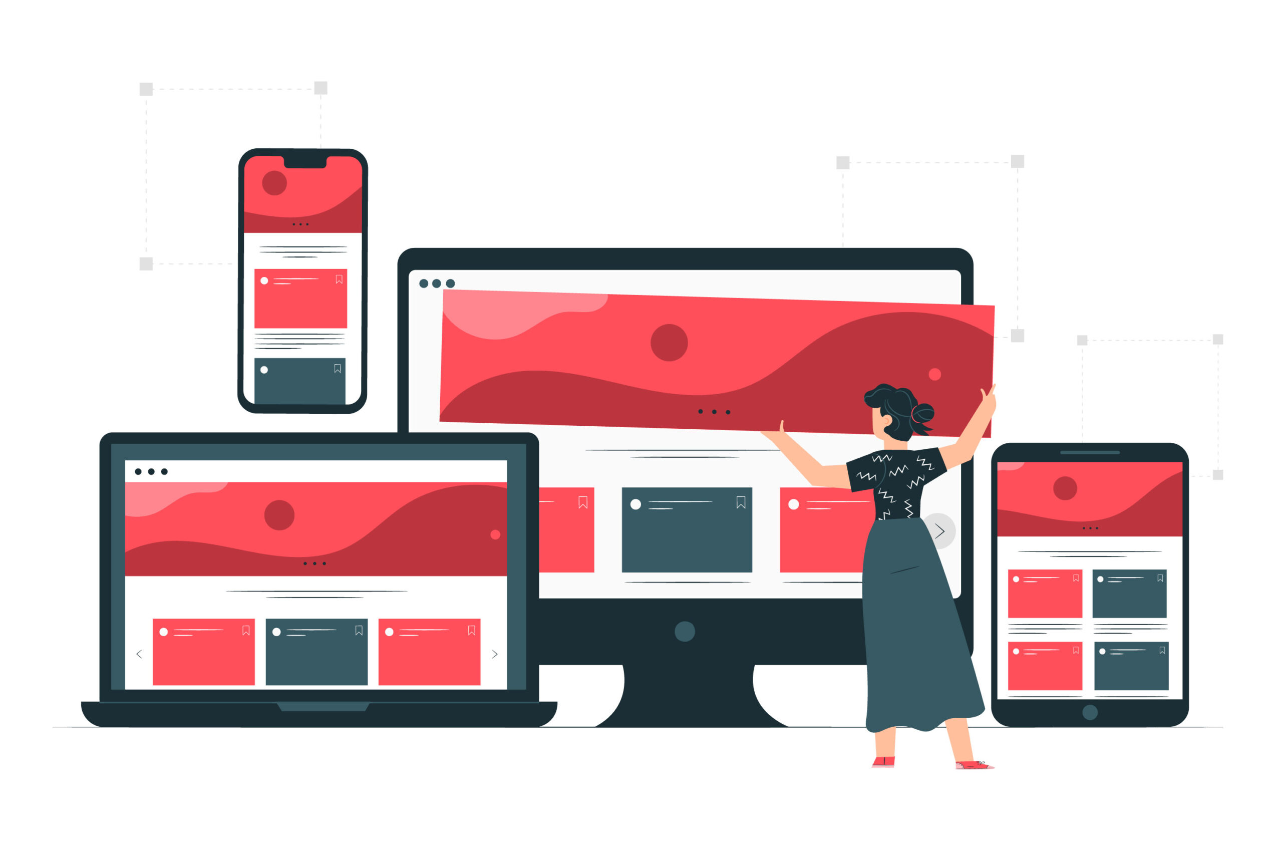 Use responsive design[/caption]
Also Read This: Exploring Getty Images Alternatives: Finding the Perfect Fit
Use lazy loading:
Lazy loading:
is a technique that allows images to load as the user scrolls down the page, rather than all at once. This can help to reduce the load time of your website on mobile devices.
Use a lazy loading plugin:
If you’re using WordPress, there are several lazy loading plugins available that can help to automatically lazy load your images.
[caption id="attachment_182548" align="alignnone" width="2560"]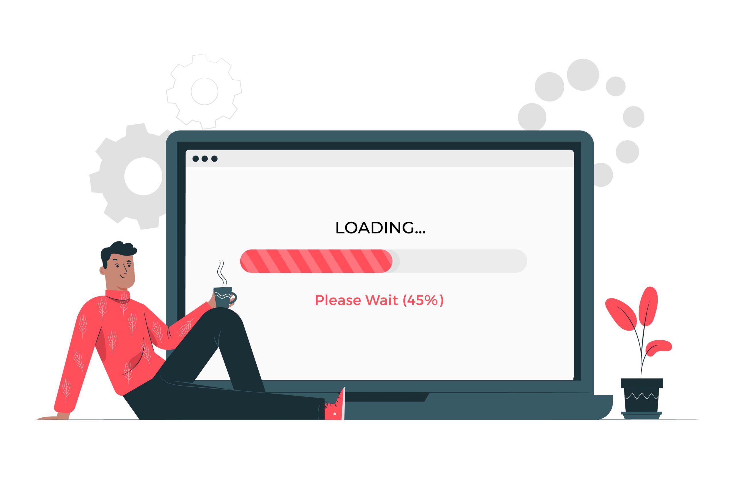 Use lazy loading[/caption]
Also Read This: Ultimate Guide to Using uBlock Origin for Ad-Free YouTube Viewing
Optimize image file names and alt text:
Use descriptive file names:
Use descriptive file names that include keywords related to the image content. This can help to improve your website’s SEO.
Use descriptive alt text:
Alt text is the text that’s displayed when an image can’t be loaded. Use descriptive alt text that accurately describes the content of the image.
[caption id="attachment_182549" align="alignnone" width="2000"]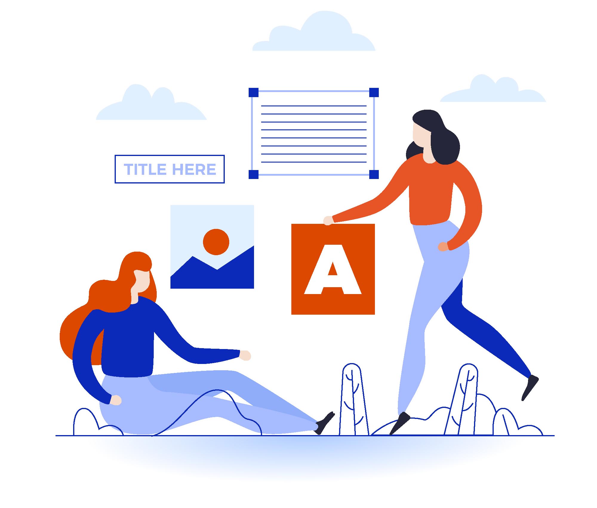 Optimize image file names and alt text[/caption]
Use a content delivery network (CDN):
- A CDN is a network of servers that are located around the world. When a user visits your website, the content is delivered from the server that’s closest to them, which can help to reduce the load time of your website on mobile devices.
- Use a CDN that’s optimized for mobile devices: Some CDNs are specifically optimized for mobile devices, and can help to further reduce the load time of your website on mobile devices.
[caption id="attachment_182550" align="alignnone" width="1500"] Use a content delivery network (CDN)[/caption]
Also Read This: Guide to Adding and Using Proxy Servers on Telegram
Use an image optimization tool
Using an image optimization tool is a crucial step in optimizing website images for mobile devices. These tools are designed to compress and resize images while still maintaining their quality, resulting in faster page load times and improved user experience on mobile devices.
In this step, you will learn about the different types of image optimization tools available and how to use them to optimize your images for mobile devices. There are various free and paid image optimization tools available online, each with its own unique features and benefits.
Once you have chosen an image optimization tool, you will need to upload your images and select the optimization settings that best suit your needs. These settings may include the image format, compression level, and resizing options. After optimizing your images, you can then download them and replace the original images on your website with the optimized versions.
[caption id="attachment_182551" align="alignnone" width="2560"]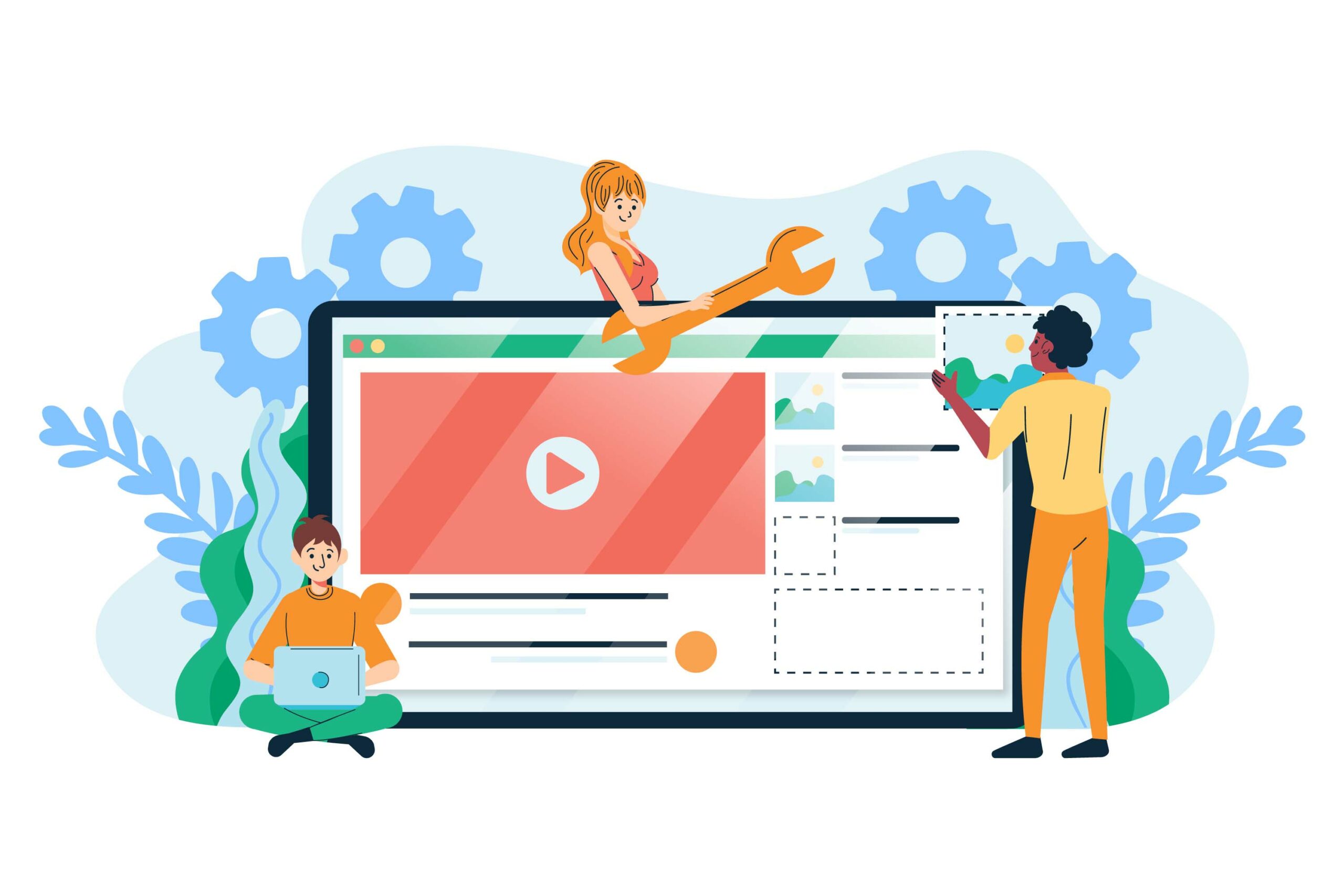 Use an image optimization tool[/caption]
Also Read This: How to Remove Watermarks from Shutterstock Images Effectively
Best Practices for Optimizing Images for Mobile Devices
Compress images:
Compressing images can reduce the size of the file without significantly affecting its quality. Use an image compression tool to compress images before uploading them to your website.
Choose the right file type:
Select the appropriate file type for your images. JPEG is a good choice for photographs, while PNG is better for images with transparency.
Use responsive design:
Responsive design ensures that your website adjusts to fit the size of the screen it is being viewed on. Use responsive design to make sure your images are displayed properly on all devices.
Use an image optimization tool:
There are several image optimization tools available online that can help you optimize images for mobile devices. These tools can reduce the file size of images, optimize them for faster loading times, and more.
Use alt tags:
Alt tags provide a text description of your images, which can be helpful for users with visual impairments. Make sure to use descriptive alt tags for your images to improve accessibility.
Use the correct image size:
Use the correct image size for your website to ensure that it loads quickly on mobile devices. Avoid using oversized images, which can slow down your website's loading time.
Test your images:
Test your website on various mobile devices to ensure that your images are displaying properly and loading quickly. Use a tool like IMGPANDA Page Speed Checker, Google's PageSpeed Insights to identify any issues and optimize your images accordingly.
Also Read This: How to Make Sausages in a Factory Industrial Process Explained
Pros & Cons
| Pros | Cons |
|---|---|
| Improved user experience | May require additional time and effort |
| Faster page load times | Potential loss of image quality |
| Better search engine rankings | May not be necessary for all websites |
| Increased mobile traffic | May require additional resources or budget for image optimization tools |
Also Read This: How to Download YouTube Videos for Free and Save Them Offline
Conclusion
In conclusion, optimizing website images for mobile devices is essential to improve website performance and enhance the user experience. By compressing images, choosing the right file type, using responsive design, and utilizing image optimization tools, businesses can ensure that their website images load quickly and look great on any device.
Following the best practices for optimizing images for mobile devices will help businesses stay competitive and attract more visitors to their website. By investing in image optimization, businesses can ultimately increase customer engagement and drive more conversions.
FAQs
What is image optimization for mobile devices?
Image optimization for mobile devices refers to the process of reducing the file size of images to make them load faster on mobile devices without compromising their quality.
Why is image optimization important for mobile devices?
Image optimization is important for mobile devices because mobile devices have smaller screens and slower internet speeds than desktops, which can lead to slower load times. Slow load times can negatively impact the user experience and lead to higher bounce rates.
What are some tools for image optimization?
Some popular tools for image optimization include, IMGPANDA Compressing Tools, TinyPNG, Kraken.io, and Imagify.
How do I choose the right file type for my images?
The best file type for your image depends on the type of image and how you want to use it. JPEG is best for photographs, while PNG is best for graphics and images with transparency. GIF is best for animations.
What is responsive design?
Responsive design is a design approach that allows web pages to adjust their layout and content to fit the screen size of the device the user is using to view the page.
Can I use the same images for desktop and mobile?
Yes, you can use the same images for desktop and mobile, but it's important to optimize them for mobile to ensure fast load times and a good user experience.
How can I check if my images are optimized for mobile?
You can use tools like, IMGPANDA Page Speed Checker Google PageSpeed Insights or GTmetrix to check if your images are optimized for mobile devices.
How much should I compress my images?
The amount of compression you should apply to your images depends on the type of image and how much you're willing to compromise on quality. Generally, a compression rate of 60-70% is a good starting point.
Can I optimize images after I've uploaded them to my website?
Yes, you can optimize images after you've uploaded them to your website using an image optimization tool or plugin.
What are some best practices for optimizing images for mobile devices?
Some best practices for optimizing images for mobile devices include compressing images, choosing the right file type, using responsive design, and using an image optimization tool or plugin.