Altering the color of text on Behance may appear to be a minor aspect but it significantly impacts the perception of your work. I recall when I began using Behance I was so absorbed in my designs that I neglected the text element. It wasn't until I received feedback from colleagues that I understood the importance of text color in improving readability and conveying sentiments. Let's explore the reasons and methods for changing text color to elevate your project presentations.
Why Text Color Matters for Your Projects
When it comes to displaying your work the words you use can either enhance your project or bring it down. Here’s why the color of your text is worth considering.
- Readability: Dark text on a light background is easier to read. If your text color blends into the background, your audience might miss out on your message.
- Emotional Impact: Colors evoke feelings. For example, red can stir excitement, while blue often conveys calmness. Choosing the right color helps in setting the mood.
- Brand Identity: Consistent color schemes reinforce your brand. If you have a signature color, using it in your text can enhance recognition.
- Aesthetic Appeal: Well-chosen colors make your project visually appealing. A striking color can capture attention instantly.
Looking back on my journey I frequently experimented with different text colors, trying to find that one shade that truly captured my idea.
Also Read This: Understanding Fragments in Telegram
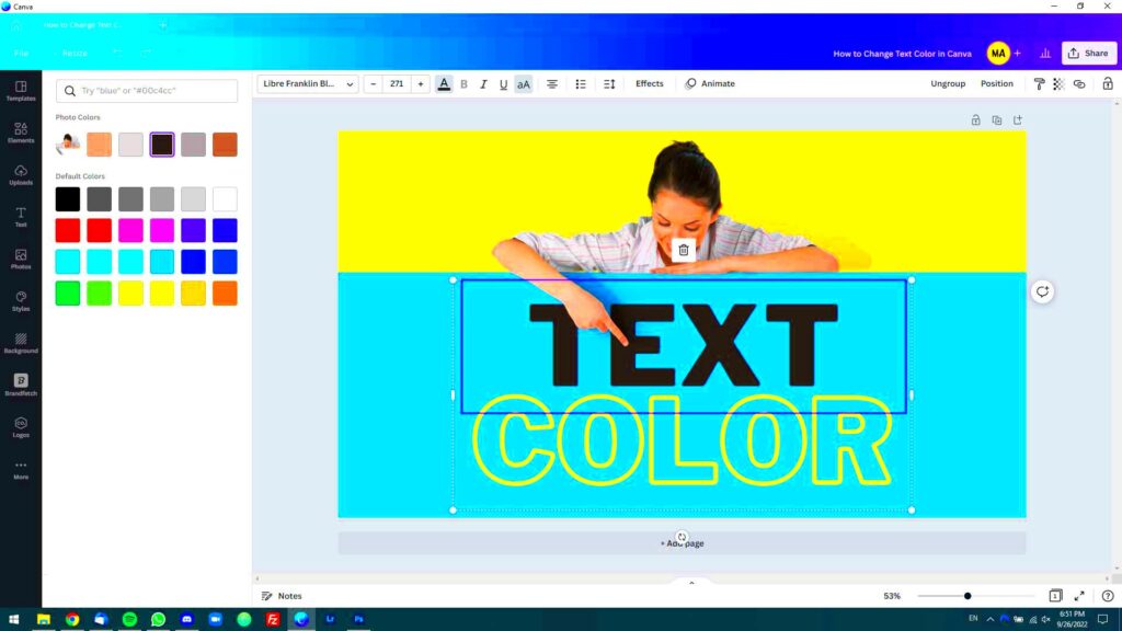
Step-by-Step Guide to Change Text Color in Behance
Now, let’s dive into the details of how to change the color of your text on Behance. Just follow these straightforward steps to make your text stand out.
- Log into Your Behance Account: Access your project dashboard.
- Select Your Project: Click on the project you want to edit.
- Open the Editor: Click on the “Edit Project” button. This will take you to the editing interface.
- Select the Text Box: Click on the text box you wish to change. A formatting toolbar will appear.
- Choose the Text Color: Click on the color option in the toolbar. A palette will pop up, allowing you to choose from a range of colors or input a specific hex code.
- Preview Your Changes: Always preview to see how your new color looks in context. This step can save you from unexpected surprises later.
- Save Your Changes: Once satisfied, hit the “Save” button. Remember, your changes will be visible to your audience immediately!
Having gone through these stages a few times, I can confidently say that putting in the effort to select the perfect text color pays off. It elevates your work from being mundane to something truly remarkable.
Also Read This: How to Watch Explicit Content on Dailymotion Safely
Using the Behance Editor for Text Color
Ah the Behance editor! Its like a painters palette where you can mix your imagination with your technical prowess. Changing text color using it goes beyond looks; its a way to convey your individuality. In the beginning of my design journey I found the multitude of choices overwhelming but as time went on I grew to appreciate the tools it offers.
To start off when you access the Behance editor keep an eye out for the text box that you wish to change. Here are some tips on how to make the most of the editor,
- Formatting Toolbar: The toolbar at the top offers several options, including font style, size, and alignment. The text color option is usually represented by a color palette icon.
- Color Palette: Clicking on the color palette reveals a range of colors. You can either select a color from this spectrum or input a specific hex code if you have a particular shade in mind.
- Opacity Control: If you want your text to blend subtly with the background, consider adjusting the opacity. This feature can add depth to your design.
- Undo Feature: Don’t be afraid to experiment! If you make a mistake, the undo feature allows you to revert back to the previous state.
Using the editor felt similar to picking up a paintbrush; every color selection was like a stroke adding to the overall canvas of my work. So take it slow and don’t hurry through this stage; it plays a crucial role in shaping your design path.
Also Read This: Behance location change tutorial
Tips for Choosing the Right Text Color
Selecting the perfect hue for your text may seem like a challenge but it really doesn’t have to be. There’s a realm of color psychology waiting to be explored and grasping its concepts can aid you in making well thought out decisions. Here are a few suggestions that have proven beneficial for me;
- Consider Your Audience: Who will view your project? Bright, bold colors may attract younger audiences, while softer tones might appeal to a more mature demographic.
- Think About Contrast: Ensure there’s enough contrast between your text and the background. A simple rule of thumb is to use light text on dark backgrounds and vice versa.
- Stick to a Color Palette: Limit your color choices to two or three colors that complement each other. This creates harmony and prevents your design from looking chaotic.
- Test with Real Users: If possible, show your project to friends or colleagues and ask for their thoughts on the text colors. Sometimes a fresh pair of eyes can provide invaluable feedback.
Looking back on my path I recall a phase when I opted for a fashionable hue that appeared stunning in theory but didn't quite work out in my project. It's these experiences that have helped me refine my design aesthetic throughout the years.
Also Read This: How Shutterstock Contributors Are Paid and What to Expect
Common Mistakes to Avoid When Changing Text Color
Although switching up text color might appear simple, there are traps that numerous designers, myself included, have fallen into. Here are a few typical blunders to avoid.
- Ignoring Readability: It's easy to get carried away with aesthetics. However, if your text is difficult to read, your message gets lost. Always prioritize clarity.
- Overusing Colors: Using too many colors can make your project look unprofessional. Stick to a cohesive color scheme to maintain a polished appearance.
- Forgetting About Accessibility: Some colors are hard for people with visual impairments to distinguish. Tools like contrast checkers can help you ensure your project is accessible to all.
- Neglecting the Background: Always consider how the text color interacts with the background. A beautiful color can become irrelevant if it blends in too much.
Throughout my journey, I’ve come to realize that every misstep holds a valuable lesson within it. Its important to remember that every creative has encountered obstacles along the way. Embrace the journey and continue honing your abilities!
Also Read This: How to Delete a Message in LinkedIn Managing Conversations Effectively
How to Preview Your Changes Before Publishing
Taking a moment to review your edits on Behance is akin to giving your creation a last look before putting it in a frame. This step is essential as it can spare you from possible awkwardness or remorse down the line. I remember my initial project where I failed to preview my adjustments only to find out post publication that the color of my text merged with the backdrop. It was a tough lesson learned! Here's a guide on how to preview your modifications.
- Use the Preview Button: After making your text color adjustments, look for the “Preview” button, usually located at the top of the editor. This feature lets you see how your project will appear to your audience.
- Check Different Devices: Behance allows you to view your project as it would appear on various devices. This is important because a color that looks good on a desktop might not translate well to a mobile screen.
- Take a Step Back: Sometimes, we get so caught up in details that we forget to see the big picture. Viewing your project as a whole can give you a fresh perspective on your color choices.
- Ask for Feedback: If you're unsure about your color choices, consider sharing the preview link with friends or fellow designers. Their input can provide valuable insights.
Keep in mind that previewing acts as your security blanket. Its an opportunity to refine your work before showcasing it to the public. Make the most of this moment and avoid hurrying through such a crucial stage!
Also Read This: Interview with a WireImage Photographer: Insights and Advice
FAQs about Changing Text Color in Behance
While exploring the realm of text hues on Behance you might come across a couple of queries. I have gathered a list of questions that could assist in clearing up any uncertainties you may have.
- Can I change text color after publishing? Yes, you can! Simply go back to the editor, make your changes, and republish. It's never too late to adjust your text colors.
- What if I can’t find the color I want? If you have a specific color in mind, you can enter the hex code directly into the color input field. This way, you won’t be limited to the predefined palette.
- Are there any restrictions on text color? While Behance doesn't impose strict rules, it’s best to avoid colors that clash or create poor readability. Always aim for a professional look.
- Can I save my color choices for future projects? Currently, Behance doesn’t have a built-in feature for saving colors, but keeping a personal color palette handy can help streamline your process.
These frequently asked questions are only scratching the surface. As you embark on your design journey keep in mind that each inquiry presents a chance for knowledge and personal development.
Wrapping Up Your Color Choices
As we wrap up our discussion on text color, let’s take a moment to consider the influence of your decisions. Selecting the text color in Behance goes beyond being a task; it’s a creative expression that can greatly impact how your work is viewed. Throughout the years I’ve come to realize that each color has its own narrative and emotion attached to it, so make your selection carefully.
Here are a few concluding thoughts to consider.
- Stay True to Your Brand: Your text color should resonate with your overall brand identity. It’s your unique fingerprint in the vast digital landscape.
- Keep Experimenting: Don’t shy away from trying new color combinations. Each project is an opportunity to learn and refine your aesthetic.
- Prioritize Consistency: A consistent color scheme across your projects builds recognition and trust with your audience.
- Remember the Power of Feedback: Always be open to feedback from peers. Their perspectives can help you refine your choices and grow as a designer.
Ultimately allow the hues in your text to showcase your imagination and enthusiasm. With every endeavor you embark on you not only demonstrate your abilities but also weave a tale where each shade contributes to the storyline. Enjoy the process of designing!