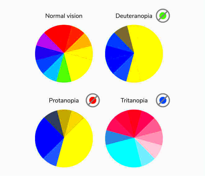
Color blindness is not merely a condition but rather a range of visual difficulties that individuals face. I recall a childhood friend who would narrow his eyes at a painting trying to discern the hues that others vividly described. Witnessing that instance made me realize the significance of being mindful of how our perceptions affect everyone not just the majority.
Color blindness can impact the way images are viewed particularly in a society where visuals are essential for conveying messages. Individuals with color blindness may struggle to differentiate between shades causing confusion and misinterpretation.
Here are key points about color vision deficiency.
- Approximately 1 in 12 men and 1 in 200 women are color blind.
- The most common form is red-green color blindness, affecting around 99% of those who experience it.
- Color blindness can make certain colors appear muted or indistinguishable.
By grasping this aspect we can enhance the inclusivity of our visuals. Taking into account the needs of color blind individuals when crafting images can improve how we convey messages and enrich the overall experience for all.
Choosing the Right Color Palette for Accessibility
Choosing the right color scheme is vital in image design, particularly for ensuring accessibility. I remember designing an infographic that I believed looked stunning only to discover later that the colors merged together for individuals with color blindness. This experience taught me an important lesson about making color selections.
Here are a few suggestions for choosing a color scheme that is easy to access.
- Use high-contrast colors: Ensure that your color choices have sufficient contrast. For example, combining dark colors with light ones can enhance visibility.
- Limit your palette: Stick to a maximum of three to four colors to avoid overwhelming viewers.
- Utilize color blindness simulators: These tools can show how your design will appear to those with color blindness.
An useful reference for color combinations that are easy to read is as follows
| Color Pair | Accessibility |
|---|---|
| Dark Blue and Light Yellow | Highly visible |
| Dark Green and Light Beige | Good contrast |
| Red and White | Can be problematic for red-green color blindness |
Selecting our hues thoughtfully can help us make sure that our creations connect with people fostering a more welcoming atmosphere.
Also Read This: 5 Best Image Creation and Curation Tools for Content Creators
Tools and Resources for Creating Color Blind Friendly Images
Designing images that are friendly for color blind individuals doesn't have to be a challenge. There are several tools and resources out there to assist you in finding the path. I still recall my initial experience in creating images with accessibility considerations. It was quite overwhelming to see the multitude of choices available. Nevertheless a couple of key tools simplified the entire process for me.
Here are some top notch tools that you can utilize
- Color Oracle: This is a free desktop application that simulates how your designs look to people with different types of color blindness.
- WebAIM Contrast Checker: This online tool helps you evaluate the color contrast ratio between foreground and background colors.
- Adobe Color: Adobe’s color wheel allows you to create palettes while checking for color blindness compatibility.
Besides these resources many online platforms offer tips for creating visuals. These materials can ease your path by sharing perspectives rooted in compassion and awareness. Keep in mind that the aim is to craft visuals that not enhance aesthetics but also foster inclusivity and representation for all.
Also Read This: The Pros and Cons of Running a Facebook Contest
Steps for Uploading Your Images Online
Sharing pictures on the internet is an easy task but it can be a bit daunting for beginners. I remember feeling a mix of excitement and nerves during my initial upload, hoping to get everything just right. Through a few straightforward steps I discovered how to showcase my creations to the world and now it comes naturally to me.
Here’s a detailed walkthrough to assist you in uploading your pictures efficiently.
- Choose the Right Platform: Select a platform that suits your needs. Whether it’s a social media site, a blog, or a stock photography website, the right choice can make a difference.
- Prepare Your Images: Ensure your images are in the correct format (JPEG, PNG, etc.) and are optimized for the web. A little compression can help without losing quality.
- Sign Up or Log In: If you’re using a new platform, create an account. If you already have one, just log in. Don’t forget to keep your login details safe!
- Upload Your Image: Most platforms have a clear upload button. Click it, select your file, and wait for the upload to complete.
- Add Descriptions and Tags: This step is crucial. A good description helps viewers understand your image, and relevant tags improve searchability.
- Publish and Share: Once you’re satisfied, hit that publish button. Share your work with friends and family, and don’t forget to ask for feedback!
By following these guidelines you can enhance the ease and pleasure of your uploading process. Keep in mind that each upload brings you closer to sharing your distinct viewpoint with others.
Also Read This: The Best Imago Images Features for Designers and Content Creators
Best Practices for Sharing Color Blind Friendly Images
When you share images that take color blindness into account it can change how your audience engages with your creations. I recall feeling a duty to do so after discovering how many individuals find it challenging to understand visuals not tailored for them. By tweaking your images you can foster a more inclusive environment.
Here are some guidelines to consider:
- Use Descriptive Text: Accompany images with descriptive text. This provides context and helps those who may not perceive colors as you do.
- Utilize Patterns and Textures: Instead of relying solely on color to convey information, incorporate patterns and textures to enhance differentiation.
- Maintain High Contrast: Ensure there’s sufficient contrast between text and background colors. This not only helps color-blind viewers but also improves readability for everyone.
- Get Feedback: Share your images with friends or colleagues who are color blind. Their insights can help you make necessary adjustments.
By putting these strategies into action you can enhance the accessibility of your shared content. The goal is to foster an environment where all can appreciate your creations.
Also Read This: Understanding the Causes and Solutions for Rumbling Sounds in Your Ears
How to Test Your Images for Color Blind Accessibility
Checking your visuals for color blindness is a crucial process that often gets ignored. I still remember when I thought I had created a perfect image only to discover later that it was nearly impossible for some people to make sense of it. Conducting tests can help you avoid those situations and make sure your creations connect with everyone.
Here’s a way to thoroughly assess your visuals.
- Use Color Blindness Simulation Tools: Tools like Color Oracle and Coblis allow you to see how your images will appear to individuals with different types of color blindness.
- Check Contrast Ratios: Utilize contrast checkers like WebAIM to evaluate the color combinations in your images, ensuring they meet accessibility standards.
- Seek Feedback: Share your images with people who have color blindness and ask for their honest opinions. Their feedback can provide invaluable insights.
- Iterate and Adjust: Based on the feedback and testing results, make necessary adjustments to improve accessibility. It’s an ongoing learning process.
While testing your images may feel like a task the benefits are well worth it. By investing time in making them accessible you’ll produce visuals that can be appreciated and enjoyed by all.
Also Read This: Creating a YouTube Account Without a Google Account
Common Mistakes to Avoid When Creating Accessible Images
Making images is crucial in the design process but it can be challenging for many of us. I remember when I first started in graphic design being so caught up in the visuals that I overlooked accessibility. There was an instance where I designed a beautiful flyer that didn't quite convey its message to everyone. It was a tough but valuable lesson that made me realize how essential inclusivity is.
Here are a few errors to avoid.
- Ignoring Color Contrast: One of the biggest pitfalls is not ensuring adequate contrast between text and background colors. This oversight can make text nearly unreadable for many, especially those with color blindness.
- Relying Solely on Color: Using color alone to convey information can be misleading. For instance, if you’re highlighting important data in a chart, consider adding patterns or shapes as well.
- Neglecting Alt Text: Alt text is crucial for those using screen readers. Failing to include descriptive alt text means that many viewers will miss out on your images’ context.
- Overloading with Information: Too much information can overwhelm the viewer. Aim for clarity and simplicity; sometimes, less is more.
- Skipping Testing: Not testing your images for accessibility before sharing is a major mistake. Utilize the tools available to see how your visuals will appear to those with color blindness.
Steering clear of these blunders will greatly improve your capacity to craft visuals that strike a chord with all. Making content accessible goes beyond being a necessity; it reflects a pledge towards inclusivity.
Also Read This: How to Get Popular on Behance and Become a Well-Known Designer
Frequently Asked Questions
While immersing myself in the process of making images more accessible I came across a host of inquiries. Its completely normal to crave understanding, particularly in a field that affects a significant number of people. I discovered that posing questions not only assisted me but also established a bond with individuals dealing with obstacles.
Below are some common inquiries about images that are considerate of color blindness:
- What is color blindness? Color blindness is a condition where individuals perceive colors differently than those with typical vision. It can affect how colors are distinguished, especially reds and greens.
- How can I make my images accessible? Use high contrast colors, avoid relying solely on color for information, include descriptive alt text, and test your images with simulation tools.
- Are there specific colors to avoid? Bright reds and greens can be problematic. Opting for combinations with better contrast, like blues and yellows, can help.
- What tools can I use to check accessibility? Tools like Color Oracle, WebAIM, and Adobe Color can assist in evaluating your designs for accessibility.
- How important is feedback from color blind individuals? Feedback is invaluable. It provides insight into how your images are perceived, helping you make necessary adjustments.
By tackling these inquiries youll enhance your ability to craft visuals that are both aesthetically pleasing and inclusive for everyone.
Wrapping Up Your Journey with Color Blind Friendly Images
Looking back on my experience in making images that are friendly for color blind individuals I see it as a journey filled with personal growth and valuable lessons. Every stage from grasping the nuances of color blindness to putting effective strategies into action has broadened my viewpoint. I now recognize how impactful visuals can be in bridging differences and nurturing meaningful connections.
Making images accessible goes beyond a need; it involves empathy and recognizing the varied requirements of our viewers. Here are some important points to remember.
- Empathy Matters: Always put yourself in the shoes of those who may experience your images differently.
- Continuous Learning: Stay updated with the latest tools and resources for accessibility. The landscape is ever-changing.
- Community Engagement: Connect with others in the field. Sharing experiences and insights can lead to incredible growth.
- Celebrate Progress: Acknowledge your efforts and the positive impact they have on inclusivity.
Ultimately each visual you produce serves as a chance to convey a message and engage with your viewers. Lets work towards making that engagement as welcoming and inclusive as we can.