Introduction
The success of any marketing campaign largely depends on the effectiveness of its calls-to-action (CTAs). A CTA is a specific instruction given to the target audience that prompts them to take a desired action, such as clicking a button, filling out a form, or making a purchase. CTAs are essential because they provide a clear and actionable path for users to follow, leading to more conversions and ultimately, increased revenue.
In this blog post, we'll explore the art of creating effective CTAs, including the characteristics of successful CTAs, types of CTAs, designing tips, and common mistakes to avoid. By the end of this post, you'll have a better understanding of how to create compelling and effective CTAs that drive results.
Also Read This: The Best Adblockers for YouTube in 2024 – A Userâs Guide
What is a Call-to-Action?
A call-to-action (CTA) is a specific instruction given to the target audience that prompts them to take a desired action, such as clicking a button, filling out a form, or making a purchase. CTAs are used in marketing to encourage prospects and customers to take a specific action that will move them further down the sales funnel. The primary goal of a CTA is to inspire action and create a sense of urgency to convert leads into customers. Effective CTAs are clear, concise, and action-oriented, providing a direct path for users to follow.
[caption id="attachment_182943" align="alignnone" width="1500"] What is a Call-to-Action?[/caption]
Also Read This: Does Liking Comments on YouTube Help Boost Video Engagement
Characteristics of Effective CTAs
Effective CTAs share several key characteristics that make them stand out and inspire action. Here are some of the most important characteristics of effective CTAs:
Clear and concise language:
An effective CTA should be straightforward and easy to understand, using clear and concise language that leaves no room for confusion or ambiguity.
Placement and visibility:
CTAs should be prominently placed on the page, in a location that's easily visible and accessible to the user. It's best to place CTAs above the fold and in areas where the user's attention is likely to be focused.
Relevance to the content:
An effective CTA should be relevant to the content on the page and provide a logical next step for the user to take.
Action-oriented language:
The language used in an effective CTA should be action-oriented, using words like "download," "register," or "buy" to inspire action.
Urgency and scarcity:
Effective CTAs create a sense of urgency and scarcity, conveying a sense of immediacy and importance to the user.
By incorporating these key characteristics into your CTAs, you can increase the likelihood of them being noticed and acted upon by your target audience.
[caption id="attachment_182944" align="alignnone" width="1280"] Characteristics of Effective CTAs[/caption]
Also Read This: Creating Eye-Catching Ads Using 123RF Images
Types of CTAs
There are several types of CTAs that can be used in marketing to prompt users to take a desired action. Here are some of the most common types of CTAs:
Button CTAs:
Button CTAs are clickable buttons that are designed to stand out on a webpage, often using contrasting colors and attention-grabbing language to encourage clicks. Button CTAs are commonly used for actions like "Learn More," "Sign Up," or "Buy Now."
Text-based CTAs:
Text-based CTAs are typically a line of text that prompts the user to take action, often in the form of a hyperlink or underlined text. These CTAs can be placed within the body of a webpage or at the end of a blog post, and are often used for actions like "Download Now" or "Read More."
Image CTAs:
Image CTAs use a visual element to prompt the user to take action. They can be used in the form of banners, pop-ups, or overlays and are often used for actions like "Get Started" or "Subscribe Now."
Pop-up CTAs:
Pop-up CTAs are designed to appear on top of a webpage and interrupt the user's browsing experience to prompt them to take a specific action. Pop-up CTAs can be used for actions like "Subscribe to our Newsletter" or "Get a Free Trial."
Video CTAs:
Video CTAs are typically used in video marketing to prompt users to take action after watching a video. These CTAs can be placed within the video itself or at the end of the video, and are often used for actions like "Download the Guide" or "Get a Free Consultation."
By using different types of CTAs strategically, businesses can prompt users to take specific actions at different points in the customer journey, ultimately driving more conversions and revenue.
[caption id="attachment_182945" align="alignnone" width="1240"]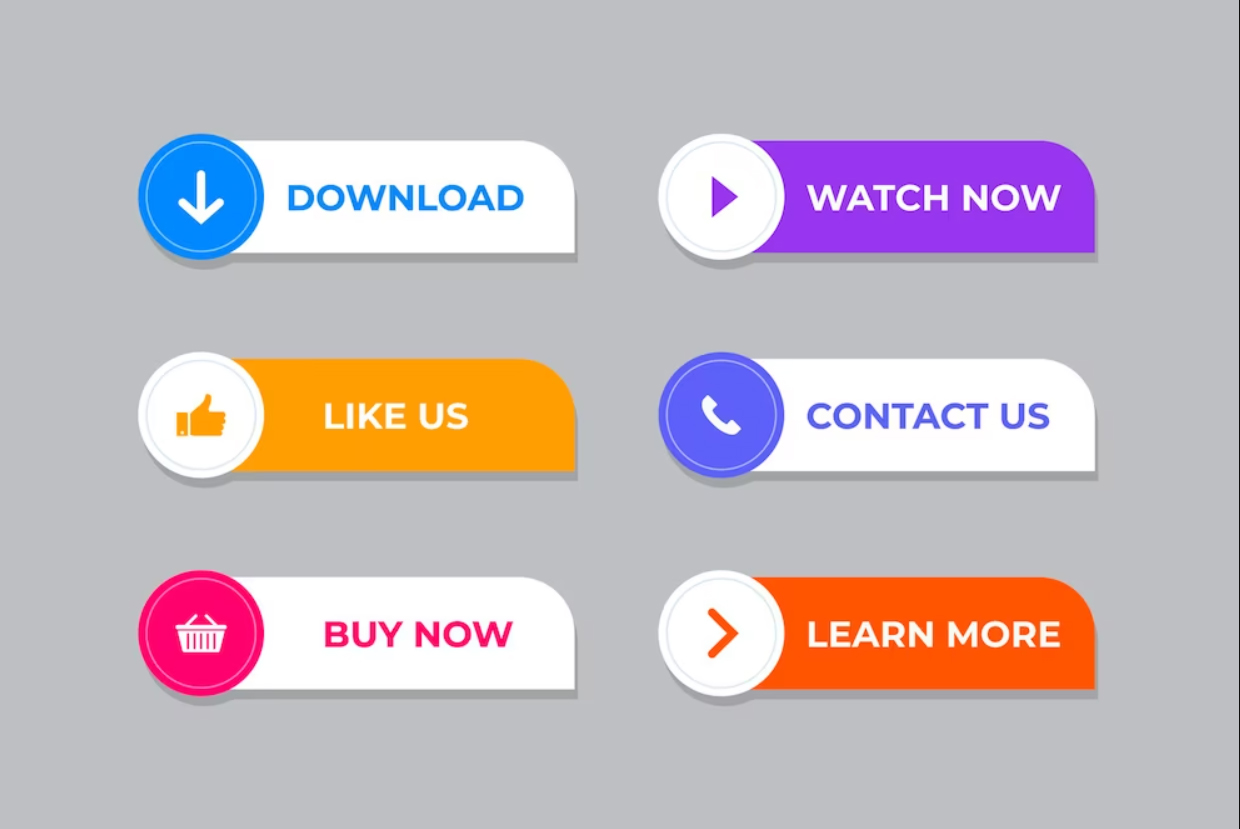 Types of CTAs[/caption]
Also Read This: Step-by-Step Guide to Princess Hairstyles Available on Dailymotion
Designing Effective CTAs
Designing effective CTAs requires careful consideration of several factors, including the target audience, the desired action, and the overall design of the page. Here are some tips for designing effective CTAs:
Use contrasting colors:
The CTA should stand out from the rest of the page, so use contrasting colors that catch the user's eye.
Use clear and concise language:
Use clear and concise language that tells the user exactly what they'll get by clicking the CTA. Avoid using vague or misleading language.
Create a sense of urgency:
Use language that creates a sense of urgency, such as "Limited Time Offer" or "Only 5 Spots Left."
Keep it simple:
Avoid cluttering the CTA with too much text or too many design elements. Keep it simple and easy to understand.
Make it prominent:
Ensure that the CTA is prominently placed on the page, and that it's easy to find and click.
Test and refine:
Experiment with different CTAs and designs, and test them to see which ones are most effective. Refine your CTAs over time based on the results.
By following these tips, businesses can design CTAs that are effective at prompting users to take a desired action, ultimately driving more conversions and revenue.
[caption id="attachment_182946" align="alignnone" width="1500"]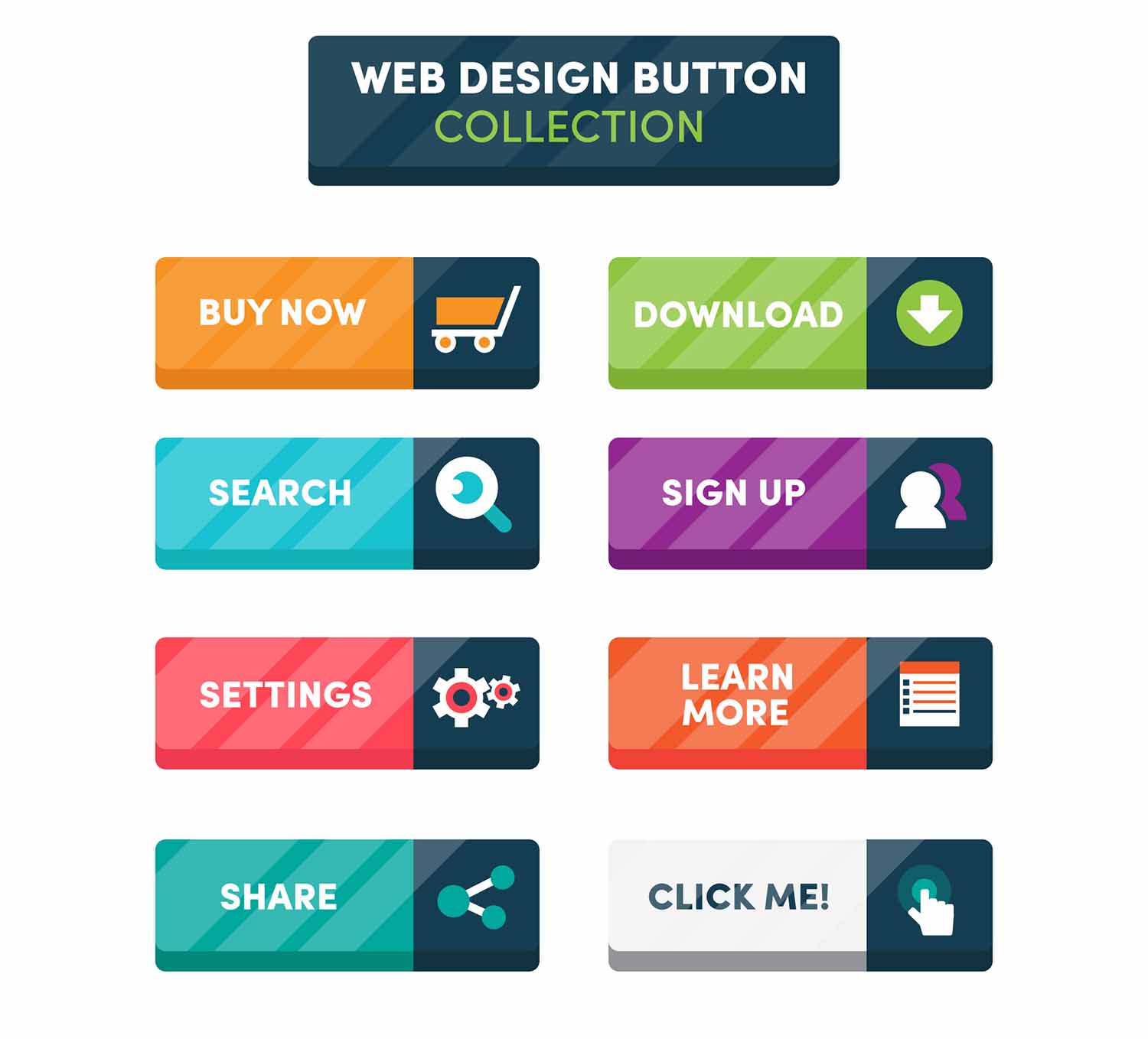 Designing Effective CTAs[/caption]
Also Read This: Create Impactful Presentations with Canva Google Slides Templates
Tips for Creating Effective CTAs
Creating effective CTAs involves more than just designing visually appealing buttons or text. Here are some tips for creating CTAs that can help improve conversion rates:
Use action-oriented language:
Use language that inspires action, such as "Download Now" or "Register Today."
Highlight the benefits:
Clearly communicate the benefits of taking the desired action, such as "Get instant access to exclusive content" or "Save time and money."
Keep it concise:
Use concise language that is easy to understand. Avoid long, complex sentences or technical jargon.
Create a sense of urgency:
Use language that creates a sense of urgency, such as "Limited time offer" or "Only a few spots left."
Use clear and contrasting colors:
Use colors that stand out from the rest of the page and clearly differentiate the CTA from other elements.
Ensure visibility:
Place the CTA in a prominent location that is easy to find and click.
Consider the placement:
The placement of the CTA can significantly affect its effectiveness. Experiment with placing CTAs in different locations on the page, such as above the fold or at the end of a blog post.
Test and refine:
Continuously test different CTAs and their placement on the page to see which ones work best for your audience. Analyze the data and refine the CTAs accordingly.
By following these tips, businesses can create CTAs that are more effective at prompting users to take the desired action, ultimately driving more conversions and revenue.
[caption id="attachment_182952" align="alignnone" width="1500"]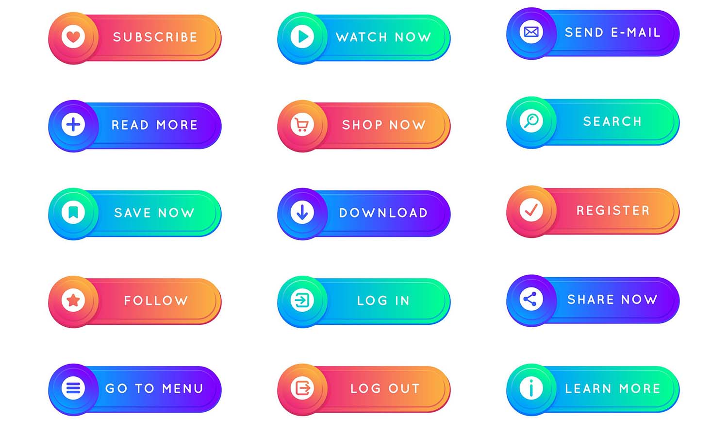 Tips for Creating Effective CTAs[/caption]
Also Read This: Experience the Future: Exploring Shutterstock 3D Images
Common CTA Mistakes to Avoid
While there are many best practices for creating effective CTAs, there are also some common mistakes that businesses should avoid. Here are some of the most common CTA mistakes:
Vague language:
Using vague language like "Click here" or "Learn more" doesn't provide enough information to the user, which can lead to confusion and a lack of action.
Too many CTAs:
Including too many CTAs on a page can overwhelm the user and make it unclear which action is the most important.
Unclear benefits:
Failing to clearly communicate the benefits of taking the desired action can lead to a lack of interest from the user.
Poor placement:
Placing the CTA in an obscure or hard-to-find location can decrease its visibility and effectiveness.
Lack of urgency:
Failing to create a sense of urgency through language or design can lead to a lack of motivation from the user.
Not testing:
Failing to test different CTAs or their placement can result in missed opportunities for conversion optimization.
Design issues:
Poorly designed CTAs that are hard to read, too small, or not contrasted enough can lead to a lack of clicks.
By avoiding these common mistakes, businesses can create CTAs that are more effective at prompting users to take the desired action, ultimately driving more conversions and revenue.
[caption id="attachment_182953" align="alignnone" width="1500"] Common CTA Mistakes to Avoid[/caption]
Also Read This: Create Online Courses with Canva Online Course Template
Conclusion
Effective CTAs are a crucial component of any successful marketing strategy. They help to guide users towards taking specific actions that can ultimately drive more conversions and revenue. By following the best practices for creating effective CTAs, businesses can create buttons, text, or graphics that stand out and inspire users to take the desired action.
However, it's important to also avoid common CTA mistakes, which can lead to confusion, a lack of interest, or missed opportunities for optimization. By continuously testing and refining CTAs, businesses can create a seamless user experience that leads to greater engagement, loyalty, and revenue.
FAQs
What is the best color for a CTA button?
There isn't a single "best" color for a CTA button, as it can vary depending on factors like brand identity, user preferences, and design elements. However, using contrasting colors that stand out from the rest of the page can help to draw attention to the CTA.
How many CTAs should I include on a page?
It's generally recommended to include one main CTA per page, as including too many CTAs can be overwhelming for the user and decrease their effectiveness.
Can I use the same CTA across all pages of my website?
While it's possible to use the same CTA across all pages of your website, it's generally recommended to customize CTAs based on the specific page or content. This can help to make the CTA more relevant and compelling to the user.
How can I create urgency in my CTAs?
Using language that creates a sense of urgency, such as "Limited time offer" or "Act now," can help to create urgency in your CTAs. Additionally, using design elements like countdown timers or highlighting the scarcity of an offer can also help to create urgency.
How often should I test my CTAs?
It's recommended to continuously test and refine CTAs to optimize their effectiveness. A/B testing different CTAs or their placement on the page can help to determine what works best for your audience.
