Creating tri fold brochures is akin to putting together a mini book that weaves a narrative. I recall my initial attempt at designing one for my cousins wedding invitation. It was a bit daunting at first but as I explored the realm of design I found it to be quite an enjoyable and rewarding experience. A tri fold brochure goes beyond simply folding paper; it involves showcasing information in an eye catching manner that grabs the readers interest. Whether it's for a business, an occasion or a personal endeavor these brochures act as compact marketing tools conveying essential messages while being convenient to distribute. So lets jump right in!
Understanding Tri Fold Brochure Templates

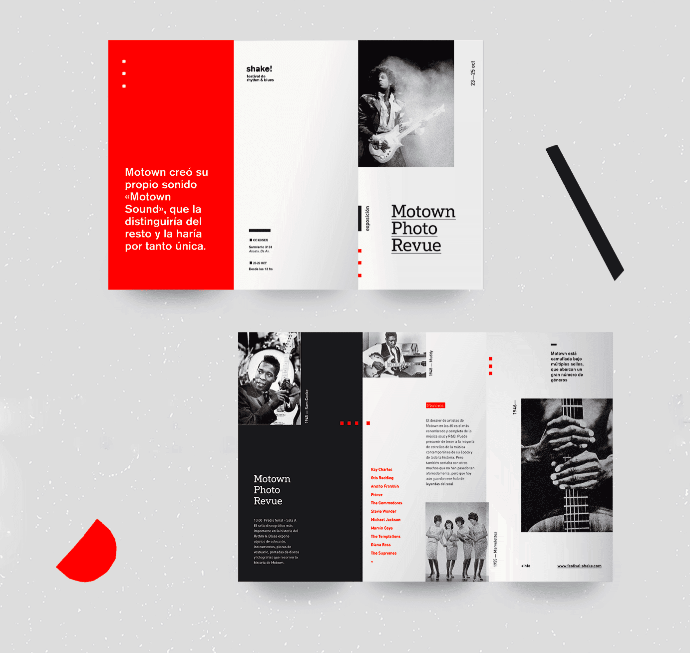
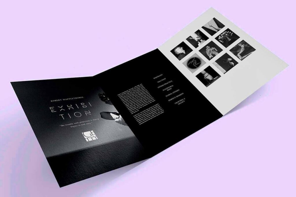
Tri fold brochures stand out due to their design featuring three sections that fold inward to form a total of six panels. This arrangement provides a tidy and structured presentation. Here’s an overview of what you should be aware of regarding these templates.
- Panel Layout: The panels are typically arranged with a front cover, inside content, and a back cover, making it easy to present information logically.
- Design Flexibility: You can customize each panel for different purposes, such as showcasing services, testimonials, or contact details.
- Space Utilization: Despite their small size, tri fold brochures can hold a significant amount of information, making them efficient for communication.
When choosing a template keep in mind who you are trying to reach and what message you want to send. Being mindful of these factors will help you make design decisions that ensure your brochure effectively serves its intended purpose.
Also Read This: Gaining more followers on Behance
Benefits of Using Canva for Brochure Design
Canva has established itself as a preferred choice among budding designers like me. With its intuitive design and wide selection of templates it caters to users ranging from novices to experienced experts. Here are several advantages of utilizing Canva for creating your tri fold brochure,
- Easy to Use: With drag-and-drop functionality, creating stunning designs is a breeze, even for those who aren’t tech-savvy.
- Extensive Library: Canva offers a rich collection of templates, images, and design elements. You can find inspiration or adapt existing designs to fit your needs.
- Collaboration Features: If you’re working with a team, Canva allows for easy sharing and collaboration, making it simple to gather feedback and make adjustments.
- Cost-Effective: Many features are available for free, and the premium options are reasonably priced, making it an affordable choice for anyone on a budget.
I was really impressed with how fast I could bring my concepts to life when I created my brochure using Canva. The tool not only assisted me in honing my design abilities but also made the whole experience fun. If you want to craft a brochure that stands out, Canva is definitely a platform to check out!
Also Read This: How to Remove All Comments from Your YouTube Videos: A Simple Method
How to Access Canva Tri Fold Brochure Templates
Getting your hands on Canva's tri fold brochure templates is as simple as brewing a cup of masala chai. I still recall the thrill I experienced when I initially joined Canva without having any idea of what to anticipate. The platform welcomed me with a colorful selection of design choices that immediately ignited my imagination. Here's a guide on how you can explore the realm of brochure templates on Canva:
- Sign Up or Log In: Start by creating a free account on Canva’s website or log in if you already have one. Trust me; it’s worth it!
- Search for Templates: Once logged in, use the search bar at the top. Type in “tri fold brochure” and hit enter. You’ll be amazed at the variety available.
- Explore Your Options: Browse through the numerous templates. You’ll find designs ranging from minimalist to elaborate, catering to different themes and purposes.
- Select a Template: Once you find a design that resonates with you, click on it to open it in the editor. You can preview it to see how it looks.
- Start Designing: After selecting your template, you can customize it to your heart’s content. Adjust colors, fonts, and images to align with your vision.
Canva streamlines the process making it easy and fun for you to concentrate on showcasing your creativity instead of getting caught up in the nitty gritty aspects.
Also Read This: Access Teacher Templates with Canvas Teacher Templates
Customizing Your Tri Fold Brochure in Canva
Tailoring your tri fold brochure using Canva is akin to creating a masterpiece on a blank canvas. The opportunities are limitless! When I began putting my own spin on designs, I realized that even the smallest adjustments could have a significant impact. Here’s a straightforward roadmap to assist you in kicking off your journey:
- Change Text: Click on the text boxes to edit them. Be clear and concise, as brochures should convey messages quickly. Don’t hesitate to use friendly language!
- Alter Colors: Match the colors to your brand or theme. You can change the background color or the colors of text and images to create a cohesive look.
- Add Images: Upload your own photos or choose from Canva’s extensive library. Images can evoke emotions and make your brochure visually appealing.
- Incorporate Shapes and Icons: Utilize shapes and icons to highlight important information or add visual interest. These small details can enhance the overall design.
When personalizing your brochure, it's important to maintain a tidy and structured design. A messy layout can make it difficult for readers to grasp the content, so be strategic with your use of empty space. It took me some time to grasp this concept, but once I did, my creations really reached a new level!
Also Read This: Mastering Toga in My Hero Ultra Rumble
Tips for Creating Eye-Catching Brochures
Crafting a brochure that grabs attention is like a skill. I remember designing one for a community event and it was a success! Here are some insights Ive picked up along the way to assist you in making brochures that genuinely shine.
- Start with a Strong Headline: Your headline should grab attention immediately. Think of it as the first impression you make; it should be inviting and intriguing.
- Use High-Quality Images: Invest time in selecting high-resolution images. A blurry or pixelated image can ruin the overall appeal of your brochure.
- Stick to a Color Palette: Limiting your color palette to 2-3 main colors can create a more professional look. It helps maintain visual harmony throughout the brochure.
- Include a Call to Action: Encourage your readers to take the next step, whether it’s visiting a website or attending an event. A clear call to action can significantly boost engagement.
- Proofread Your Content: Spelling or grammatical errors can undermine your credibility. Take the time to proofread your text or ask a friend to review it.
Keeping these suggestions in you’ll be poised to craft brochures that not only convey information but also captivate your readers. Keep in mind that the design process is a journey so savor each moment along the way!
Also Read This: Watching A Week Away Full Movie on YouTube
Common Mistakes to Avoid in Brochure Design
Designing a brochure can be a fun adventure, but it's not without its pitfalls. I learned this the hard way when I tried to whip up a brochure for my buddies business. I got so wrapped up in making it look good that I missed some key details. Here are a few blunders to steer clear of to ensure your brochure stands out in all the right ways.
- Overcrowding the Design: It’s tempting to fill every inch of space, but less is often more. A crowded design can confuse readers and dilute your message. Aim for clarity.
- Using Inconsistent Fonts: Stick to two or three fonts at most. Mixing too many fonts can create a chaotic look and distract from your content. Choose fonts that complement each other.
- Ineffective Call to Action: A call to action is crucial. If it’s vague or buried, potential customers might not know what to do next. Be clear and direct.
- Neglecting the Target Audience: Always design with your audience in mind. What appeals to teenagers might not work for professionals. Tailor your design to suit the preferences of your target demographic.
- Ignoring Proofreading: Spelling and grammatical errors can undermine your credibility. Always take a moment to review your text or ask someone else to look it over.
Every blunder hides a valuable lesson. By rectifying my design missteps I noticed a significant boost in the feedback I received. Steering clear of these traps can assist you in crafting brochures that captivate and connect with your target audience.
Also Read This: iStock or Shutterstock: Which platform is better suited for your creative needs?
Frequently Asked Questions
If you’re diving into the world of tri fold brochure design you probably have some questions swirling around. I totally get that feeling of being bombarded with choices when I was just starting out too. So to help ease your mind here’s a list of commonly asked questions that can shed some light on things.
- What software should I use to design brochures?
While there are many options, Canva stands out for its user-friendly interface and variety of templates. It’s perfect for both beginners and experienced designers. - How do I choose the right paper for printing?
Consider the feel you want your brochure to convey. Glossy paper gives a vibrant look, while matte offers a more sophisticated feel. It depends on your branding. - What size should my tri fold brochure be?
The standard size is typically 8.5 x 11 inches when folded. However, you can experiment with different sizes to see what works best for your content. - How can I distribute my brochures effectively?
Think about where your target audience frequents. Coffee shops, local businesses, and community events are excellent places to leave your brochures. - Is it necessary to hire a professional designer?
Not at all! With tools like Canva, anyone can create stunning brochures. However, if you want a unique touch or have a specific vision, hiring a designer can be beneficial.
These frequently asked questions were invaluable in helping me overcome the challenges of creating a brochure. By tackling issues I aim to inspire you to approach your design process with assurance.
Conclusion and Final Thoughts
In conclusion of our journey through tri fold brochure creation I want to stress that crafting an engaging brochure involves a fusion of creativity and careful planning. Looking back on my past experiences I see that every brochure I worked on imparted a lesson. Be it trying out different designs or honing my communication skills every moment spent was rewarding.
Keep in mind that your brochure is more than just a sheet of paper; it serves as a representation of your identity, your communication and your enthusiasm. Embrace the journey and dont hesitate to stumble as you go. Every talented designer has encountered obstacles and it’s through these moments that we evolve.
Take some time to brainstorm your thoughts check out the templates available on Canva and dive into the design process with assurance. The world is ready to witness your unique perspective and your brochure serves as an ideal platform to convey your ideas. Cheers to crafting something both stunning and significant. Enjoy the design journey!
