Creating a stunning online portfolio can significantly elevate your presence as a designer. Behance is a popular platform that showcases creative work, but what if you could replicate that visually appealing layout on your own website? In this post, we’ll explore design tips that effectively mimic the unique elements of a Behance portfolio. Whether you're a graphic designer, illustrator, or photographer, these insights will help you craft an engaging portfolio that stands out!
Understanding Behance's Unique Design Elements
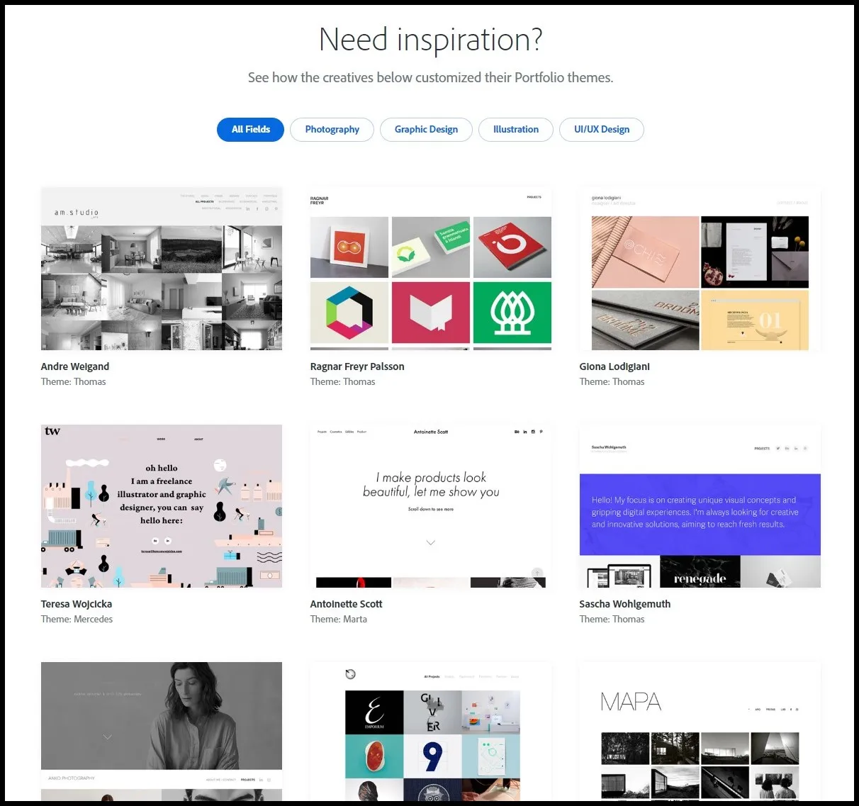
To successfully imitate the Behance layout, it's crucial to dissect what makes it tick. Behance is renowned for its clean, grid-based design, vibrant visuals, and user-friendly navigation. Let’s delve into these components to understand how you can incorporate them into your own website.
- Grid Layout: The most striking feature of Behance is its responsive grid. This layout allows projects to be displayed in various sizes, creating visual interest and making content easier to navigate. Implement a similar grid system on your site using CSS Grid or Flexbox.
- High-Quality Visuals: Imagery is at the heart of any creative portfolio. Behance emphasizes large, captivating images that draw the viewer's eye. Use high-resolution photos and limit the number of projects on each page to avoid overwhelming your audience.
- Whitespace: Effective use of whitespace enhances readability and gives the portfolio a polished look. Don’t overcrowd your designs; instead, let each project breathe by providing adequate spacing around it.
- Dynamic Project Presentation: Behance offers various ways to showcase projects, including videos, images, and detailed descriptions. Consider creating engaging slideshows or interactive elements that allow users to explore your work in depth.
- Typography: Clean and modern typography choices contribute to the overall aesthetic. Choose fonts that reflect your style while ensuring readability. Pair a bold header font with a simpler body font for balance.
By understanding and applying these distinctive design elements, you'll be well on your way to creating a portfolio that not only mirrors Behance's charm but also highlights your unique creative identity.
Also Read This: Understanding YouTube Impressions and Their Effect on Video Reach
Choosing the Right Color Scheme and Typography
When it comes to designing a portfolio that mimics the sleek and modern feel of a Behance layout, selecting the right color scheme and typography is crucial. These elements not only define the visual identity of your website but also enhance the user experience.
Start by choosing a color palette that resonates with your brand. Consider these tips:
- Limit Your Palette: Stick to 3-5 colors that complement each other. Tools like Adobe Color can help you generate harmonious combinations.
- Use Contrast Wisely: Employ contrasting colors to draw attention to key elements like buttons or calls to action. For example, if your background is light, use darker colors for your text.
- Embrace Neutrals: Neutrals can act as a backdrop for your work, allowing your projects to shine without distraction.
Now, let’s talk typography. The font you choose plays a significant role in conveying your style:
- Readability is Key: Opt for sans-serif fonts for clean, modern looks, or serif fonts for a more traditional feel. Google Fonts offers a plethora of options.
- Limit Font Styles: Use no more than two different fonts across your site to maintain a cohesive appearance.
- Hierarchy Matters: Use different sizes and weights to create a visual hierarchy, making it easier for visitors to navigate your content.
By carefully curating your color scheme and typography, you’ll create a polished portfolio that captures attention and reflects your personal brand.
Also Read This: Download Free PPT Templates with Canvas PPT Template Free Download
Creating a Grid Layout for Visual Consistency
A grid layout is essential when mimicking a Behance portfolio because it provides structure and visual consistency to your projects. It helps your audience navigate through your work seamlessly and keeps the design aesthetically pleasing.
Here’s how to effectively create a grid layout:
- Choose the Right Grid System: Whether it’s a simple two-column layout or a complex asymmetrical grid, select a system that showcases your work best. Bootstrap and CSS Grid are great frameworks to start with.
- Maintain Consistent Spacing: Ensure that the margins and padding between elements are uniform. This creates a clean look and enhances readability.
- Align Elements: Stick to a clear alignment for all items in your grid. This can be left-aligned, center-aligned, or right-aligned, depending on your aesthetic preference.
Consider using a responsive grid. This means your layout will adapt to different screen sizes, ensuring all visitors have a pleasant experience whether they’re on a desktop, tablet, or smartphone.
Here’s a simple example of a grid layout:
| Project Title | Thumbnail | Description |
|---|---|---|
| Project 1 | Image 1 | A brief description of the project. |
| Project 2 | Image 2 | A brief description of another project. |
With a well-structured grid layout, your portfolio will not only look professional but also provide visitors with an intuitive browsing experience. This will keep them engaged and eager to see more of your work!
Also Read This: How to Pay Your YouTube TV Bill – A Simple Guide
Incorporating High-Quality Images and Projects
When it comes to showcasing your work online, the quality of your images can make or break your portfolio. High-quality visuals grab attention and convey professionalism, ultimately reflecting the caliber of your projects. Here are some tips to effectively incorporate stunning images into your portfolio:
- Use Professional Photography: Invest in high-quality photography for your projects. If possible, hire a professional photographer to capture your work in the best light. This investment will pay off in terms of user engagement.
- Optimize Image Size: Large images can slow down your website. Use tools like TinyPNG or ImageOptim to compress your images without sacrificing quality.
- Create a Cohesive Aesthetic: Ensure that your images have a consistent style. This could be in terms of color palette, lighting, or composition, which helps in creating a united visual experience.
- Showcase Multiple Angles: For products or installations, include images from different angles. This gives visitors a better sense of the details and craftsmanship involved.
- Utilize Carousel or Grid Layouts: Use image carousels or grid layouts to present multiple projects without overwhelming visitors. This layout mimics popular Behance portfolios and allows for a clean presentation.
Remember, the goal is to make your work shine. By incorporating high-quality images thoughtfully, you not only enhance the aesthetic appeal of your website but also engage your audience effectively.
Also Read This: How to Message Hiring Manager on LinkedIn
Enhancing User Experience with Smooth Navigation
A seamless user experience is crucial for keeping visitors on your site and encouraging them to explore your work. If your navigation is clunky or confusing, potential clients may leave before discovering your amazing projects. Here are some tips to enhance user experience through smooth navigation:
- Keep It Simple: Use a straightforward navigation menu with clear labels. Avoid jargon; instead, use terms like "Portfolio," "About," and "Contact" that everyone understands.
- Implement Sticky Navigation: Consider a sticky navigation bar that remains at the top as users scroll. This keeps essential links handy, improving the overall browsing experience.
- Include a Search Function: If your portfolio is extensive, a search bar can be invaluable. It allows users to quickly find specific projects without endless scrolling.
- Organize Projects by Categories: Group your projects into categories (e.g., Web Design, Graphic Design, Illustration). This organization helps users navigate based on their interests.
- Utilize Breadcrumbs: Breadcrumb navigation aids usability by showing users their path. This is particularly helpful on pages with multiple subcategories.
By prioritizing user-friendly navigation, you can create a portfolio that not only showcases your work beautifully but also makes it easy for potential clients to find what they’re looking for. Ultimately, a well-designed navigation system fosters a positive experience that reflects your professionalism.
Also Read This: Create Inspirational Mood Boards Using Canva Mood Board Template
7. Utilizing White Space Effectively
White space, often referred to as negative space, is your best friend when it comes to creating a visually appealing website. It’s not just empty space; it’s an essential design element that can enhance readability and focus attention on your content. Here’s how to effectively utilize white space to mimic a Behance portfolio layout:
- Create Breathing Room: Ensure that each design element has enough space around it. This helps prevent your site from feeling cluttered and allows visitors to focus on individual pieces of work.
- Group Related Elements: Use white space to visually separate different sections or categories in your portfolio. For example, if you're showcasing graphic design and photography, separate these with ample space.
- Highlight Call-to-Action Buttons: Place buttons against a backdrop of white space to draw attention. When a button stands out, it's more likely to be clicked.
- Consistent Margins and Padding: Keep margins and padding consistent throughout your site. This creates a harmonious flow that is easy on the eyes.
Remember, effective use of white space can dramatically improve user experience. It’s a simple yet powerful way to direct attention where you want it while making your portfolio look professional and polished.
Also Read This: How to Connect Dailymotion with Roku from S9 Plus
8. Adding Interactive Elements to Engage Visitors
In today’s digital landscape, adding interactive elements to your website isn’t just a bonus; it’s a necessity. Interactive features can transform a static portfolio into a dynamic experience that captivates your audience. Here are some ideas to get you started:
- Hover Effects: Implement hover effects on your portfolio pieces. For example, when users hover over an image, it could enlarge slightly or reveal a brief description.
- Image Sliders: Consider adding an image slider for showcasing multiple images of a project. This allows visitors to see different angles or stages of your work without overwhelming them with options.
- Quizzes or Polls: If relevant, add a fun quiz or poll related to your work to engage users further. It encourages interaction and can provide valuable feedback.
- Interactive Prototypes: For designers, including interactive prototypes can give viewers a taste of how your designs function in real life, enhancing their understanding of your capabilities.
Incorporating these interactive elements not only makes your site more engaging but also reflects the creativity and innovation that you bring to your portfolio. Remember, the goal is to create an experience that leaves visitors wanting more!
Also Read This: How to Earn Money on Rumble
9. Showcasing Your Work in a Professional Manner
When it comes to displaying your projects, professionalism is key. Your portfolio is often the first impression potential clients will have of your work, so it’s crucial to make it count! Here are some tips to ensure your showcase stands out:
- High-Quality Images: Use sharp, high-resolution images of your work. A blurry or pixelated image can detract from the quality of your projects. Consider using image editing tools to enhance your visuals before uploading.
- Consistent Layout: Maintain a uniform layout across all project entries. This could mean using the same size for images or sticking to a specific grid system. Consistency helps in creating a cohesive look.
- Project Descriptions: Include brief but informative descriptions for each project. Describe the goals, processes, and outcomes. This not only provides context but also showcases your thought process and design rationale.
- Interactive Elements: Consider adding interactive elements like hover effects or clickable prototypes. This engagement can keep visitors interested in your work.
- Client Testimonials: If applicable, include testimonials from clients or collaborators. A positive review can add credibility to your work and help persuade potential clients.
Remember, the aim is to make your portfolio not just a display of your work but an experience that reflects your style and professionalism.
10. Conclusion
Creating a portfolio that mimics the sleek, clean layout of Behance can significantly enhance your online presence. By focusing on showcasing your work in a professional manner, you’re not just presenting projects; you’re telling a story about your skills and creativity. Here are a few quick takeaways:
| Key Takeaways |
|---|
| Utilize high-quality visuals. |
| Maintain a consistent layout. |
| Include informative project descriptions. |
| Integrate interactive elements to boost engagement. |
| Add client testimonials for credibility. |
Ultimately, your goal is to create a portfolio that not only showcases your skills but also reflects your unique personality and design aesthetic. So, take these tips, get creative, and start building a portfolio that leaves a lasting impression!