Canva makes it easy for anyone to create stunning designs, and one key element is color. Changing the colors in your images can completely transform your design's look and feel. Whether you're aiming for a vibrant pop or a subtle touch, understanding how to modify colors in Canva can elevate your projects. In this section, we’ll explore why color matters and how you can easily make these changes.
Importance of Color in Design

Color plays a crucial role in design. It can evoke emotions, grab attention, and convey messages. Here’s why it’s important:
- Emotional Connection: Colors can trigger emotions. For example, blue often represents calmness, while red can signify excitement.
- Brand Identity: Consistent use of color helps reinforce brand recognition. Think of how recognizable the color red is for Coca-Cola.
- Visual Hierarchy: Colors can guide viewers’ eyes to specific areas of your design, helping them focus on what matters most.
- Accessibility: Choosing the right color combinations can make your designs more accessible to those with visual impairments.
By understanding the psychology of color, you can create more impactful designs that resonate with your audience.
Also Read This: Best Time to Share on Flickr: Tips and Tricks
How to Change Colors in Canva Images

Changing colors in Canva is a simple process. Here’s how you can do it:
- Open Your Design: Log into Canva and open the design you want to edit.
- Select the Image: Click on the image whose color you want to change.
- Use the Color Tool: Click on the color icon in the top menu. You’ll see a color palette.
- Choose Your Color: Select a new color from the palette or enter a specific hex code for precision.
- Apply Changes: Once you choose a color, it will automatically update in your design. You can continue adjusting until you're happy with the result.
Canva also offers features like filters and transparency adjustments, allowing even more customization. Remember to experiment with different colors to find the best match for your design!
Also Read This: StockSnap.io Review: Insights from a Photographer
Using Canva's Color Palette

Canva’s color palette is a powerful tool that can help you choose the perfect colors for your designs. It provides a range of options to ensure your color choices are not only aesthetically pleasing but also cohesive. Here's how you can make the most of it:
- Access the Palette: When you select an element in your design, you’ll see the color tool in the top menu. Click on it to reveal the palette.
- Explore Pre-set Palettes: Canva offers pre-made color palettes that you can use. These palettes are designed by professionals to ensure a balanced look.
- Create Custom Palettes: You can also create your own palette by selecting colors that resonate with your brand or theme. Just click on the "+" icon in the color tool to add your chosen colors.
- Use Color Harmonies: Canva has built-in color harmonies that suggest color combinations based on the color wheel. These include complementary, analogous, and triadic schemes, which can make color selection easier.
With Canva's color palette, you can easily find the right mix of colors that reflects your message and style. Don't hesitate to experiment with different combinations to see what works best!
Also Read This: How to Download a Video on Behance
Adjusting Image Colors for Better Impact
Once you have your colors selected, adjusting the image colors can greatly enhance the overall impact of your design. Here are some tips to help you do just that:
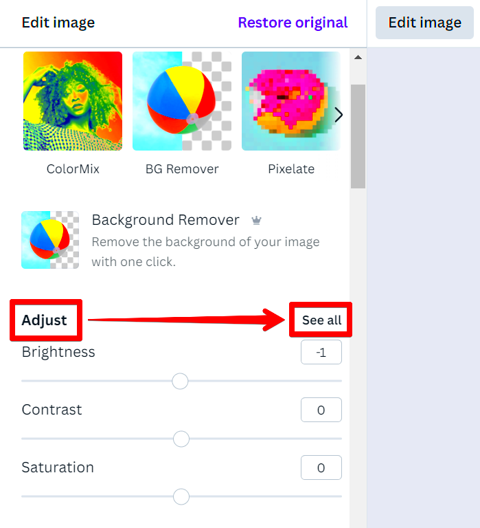
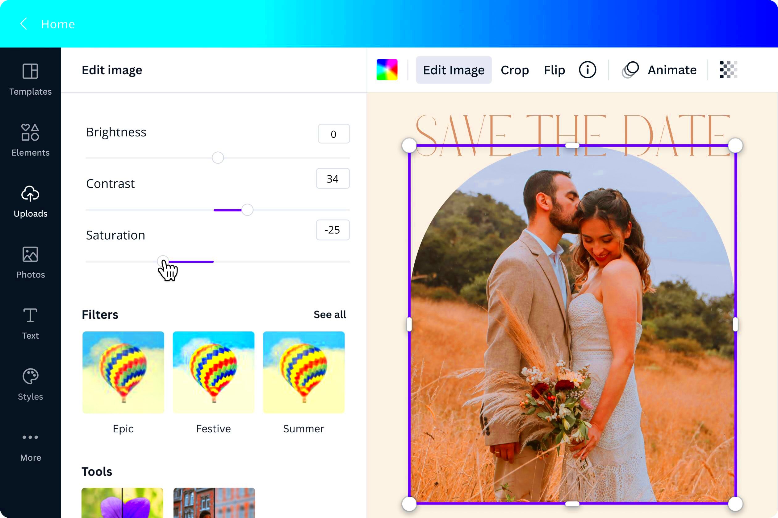
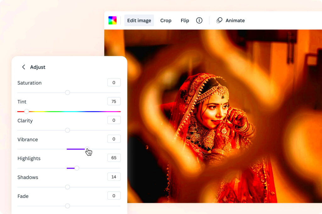
- Use Filters: Canva offers various filters that can instantly change the look of your image. You can adjust the intensity of each filter to suit your design needs.
- Adjust Brightness and Contrast: By tweaking brightness and contrast levels, you can make your images stand out. A well-lit image can draw attention, while good contrast can highlight important elements.
- Saturation Levels: Increasing saturation makes colors more vibrant, while decreasing it gives a more muted look. This can help convey different moods.
- Transparency Adjustments: Changing the transparency of your images can create a layered effect, making your design feel more dynamic.
- Crop and Resize: Sometimes, adjusting the composition of your image can enhance its impact. Experiment with cropping to focus on the most important aspects.
By effectively adjusting image colors, you can create designs that resonate more deeply with your audience and convey your intended message more clearly.
Also Read This: How to Get YouTube on Your Phone Quick Setup for Mobile Devices
Tips for Choosing the Right Colors
Choosing the right colors can make or break your design. Here are some helpful tips to guide you in selecting the perfect colors:
- Understand Color Psychology: Different colors evoke different feelings. For instance, blue often conveys trust, while yellow can evoke happiness. Consider the emotions you want to evoke.
- Stick to a Color Scheme: Using a limited color palette can create a cohesive look. Aim for two to five colors that complement each other.
- Consider Your Audience: Think about who will view your design. Different demographics may have varying color preferences.
- Test Color Combinations: Don’t hesitate to try out different combinations. Use tools like Canva's color palette to explore options.
- Get Feedback: Share your designs with friends or colleagues to get their input. Fresh eyes can offer valuable insights.
With these tips in mind, you’ll be well on your way to creating visually appealing designs that capture your audience's attention. Happy designing!
Also Read This: Canva Image Saving
Common Mistakes to Avoid
When it comes to changing colors in your designs, it’s easy to make mistakes that can affect the overall look. Here are some common pitfalls to watch out for:
- Overusing Bright Colors: While bright colors can grab attention, using too many can be overwhelming. Aim for balance by pairing bright colors with more muted tones.
- Ignoring Color Contrast: Ensure that text is readable against the background. Poor contrast can make your message hard to read, so always check that the colors work well together.
- Not Considering Color Harmony: Using colors that clash can create a chaotic look. Familiarize yourself with color harmonies like complementary and analogous colors to maintain a pleasing aesthetic.
- Neglecting Your Brand Colors: If you’re designing for a brand, stay true to its color scheme. Straying from established colors can confuse your audience and weaken brand identity.
- Failing to Test Your Colors: Always preview your design on different devices to see how colors appear. What looks good on a computer screen might look different on a mobile device.
Avoiding these common mistakes can lead to more effective and appealing designs, ensuring your message comes through loud and clear.
Also Read This: Using Alamy Stock Photos for Free in Commercial and Personal Projects
Frequently Asked Questions
Got questions about changing colors in Canva? Here are some frequently asked questions to help you out:
- Can I change colors in any image I upload?
Yes, you can change colors in most images, but some images with complex patterns may have limited color adjustments. - What if I can’t find the right color?
You can enter a specific hex code to find the exact color you want. This feature allows for precise matching. - Are there any tools to help with color selection?
Yes! Canva offers a color palette tool and suggestions for color harmonies to make choosing easier. - Can I save my custom color palette?
Absolutely! You can save custom palettes to use in future designs, making it easier to maintain a consistent look. - What if I want to use a color from a photo?
Canva has a color picker tool that allows you to select colors directly from uploaded images.
If you have any other questions, don’t hesitate to explore Canva’s help resources or community forums for more tips!
Conclusion and Final Thoughts
Changing colors in Canva is a straightforward process that can significantly enhance your designs. By understanding the importance of color, using Canva's tools effectively, and avoiding common mistakes, you can create stunning visuals that resonate with your audience. Remember, the right colors can evoke emotions, convey messages, and establish your brand identity.
As you continue to experiment with colors, don't forget to seek feedback and keep learning. Design is an ongoing journey, and every project helps you grow. So, dive into your next design with confidence and creativity. Happy designing!
