Canva is an awesome resource for those who want to infuse some creativity into their visuals. When I began exploring Canva I was pleasantly surprised by how effortlessly I could turn mundane images into lively masterpieces. A standout feature for me was the option to incorporate hues. Whether you're a small business proprietor aiming to design attention grabbing promotional content or simply an individual looking to spruce up your snapshots honing the skill of adding colors can truly elevate your creations.
Understanding Color Theory in Design
Color theory is an aspect of design that involves understanding how colors interact and influence emotions. Its intriguing to see how different hues can convey moods and feelings in visuals. For example warm tones like red and orange can evoke sensations of warmth or enthusiasm while cooler shades such as blue and green can promote tranquility and serenity. Here are some important principles to consider.
- Color Wheel: The color wheel is a circular diagram of colors arranged by their chromatic relationship. It’s a helpful tool to understand how colors interact.
- Complementary Colors: These are colors that are opposite each other on the color wheel. Using them together can create a striking contrast.
- Analogous Colors: These are colors that are next to each other on the color wheel. They create a harmonious look when used together.
When I was introduced to the concept of color theory it was as if a switch flipped in my mind. I instantly grasped the reasons behind why some color pairings resonate well while others fall flat. By incorporating this understanding into your creative projects you can take your design skills to a whole new level.
Also Read This: How Dailymotion Empowers Niche Content Creators Globally
Step by Step Guide to Adding Colors in Canva
Enhancing your pictures with hues in Canva is a straightforward task that can be simplified into a series of steps. Here’s a guide on how to accomplish it.
- Open Canva: Start by logging into your Canva account. You can use it on both your computer and mobile device.
- Select Your Design: Choose a template or start with a blank canvas. The options are endless!
- Choose an Element: Click on the element you wish to add color to. This could be text, a shape, or an image.
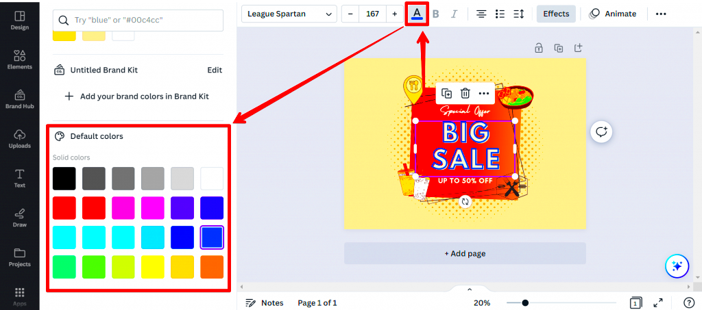
- Access the Color Tool: Once your element is selected, look for the color tool in the top menu. Click on it to open the color palette.
- Pick Your Color: You can choose from the preset colors or use the color picker to create a custom shade. This is where the fun begins! Play around with different hues until you find the one that speaks to you.
- Apply and Adjust: After selecting your color, apply it and see how it looks. You can always go back and adjust if needed.
As a color enthusiast I can assure you that its a process of testing things out. Feel free to mix and match shades and combinations. That’s where the real creativity comes to life!
Also Read This: A Comprehensive Guide to Creating a Yahoo Account with Dailymotion Videos
Using Canva’s Color Picker Tool Effectively
The color picker feature in Canva is a tool that helps you add a touch to your designs. I had a moment when I stumbled upon this functionality. I was creating a poster for a friends wedding and wanted to coordinate the colors with their stunning decorations. With the color picker I could choose an exact hue from an image making sure everything looked harmonious. Here are some tips to maximize the potential of this amazing tool:
- Accessing the Color Picker: After selecting your element, click on the color option in the toolbar. This will bring up the color palette.
- Using the Eyedropper Tool: The eyedropper tool is your best friend. It lets you hover over any color in your design or even in another image on your screen. This way, you can select the exact color that catches your eye.
- Adjusting Brightness and Saturation: Once you’ve picked a color, you can fine-tune it. Play with the brightness and saturation sliders to get that perfect shade.
One small piece of advice I’ve picked up along the way is to have a color scheme readily available. This allows you to revisit your favorite hues and effortlessly bring them back in upcoming projects. The color selection tool not only improves your creations but also infuses a distinct element that showcases your individuality.
Also Read This: A Comprehensive Guide to Uploading Your Photos to Adobe Stock
Exploring Color Combinations for Your Images
Discovering color combinations can be a challenge but the effort is definitely rewarding! Colors have the ability to narrate tales and evoke feelings. I vividly remember designing a brochure for my cousins travel agency. I opted for a shade of orange and a refreshing blue which brought the pictures to life. Here are some tips on how to experiment with color combinations.
| Combination Type | Description | Example Colors |
|---|---|---|
| Complementary | Colors opposite each other on the color wheel create a strong contrast. | Blue and Orange |
| Analogous | Colors next to each other create a harmonious look. | Red, Red-Orange, Orange |
| Triadic | Three colors that are evenly spaced on the color wheel provide balance. | Red, Yellow, Blue |
Trying out different combinations can yield stunning outcomes. Feel free to blend and switch things up until you discover what resonates with you. I usually kick off with a hue that captivates me and then expand my color scheme from there. This approach not only simplifies the design journey but also adds an element of fun to the process!
Also Read This: Is ACCNX Available on YouTube TV for Subscribers
Common Mistakes to Avoid When Adding Colors
While incorporating hues can elevate your creations its important to steer clear of certain traps. I have had my share of blunders during my initial encounters with Canva. Gaining insights from these situations can assist you in sidestepping similar errors. Here are a few typical missteps to be mindful of:
- Overusing Colors: While it’s tempting to use every color you love, too many can create chaos. Stick to a few main colors for a cleaner look.
- Ignoring Contrast: Ensure there’s enough contrast between text and background colors. Readability is key!
- Not Testing on Different Devices: Colors can appear differently on various screens. Always check how your designs look on a mobile and desktop device.
- Being Afraid to Experiment: Don’t shy away from trying new combinations. Some of the best designs come from taking risks!
Looking back to my days as a designer I recall a poster I made featuring a vibrant yellow backdrop and soft text. It appeared fantastic on my laptop screen but when it came to printing it was almost impossible to read! This experience taught me a valuable lesson about the significance of testing and making adjustments. Keep in mind that each blunder is a valuable opportunity to enhance your abilities.
Also Read This: DIY Elsa Dress Tutorial for Fashion Enthusiasts
Tips for Enhancing Images with Colors in Canva
While adding hues to your pictures is one thing elevating them brings it to a level. I recall creating a flyer for a family get together and my goal was to make it not colorful but genuinely attention grabbing. Here are a few suggestions that proved beneficial for me and can also assist you:
- Use Color Gradients: Instead of a solid color, try using gradients. They add depth and richness to your images. Canva allows you to create beautiful gradient effects easily. For instance, a blend of warm sunset colors can evoke a sense of calm.
- Incorporate Transparency: Adjusting the transparency of colors can create a layered effect. This technique can make your text pop against a busy background. I often set background colors to 80% opacity to let images shine through without overwhelming them.
- Focus on Color Psychology: Different colors evoke different feelings. Use this to your advantage! For example, green is calming and represents nature, making it perfect for environmental themes.
- Balance Warm and Cool Colors: Mixing warm and cool colors can create a dynamic look. I’ve found that a warm yellow with a cool blue can really grab attention, making designs vibrant yet balanced.
Lastly dont forget to step back and take a broader look at your design. What may appear visually appealing up close can come across as overwhelming when seen from a distance. By keeping these suggestions in mind you can craft breathtaking visuals that truly make an impression!
Also Read This: How to Do Football Tricks Step by Step on Dailymotion
Frequently Asked Questions about Canva Color Addition
Like any creative journey it’s natural to have questions along the way. Here are a few of the inquiries I frequently come across when it comes to adding colors in Canva along with my thoughts on them.
- Can I use my own colors in Canva? Absolutely! You can create custom colors by using the hex code or selecting from the color wheel. This feature has helped me maintain brand consistency in my designs.
- What if I can’t find the right shade? Don’t worry! Use the eyedropper tool to pick colors from images. This is particularly handy for matching shades in your project.
- How do I ensure my colors are print-ready? Always check the contrast and brightness of your colors. I recommend testing your design by printing it on paper to see how the colors translate.
- Can I save my favorite colors? Yes! Canva allows you to save your color palette for easy access in future projects. This feature has saved me countless hours.
These queries merely scratch the surface. The more you play around with hues in Canva, the more at ease you’ll feel resulting in a more fulfilling design journey!
Conclusion and Final Thoughts
As we conclude this vibrant exploration of Canva it becomes evident that perfecting the use of colors can elevate your designs from the mundane to the remarkable. Whether it's grasping the principles of color theory or playing around with different hues every stage presents a moment to showcase your individuality and artistic flair. For me every task I embark on feels like an opportunity to convey a narrative through shades.
Dont forget that making mistakes is perfectly fine as they often teach us the most important lessons. I urge you to tap into your creativity experiment with colors and allow your imagination to roam freely. Whether you’re creating something for yourself or for work every burst of color can stir up feelings and create a memorable impact.
Feel free to launch Canva and showcase your vibrant designs to the world. You have the freedom to make the canvas your own!