Colors have an impact on our feelings and the atmosphere they create in design. When I started exploring graphic design I was amazed at how a shift in color could completely alter an image. Canva simplifies this process for everyone, whether you're an experienced designer or just starting out. Whether you're enhancing a social media post or putting together a presentation adjusting colors can inject freshness into your creations. Let's delve into the realm of colors within Canva and discover how you can experiment with shades to make your designs stand out!
Understanding the Importance of Color in Design
Colors go beyond being mere visuals; they express emotions and convey messages. Consider the associations that arise with colors like vibrant yellow exuding happiness or rich blue evoking a sense of tranquility and reliability. Recognizing the significance of color in design is essential for these reasons.
- Emotional Impact: Colors influence how viewers feel. A warm color palette can evoke excitement, while cool colors can create a serene atmosphere.
- Brand Identity: Consistent use of colors helps establish a brand’s personality. Think of famous brands and their iconic colors!
- Visual Hierarchy: Colors can guide the viewer's attention to important elements in your design.
Back when I was starting out I realized how a little tweak in color could completely alter the vibe of a project. Playing around with hues taught me that a design could capture the energy of a Bollywood dance routine or evoke the tranquility of a serene evening at a neighborhood tea stall.
Also Read This: Working with Adobe Stock Vectors in Illustrator Tips and Tricks
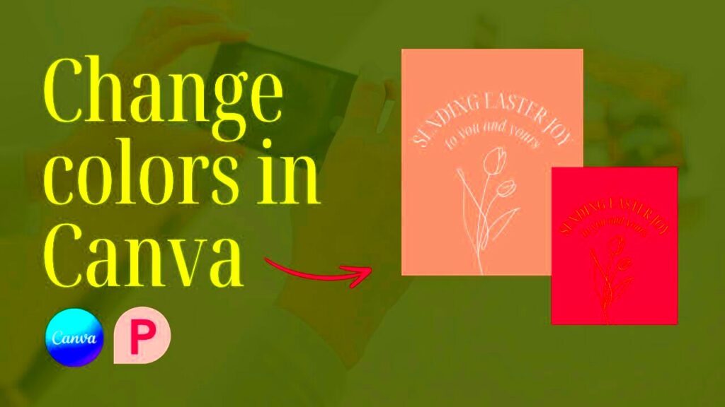
Step by Step Guide to Change Image Colors in Canva
Altering image hues in Canva is a breeze and an enjoyable task. Follow this easy step by step tutorial to navigate the procedure smoothly.
- Open Canva: Start by logging into your Canva account or creating one if you haven’t already.
- Select Your Design: Choose an existing design or create a new one from scratch.
- Upload Your Image: Click on the “Uploads” tab on the left sidebar and upload your desired image.
- Click on the Image: Once the image is on your canvas, click on it to reveal the editing options.
- Select ‘Edit Image’: From the toolbar above, choose the ‘Edit image’ option.
- Adjust Colors: Use the ‘Filter’ or ‘Adjust’ options to change the brightness, contrast, or apply a color filter. You can also explore the ‘Duotone’ feature for creative color combinations.
- Apply Color Palette: Utilize Canva's color palette to select specific colors or create your own.
- Save Your Work: Once satisfied, hit the ‘Download’ button at the top right to save your design.
Adjusting colors is similar to cooking you may need to tweak a few elements to achieve perfection. Feel free to try out different things! Based on my past observations the most surprising mixtures often yield delightful outcomes.
Also Read This: Downloading Images from 123RF for Free: Quick Guide
Using Canva's Color Palette Effectively
Canva's color selection is like a box of goodies brimming with potential. When I discovered it for the time I felt like a kid in a sweet shop, thrilled but also a bit dazed by the sheer variety! Choosing the palette can turn a dull design into a striking and lively one. Here's a guide on how to make the most of Canva's color palette.
- Explore the Default Palettes: Canva offers several pre-made color palettes. Take time to explore these and see what resonates with your design.
- Create Custom Palettes: Sometimes, you want something unique. Use Canva's color wheel to create a palette that speaks to you. Pick a dominant color and complement it with two or three accent colors.
- Use the Color Picker Tool: This nifty tool lets you select colors directly from your uploaded images. It's a great way to ensure your colors match perfectly!
- Test Color Combinations: Before finalizing, try out different combinations on your design. Sometimes, what looks great in theory might not feel right visually.
From what I ve seen the colors you choose can express feelings more effectively than language. For example a mix of oranges and reds can convey intensity and enthusiasm while softer blues and greens create a sense of peace and serenity. Experiment with combinations relish in the journey and allow your imagination to run wild!
Also Read This: Mastering Storytelling with 123RF Images
Tips for Choosing the Right Colors
Selecting hues goes beyond simply liking them; it involves grasping the sentiment you wish to express. Consider colors as the tone of your creation. Here are a few suggestions I’ve collected throughout the years:
- Know Your Audience: Different demographics respond to colors differently. For instance, vibrant colors may attract younger audiences, while muted tones might appeal to professionals.
- Consider Cultural Significance: Colors hold different meanings across cultures. For example, while white symbolizes purity in some cultures, it can signify mourning in others.
- Emotional Connection: Think about the emotions you want to evoke. Warm colors can create excitement, while cool colors might elicit calmness. I often recall how the colors of a sunset made me feel; they always seem to tell a story.
- Stick to a Color Scheme: Using a limited color palette helps maintain visual harmony. A common approach is the 60-30-10 rule, where 60% is the dominant color, 30% is a secondary color, and 10% is an accent.
Selecting hues might seem overwhelming at first, but keep in mind that it's an adventure. Rely on your gut feelings and allow your past encounters to steer you. Every endeavor presents a chance to showcase your individuality!
Also Read This: Earning Potential with Adobe Stock
Common Mistakes to Avoid When Changing Colors
Even experienced designers can make mistakes with color choices. From my own experiences I've picked up some traps to steer clear of when it comes to adjusting colors in Canva.
- Overcomplicating Color Choices: It’s tempting to use many colors, but too many can confuse your audience. Stick to a few key colors to ensure your message is clear.
- Ignoring Contrast: Ensure there's enough contrast between text and background colors. Poor contrast can make text hard to read. I once created a beautiful design that looked stunning on the screen but was almost illegible when printed!
- Forgetting Color Psychology: Always consider the emotional impact of colors. Using colors that contradict your message can lead to confusion.
- Not Testing Your Colors: Always view your design on different screens and in various lighting conditions. What looks great on your laptop may not look the same on a mobile device or in natural light.
Steering clear of these errors requires some effort, yet every design venture serves as a chance to grow. Embrace the journey and don't hesitate to stumble along the way as those missteps frequently yield the most invaluable insights!
Also Read This: Complete Viewing Guide to Watching Home and Away on Dailymotion
How to Use Color Combinations to Enhance Your Design
Utilizing color combinations in a way can elevate your designs from the mundane to the exceptional. It’s akin to preparing a meal; selecting the ingredients can result in a savory creation. Throughout the years I’ve played around with different color combinations and stumbled upon some that genuinely make an impact. Here’s how you can leverage color combinations to enrich your design:
- Complementary Colors: These are colors located opposite each other on the color wheel, like blue and orange. They create a vibrant contrast that grabs attention. I once designed a poster using complementary colors for a local event, and it was a hit!
- Analogous Colors: These colors are next to each other on the wheel, such as blue, blue-green, and green. They create a harmonious look. I often use analogous colors for backgrounds, as they provide a soothing effect.
- Triadic Colors: This scheme uses three colors evenly spaced on the wheel, like red, yellow, and blue. This approach is balanced yet dynamic, making it perfect for playful designs.
- Monochromatic Colors: Using variations in lightness and saturation of a single color can create a sophisticated look. I remember creating a calming infographic with different shades of green that felt cohesive and professional.
Finding the perfect mix is important, but keep in mind that trying things out is essential too. Don’t hesitate to venture beyond your usual preferences and explore various combinations. Your individuality will come through in a remarkable way!
Also Read This: How Long Does It Take Shutterstock to Approve Your ID and Start Selling
FAQs about Changing Image Colors in Canva
While exploring Canva I came across many inquiries regarding how to alter image hues. Here are a few commonly asked questions that might assist you in your journey,
- Can I change the color of any image in Canva?
Not all images are editable, but if it’s a PNG or vector graphic, you can typically change its colors using the editing options. - How do I match colors in Canva with my brand colors?
You can use the color picker tool to select your brand color from any uploaded image. This ensures consistency across your designs. - Can I save my custom color palette in Canva?
Yes! You can save your color palette for future use by creating a brand kit or saving it in your design. - What if the colors look different when printed?
Colors can vary between screens and print. Always check your design in different lighting and consider doing a test print before finalizing.
Feel free to contact Canva's support or community if you have any additional inquiries. They can be a valuable source of assistance!
Conclusion and Final Thoughts
In the realm of design the significance of color in conveying messages and stirring emotions cannot be overstated. During this exploration I've delved into the nuances of altering image hues in Canva harnessing color schemes strategically and steering clear of pitfalls. Each creation narrates a tale where color weaves into the fabric of that story. My journey has revealed that design goes beyond mere visuals; it revolves around establishing connections with individuals and leaving a lasting impression.
As you embark on your journey of exploration and creation dont forget to listen to your gut feelings and allow your imagination to run wild. The essence of design lies in trying out new ideas and each project presents a chance to gain knowledge and evolve. So grab your digital brush, jump into Canva and let your creativity burst forth. Enjoy the process of designing!