Let me share a moment with you. There was a time when I didn’t really pay much attention to the colors in my designs. I would just choose something random and move on. But one day while working on a birthday invitation for my nephew I noticed how off it looked because the background didn’t match the vibe I was going for. That’s when it hit me just how impactful background colors can be! They set the tone create the mood and can make or break your design. Whether you’re putting together a presentation or a fun social media post the right background color does a good portion of the work, for you. It’s like the unsung hero of your design.
Step-by-Step Guide to Changing Background Colors in Canva
Switching up background colors in Canva is a breeze, just like brewing a cup of chai. If you're a newbie, let me guide you through the process. No need to fret, it's really straightforward!
- Open your Canva design: Start by opening your design on Canva. You can either choose a template or create a custom design.
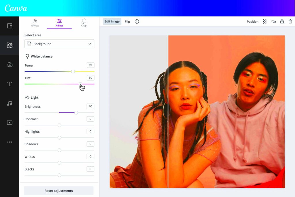
- Select the Background: Click on the background you want to change. If you don’t see any, just click on the blank area.
- Click on the Color Picker: On the top menu, you’ll find a small color box. That’s your color picker. Click on it to open the palette.
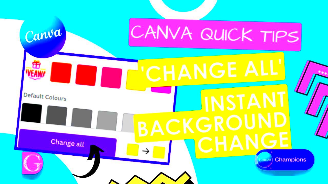
- Choose Your Color: You can select from the pre-set colors or, if you’re like me and love experimenting, use the color wheel to find a custom shade.
- Apply the Color: Once you’ve found the perfect shade, click on it, and your background will update instantly. If you change your mind, you can always click “Undo.”
And that's it! Pretty straightforward, huh? It's the small actions that turn the design process into a truly delightful journey.
Also Read This: Mastering the Behance Portfolio Angle Shot for Creative Work Presentation
Choosing the Right Color for Your Design
Now, this part gets a bit challenging but it’s really important. I’ve made mistakes here more times than I care to acknowledge. Selecting the background color is akin to choosing the outfit for an event. If it’s too vibrant it takes the spotlight if it’s too bland it falls flat. One piece of advice I’ve picked up is to always consider the intention behind your design. For a presentation neutral shades such as gray or beige do wonders. Conversely if you’re working on something playful like an Instagram post feel free to go all out with colors!
When I find myself feeling unsure I refer to a small chart.
| Purpose | Recommended Colors |
|---|---|
| Professional | Grey, Navy Blue, White |
| Creative | Pastels, Bright Hues |
| Casual | Earth Tones, Warm Colors |
By the way I like to experiment with Canva’s color schemes. They have pre set choices that really help me out. But ultimately it comes down to what resonates with you. Trust your gut feelings, they tend to be spot on!
Also Read This: Steps to Become a Contributor at Getty Images
Common Mistakes to Avoid When Changing Background Colors
Weve all had that moment, right? You get pumped up about crafting a design throw on a vibrant eye catching background and then you pause to think why does it all seem.. not quite right? Trust me when I say I’ve stumbled more times than I can remember, with background colors. And yes its all part of the journey. But hey you dont have to go through the same missteps I did. Let me point out a few blunders that Ive noticed so you can steer clear of them like a pro.
1. Using Clashing Colors: You know that feeling when your eyes hurt just looking at something? Yeah, that happens when colors don’t complement each other. If your background color is too bright and your text is also bright, they will clash. Always aim for contrast between your text and the background.
2. Ignoring the Mood: I once used a bright orange background for a yoga class poster. Needless to say, it didn’t work. Background colors set the tone. If you’re designing for a calm, peaceful theme, soft and neutral tones work better than loud, bright colors.
3. Overcomplicating It: Less is more, especially when it comes to backgrounds. You don’t need to add gradients, patterns, and bold colors all at once. Sometimes, a simple solid color does the trick.
4. Forgetting about the Audience: One of the biggest mistakes is designing for yourself rather than the audience. What might appeal to you could confuse or overwhelm your target audience. Think about their preferences when picking a background color.
Keep in mind that achieving harmony is key when it comes to design. Adding or subtracting elements can throw your whole design off course.
Also Read This: Save YouTube Videos on Your iPad Without an Internet Connection
How to Use Canva's Color Picker for Perfect Backgrounds
If there’s one feature in Canva that I absolutely love it’s the color picker. This small tool works wonders for enhancing your backgrounds. In the beginning, when I started using Canva I would randomly select a color. However, I soon discovered the impact that the color picker can have. It enables you to tailor colors precisely according to your preferences.
Here’s how you can make the most out of Canva’s color picker:
- Open the Color Picker: When you select the background in your design, you’ll notice a small color square on the top toolbar. Click on that to open the color picker.
- Use the Pre-Set Colors: Canva provides a range of pre-set colors for you to choose from. These are a good starting point if you’re not sure what to go for.
- Explore the Color Wheel: If you want something specific, use the color wheel. It allows you to pick any shade you can think of. This was a game-changer for me! I remember spending hours getting the perfect shade of teal for a project.
- Save Your Brand Colors: If you regularly use specific colors for your brand or blog, you can save them. This feature saves so much time when working on multiple designs.
Feel free to get creative and try out different colors until you discover the perfect one that suits your project.
Also Read This: Create Stylish Remittance Envelopes with Canva Templates
Tips to Make Your Background Stand Out
Backdrops often get overlooked but let me tell you they have the power to transform the mood of your design. There have been instances where my design felt lackluster until I switched up the background. It’s akin to sprinkling a dash of spice on a meal. Everything harmonizes beautifully. So here are some suggestions that I personally stick to in order to make backgrounds pop.
1. Keep It Simple: I know it’s tempting to add multiple elements to your background, but simplicity is key. A clean, solid color often works best because it lets the other elements of your design shine.
2. Use Gradients Sparingly: Gradients can be beautiful when used correctly, but too much can overwhelm your design. I usually stick to soft, subtle gradients for a smooth effect.
3. Match the Tone: The background should complement your design, not fight with it. If you’re working on a serious business presentation, a bright neon color probably isn’t the way to go.
4. Experiment with Transparency: Sometimes, I love playing with transparency settings in Canva. You can make your background semi-transparent so that it doesn’t overpower the foreground elements.
5. Create Contrast: If your design has a lot of light-colored elements, try using a darker background to make everything pop. It’s an easy trick, but it works wonders.
Believe me, a well crafted background can elevate the overall look of your design making it appear more refined and polished, even if the content is laid back.
Also Read This: Why 123RF Is a Leading Platform for Stock Photos
Canva Background Customization: Best Practices
When I began using Canva I assumed that customizing backgrounds meant choosing a color and being done with it. However as time went on I discovered the depth of thought and creativity that can be poured into this seemingly aspect of design. Whether you're crafting something for a business, a social media post or simply indulging in a project there are some best practices that can truly elevate your design. I learned these lessons through experience so let me pass them on to you.
1. Think About Your Audience: Always start with your audience in mind. What works for a corporate presentation won’t necessarily work for a playful Instagram post. Tailor your background to the message you’re trying to convey.
2. Keep Consistency Across Designs: I remember when I was working on a project, and I changed the background color in every slide. It looked chaotic. Consistency is key, especially when you’re working on multi-page designs like presentations or portfolios. Stick to a color palette that aligns with your theme.
3. Use Texture and Patterns Wisely: Canva allows you to add textures and patterns to backgrounds, but less is more. If you’re using a textured background, keep the foreground simple. It’s all about balance.
4. Don’t Overdo It with Effects: Canva gives you the option to add shadows, glows, and other effects. They’re great, but if you add too many, it can make your design look cluttered. I learned this the hard way when I was experimenting with every possible effect. Keep it subtle.
5. Take Advantage of Canva’s Templates: Sometimes, when I’m short on time or inspiration, I turn to Canva’s templates. They’re well-designed and can give you a good starting point for your customization journey.
Customizing your background is a process of discovering what suits your design the most. The more you play around with it, the more skilled you’ll become.
Also Read This: StockSnap.io Review: Insights from a Photographer
FAQ About Changing Background Colors in Canva
I frequently receive inquiries regarding alterations in background colors within Canva particularly from friends who are new to the world of design. Here are some commonly asked questions that could help address any uncertainties you may have.
1. Can I change the background color of any design in Canva?
Yes, you can change the background color of any design, whether you’re starting from scratch or using a template. Simply click on the background and choose a new color from the color picker.
2. Can I use a custom color for my background?
Absolutely! Canva has a color wheel that allows you to pick custom colors. You can also input a hex code if you have a specific color in mind.
3. Is it possible to change the background of just one section of my design?
Yes, you can use shapes, frames, or even text boxes to create individual sections with different background colors. This can help you add depth and layers to your design.
4. Can I undo a background color change?
Yes, Canva has an “Undo” option, or you can manually change the background back to the previous color.
5. Does Canva offer pre-designed backgrounds?
Yes, Canva provides various background patterns and textures that you can use if you’re looking for something more than a solid color.
Conclusion: Make Your Designs Pop with Canva's Background Options
Reflecting on my past designs I realize that the ones that truly made an impact were the ones where I paid careful attention to the background. Its akin to adding a touch of seasoning to a meal that brings all the elements together. With Canva creating a background is a breeze no matter if you prefer a look or something more intricate.
One of the things about Canvass background choices is that you dont need to be a pro to use them effectively. All it takes is a sprinkle of imagination, a readiness to try new things and perhaps a touch of perseverance. So, when youre diving into your next design project spare a moment to consider the backdrop. You might find that it adds a lot to your creation. Enjoy the design process!