Designing brochures can be challenging, but Canva makes it easy and fun! With its user-friendly interface, you don't need to be a graphic designer to create professional-looking brochures. Here are some key benefits of using Canva for your brochure design:
- Easy to Use: Canva’s drag-and-drop feature allows anyone to design without any hassle.
- Wide Range of Templates: Choose from thousands of pre-designed templates to kickstart your project.
- Access to Graphics: Use millions of images, icons, and illustrations to enhance your brochure.
- Collaboration: Share your design with team members for feedback in real time.
- Affordable Options: Canva offers a free version with plenty of features, plus premium options for advanced tools.
In short, Canva is a powerful tool that simplifies the brochure design process, making it accessible to everyone.
Explore the Variety of Canva Brochure Templates Available

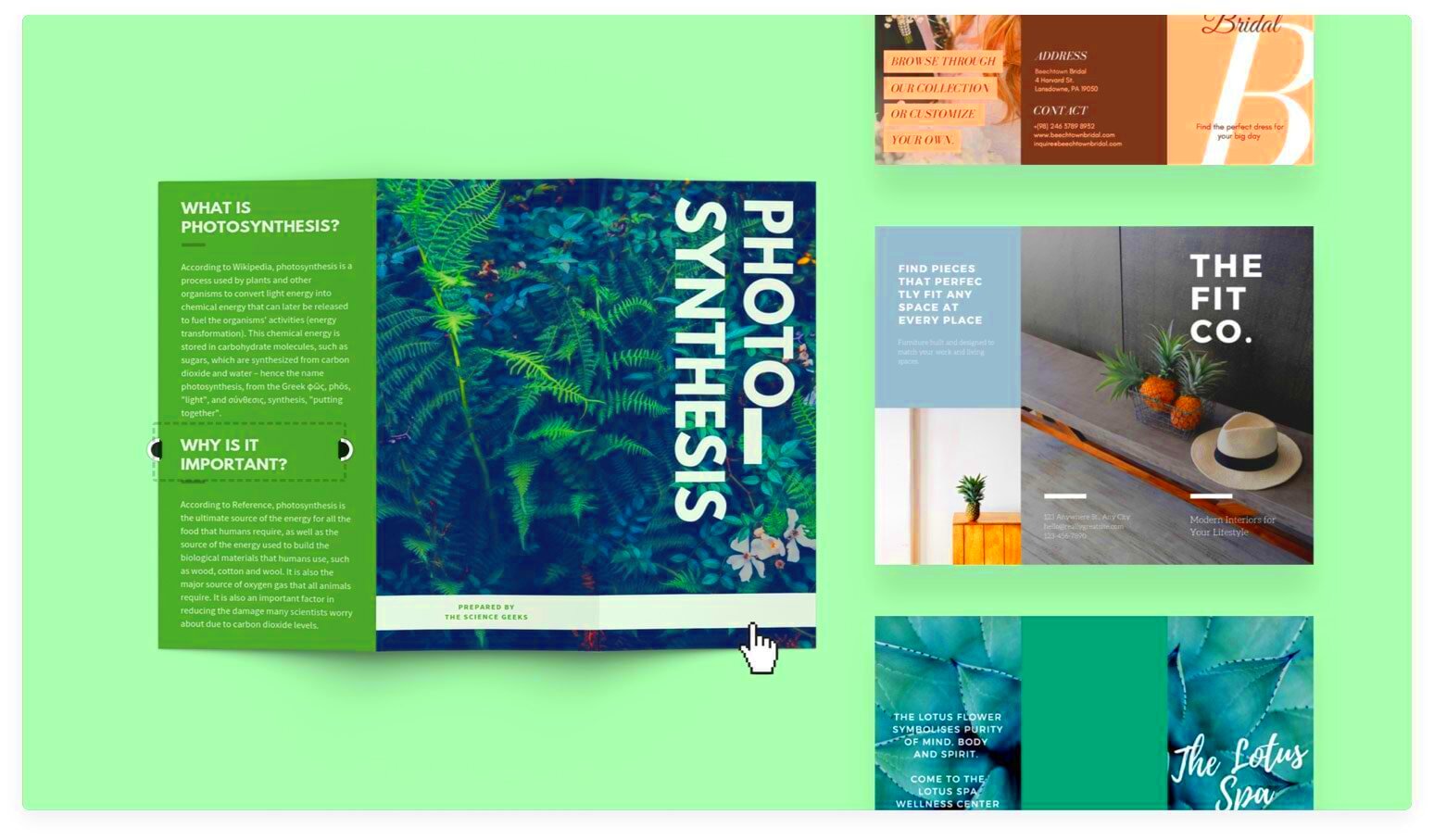
One of the best things about Canva is the variety of brochure templates it offers. Whether you're designing a corporate brochure or a fun event flyer, there's something for everyone. Here’s what you can find:
- Bi-Fold Brochures: These are classic designs that open like a book. Great for detailed information.
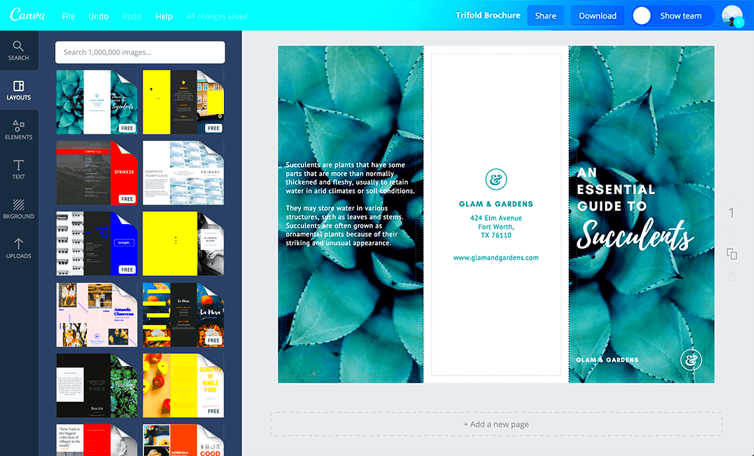
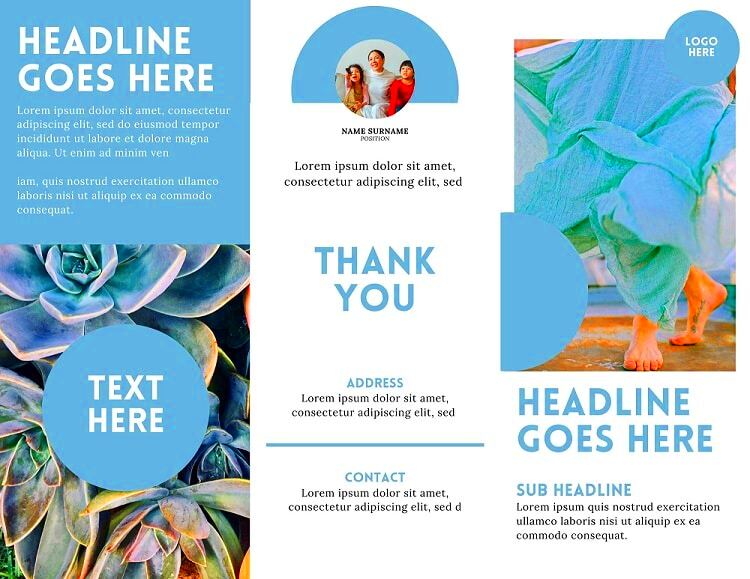
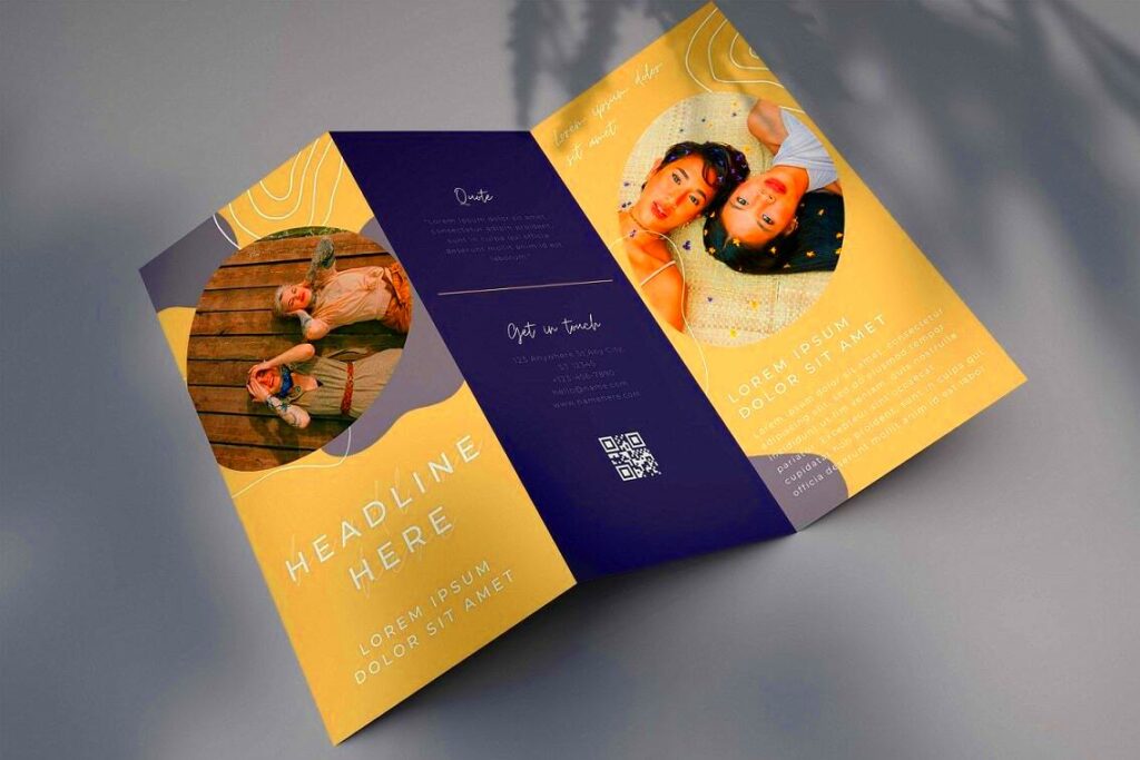
- Tri-Fold Brochures: Perfect for a compact format, allowing you to organize content neatly.
- Booklet Brochures: Ideal for presentations or product catalogs that require more pages.
- Digital Brochures: These templates are designed for online use, making them perfect for email campaigns.
With so many options, you can easily find a template that suits your style and needs.
Also Read This: Understanding Adobe Stock Pricing for Students and Access Options
Learn How to Customize Canva Brochure Templates

Customizing Canva brochure templates is a breeze. Here’s how you can make your brochure stand out:
- Choose a Template: Start by selecting a template that resonates with your vision.
- Edit Text: Click on the text boxes to input your content. Don’t forget to adjust the font style and size!
- Add Images: Use the 'Uploads' tab to add your images or choose from Canva’s library.
- Change Colors: Modify colors to match your brand identity or personal taste.
- Include Graphics: Use shapes, lines, or icons to enhance visual appeal.
- Review and Finalize: Always double-check for any spelling mistakes or design inconsistencies.
Once you’re happy with your design, simply download it in your preferred format. Customizing your brochure in Canva allows you to express your creativity and create a professional piece that truly represents you or your brand.
Also Read This: Design Professional Reports with Canva Report Templates
Use Images and Graphics Effectively in Your Brochure

Images and graphics play a vital role in brochure design. They grab attention, convey messages quickly, and enhance the overall look of your brochure. Here are some tips on how to use them effectively:
- Choose High-Quality Images: Use clear, high-resolution images to maintain professionalism. Blurry or pixelated images can harm your credibility.
- Align with Your Message: Select images that complement the content. For instance, if you’re promoting a spa, use calming images of nature or relaxation.
- Use Graphics to Break Up Text: Incorporating icons or illustrations can make your brochure more visually appealing and easier to read.
- Balance is Key: Don’t overcrowd your brochure with images. A good balance between text and visuals keeps it clean and engaging.
- Consider Color Harmony: Choose images and graphics that match your color scheme to create a cohesive look.
By using images and graphics thoughtfully, you can elevate your brochure’s appeal and communicate your message more effectively.
Also Read This: Canva Image Insertion into Shape
Incorporate Text and Fonts for a Professional Look

The right text and fonts can make a big difference in your brochure's design. They not only provide information but also set the tone. Here’s how to get it right:
- Choose Readable Fonts: Select fonts that are easy to read, even from a distance. Avoid overly decorative fonts for body text.
- Use Font Pairing: Combine a bold font for headings with a simple font for body text. This creates a visual hierarchy and enhances readability.
- Be Mindful of Size: Ensure that your text is large enough to be legible. Headings should be larger than body text.
- Keep It Concise: Use bullet points or short paragraphs to present information clearly and succinctly.
- Highlight Important Information: Use bold or italics to emphasize key points. This helps guide the reader’s attention.
By carefully incorporating text and fonts, you can achieve a polished and professional look for your brochure.
Also Read This: Can I Play YouTube Music on Alexa? A Simple Guide to Stream Music
Download and Print Your Brochure with Ease
Once you’ve designed your brochure, downloading and printing it should be straightforward. Here’s how to ensure a smooth process:
- Choose the Right Format: Canva allows you to download your brochure in various formats, such as PDF for printing or PNG for digital use.
- Check Dimensions: Make sure your brochure’s dimensions match your printing needs. Most brochures are standard sizes like A4 or letter size.
- Review Before Downloading: Take a final look at your design for any mistakes. Zoom in to check for details you might have missed.
- Select Print Quality: Choose a high-quality print option for best results. This ensures colors are vibrant and text is sharp.
- Find a Reliable Printer: Use a professional printing service if possible. They can offer better quality and paper options than home printers.
With these steps, downloading and printing your brochure will be easy, allowing you to share your professional design with the world.
Also Read This: Grow Your Network on LinkedIn and Build Meaningful Connections
Get Tips for Marketing Your Brochure Effectively
Creating a stunning brochure is just the first step; marketing it effectively is what will get your message out there. Here are some tips to help you promote your brochure and maximize its impact:
- Identify Your Target Audience: Know who you want to reach. Tailor your brochure's design and content to appeal to that specific group.
- Distribute Strategically: Place your brochures in locations where your target audience is likely to see them, such as local businesses, events, or trade shows.
- Use Social Media: Share images or digital versions of your brochure on social platforms. Consider running targeted ads to boost visibility.
- Follow Up: If you distribute your brochure at an event, follow up with interested individuals via email or phone to keep the conversation going.
- Leverage Email Marketing: Send a digital version of your brochure to your email list, ensuring that it's easy to download or print.
By implementing these marketing strategies, you can effectively promote your brochure and drive engagement with your audience.
Also Read This: How to Permanently Delete Your VectorStock Account
Frequently Asked Questions About Canva Brochure Templates
As you dive into creating your brochure with Canva, you might have some questions. Here are some frequently asked questions to help you out:
- Can I use Canva for free? Yes, Canva offers a free version that includes many templates and features, but premium options are available for more advanced tools.
- Can I collaborate with others on my design? Absolutely! Canva allows you to share your design with others for feedback and collaboration.
- What file formats can I download my brochure in? You can download your brochure in formats like PDF, PNG, or JPEG, depending on your needs.
- Are the templates customizable? Yes, all Canva templates are fully customizable. You can change colors, fonts, images, and more!
- Can I print my brochure directly from Canva? While Canva doesn’t offer direct printing, you can download your design and take it to any printing service.
These answers should clarify some of your concerns and help you feel more confident in using Canva for your brochure design.
Wrap Up Your Brochure Design Journey
Congratulations on making it through your brochure design process! By using Canva's tools and features, you've created something that can effectively communicate your message. As you wrap up, here are a few final thoughts to keep in mind:
- Stay Open to Feedback: Don’t hesitate to ask others for their opinions on your brochure. Constructive criticism can help you improve.
- Keep Your Branding Consistent: Make sure your brochure aligns with your overall brand identity in terms of colors, fonts, and messaging.
- Monitor Results: If you distribute your brochure, track its effectiveness. See what works and what doesn’t to refine your future efforts.
- Don’t Stop Here: Use what you've learned to create other marketing materials, like flyers or social media graphics.
Your brochure is more than just a design; it's a tool for connecting with your audience. Embrace the journey ahead and continue creating!
