When I embarked on my path as a designer I soon realized that color goes beyond being a mere visual aspect; it encompasses an emotion, a narrative and occasionally even a recollection. Consider how the hue of a sun makes you feel in contrast to the deep blue of an ocean? Each shade holds its own meaning and can stir up a range of emotions. In the realm of design selecting colors can grab attention and communicate messages without uttering a single word. Picture the coziness of a gathering depicted through gentle pastels or the thrill of a festival mirrored in lively reds and greens. Color is undoubtedly, a tool!
How to Change Colors in Canva
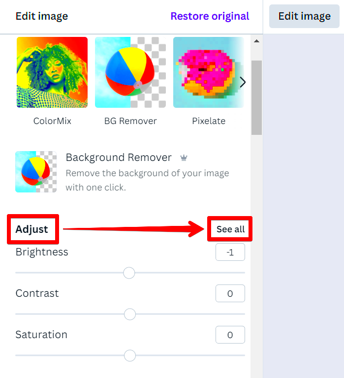
Canva is similar to a canvas where you can easily experiment with different colors. If you’re new to the platform you might be curious about how to switch colors in Canva. No need to fret; it’s really easy. Here’s a tip, once you familiarize yourself with it adjusting colors could turn into one of your go to design techniques.
- Open your design in Canva.
- Select the element you want to change.
- Click on the color tile on the toolbar.
- Choose a new color from the palette or enter a hex code.
It’s really simple! I recall how I changed the hue of an image for a friends birthday invitation. The transformation was remarkable; the invitation went from dull to stunning with just a few adjustments!
Also Read This: Showcase Your Work with Canva Portfolio Templates
Step-by-Step Guide to Adjusting Colors
Changing colors in Canva can really enhance your designs making them more eye catching and impactful. Follow these easy steps to smoothly navigate through the process.
- Select Your Design: Open the project you wish to edit. Make sure you have the right image or graphic in front of you.
- Choose the Element: Click on the specific element whose color you want to change—this could be text, a shape, or a background.
- Access the Color Menu: Look for the color tile on the toolbar above your design. Click on it to open the color options.
- Select Your New Color: You can choose from the available palette or enter a specific hex code if you have something particular in mind.
- Apply and Save: Once you’re satisfied with the color change, make sure to save your work. You wouldn’t want to lose that beautiful transformation!
It’s fascinating how changing colors can really make a design pop. I tend to get absorbed in this process trying out various hues until I find the perfect fit. Every design serves as a unique expression of my feelings and I think yours can do the same!
Also Read This: How to Curl Your Hair with a Flat Iron for Perfect Waves
Using Color Palettes for Better Design
Discovering the idea of color palettes was akin to unearthing the blend of seasonings for a meal. Similar to how a sprinkle of turmeric can enhance a curry the suitable color palette can take your design to the next level. Color palettes consist of colors that complement each other creating an attractive and unified appearance. Whether you're crafting a flyer for a community gathering or a post selecting the palette can significantly impact the outcome.
Reflect on the shades that bring back your cherished moments—perhaps the rich greens of a park from your youth or the lively tones of a festive gathering. These colors can serve as a wellspring for your creative projects! Here are some tips on how to make the most of color schemes in your designs.
- Research and Inspiration: Explore platforms like Pinterest or Canva’s color palette generator to find inspiring combinations.
- Consider Your Audience: Different colors evoke different emotions. For instance, warm colors like red and orange can convey excitement, while cool colors like blue and green offer calmness.
- Create Contrast: Ensure there’s enough contrast between your text and background colors for readability.
- Limit Your Palette: Stick to a few primary colors and a couple of accent colors to maintain a clean look.
When I used this method on a poster for a community event the reaction was incredible. The colors resonated with people capturing the essence of our lively neighborhood. It’s worth noting that a carefully chosen color scheme can elevate a design from being average to truly exceptional!
Also Read This: How to Make Thread Bracelets with This Easy DIY Guide
Common Mistakes to Avoid When Changing Colors
Like any skill changing colors comes with its challenges. I recall my initial journey in design when my enthusiasm sometimes resulted in errors. One memorable moment was when I chose a color for text against a background—let's just say it didn't turn out well! To assist you in avoiding mishaps here are some frequent mistakes to watch out for:
- Ignoring Contrast: Always ensure there’s enough contrast between text and background colors. A lack of contrast can make your content unreadable.
- Overusing Bright Colors: While vibrant colors can grab attention, using too many can be overwhelming. Aim for balance.
- Neglecting Color Meaning: Different cultures associate various meanings with colors. For example, while white symbolizes purity in some cultures, it can signify mourning in others. Be mindful!
- Forgetting About Accessibility: Consider color blindness and ensure your design is accessible to everyone.
With a bit of mindfulness these blunders can be sidestepped effortlessly. Having made my share of missteps I discovered the importance of pausing and reassessing my design with an eye. Every error turned into a valuable lesson steering me towards designs that are not only more efficient but also visually appealing!
Also Read This: A Comprehensive Guide to Downloading Photos from Adobe Stock
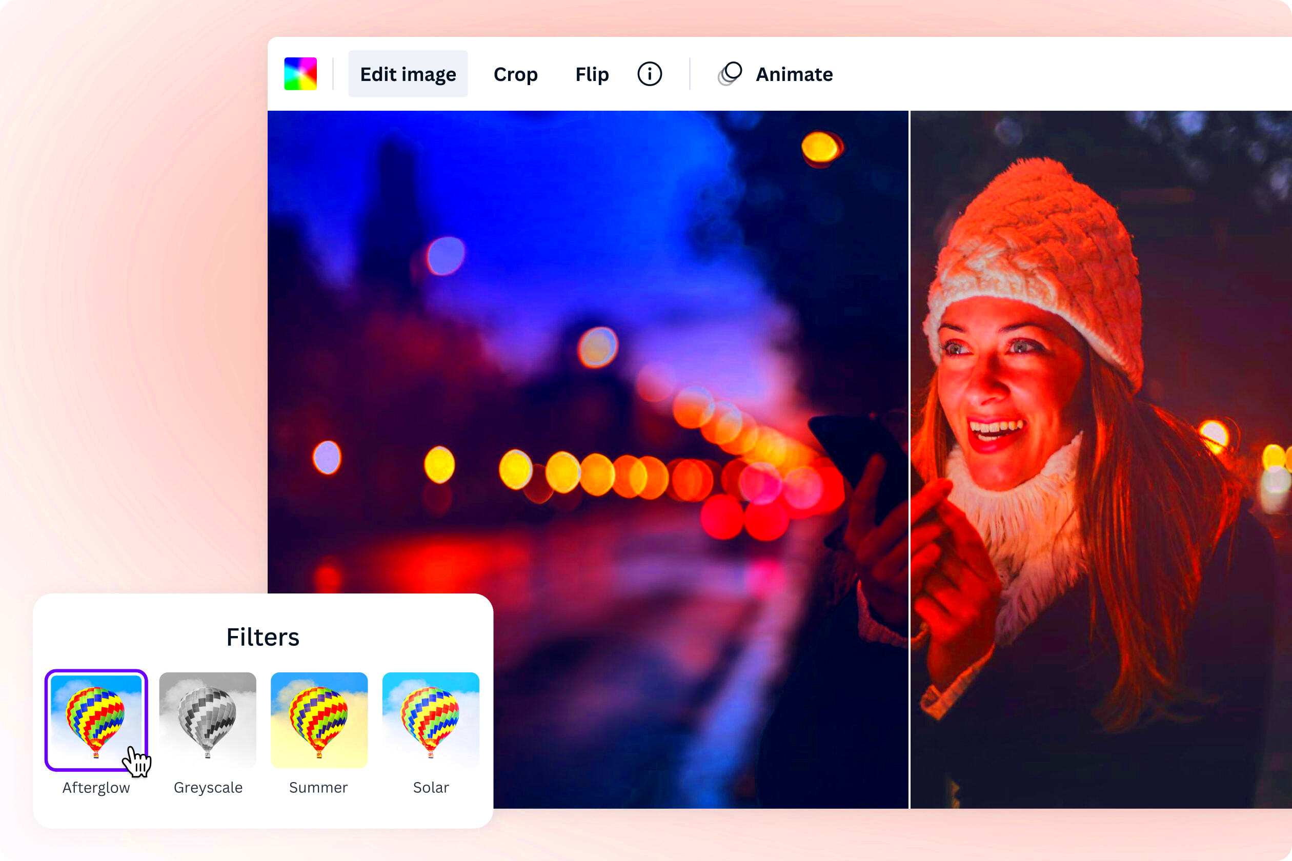
Enhancing Images with Color Filters
Color filters can work wonders in elevating an image from good to exceptional. They infuse your visuals with richness atmosphere and occasionally evoke a feeling of nostalgia. Imagine a sepia filter transporting you to the past or a vivid filter breathing life into your photos. I frequently experiment with color filters during photo editing and it has become one of my go to methods.
Here are some ways to improve your photos with the help of filters.
- Choose the Right Filter: Different filters evoke different feelings. Warm filters can create a cozy vibe, while cooler ones can feel more modern.
- Adjust the Intensity: Don’t be afraid to tweak the strength of the filter. Sometimes a subtle touch can make a significant difference.
- Combine Filters: Layering filters can add complexity and richness to your image. Just ensure they complement each other.
- Consider Your Design Theme: Make sure the filter aligns with the overall theme of your design, whether it's playful, serious, or professional.
During my travels I was editing a picture for my blog when I decided to use a bright filter to enhance the colors. The outcome was stunning! Many people appreciated how it beautifully portrayed the spirit of the location. So feel free to play around with color filters; they can truly transform your creative projects.
Also Read This: Getting Started with ShootProof: A Comprehensive Setup Guide
Tips for Choosing the Right Colors
Selecting the hues for your creations can be a bit like picking out the outfit for a special event. You aim for something that stands out feels good and above all represents your individuality or brand. I vividly recall the moment when I had to decide on a palette for my pals wedding invites. It was both a joyous and challenging endeavor! Colors have the power to stir emotions convey narratives and leave lasting impressions. So here are a few suggestions to help you navigate this process.
- Understand Color Psychology: Different colors convey different feelings. For example, blue often represents calmness, while red can signify passion or urgency. Consider the message you want to communicate.
- Stay True to Your Brand: If you’re designing for a brand, ensure the colors align with its identity. Consistency builds recognition. When I revamped my blog’s design, I made sure the colors echoed the vibe I wanted to portray.
- Test in Different Lighting: Colors can look different depending on the light. Make sure to view your choices in various settings to see how they resonate.
- Use Online Tools: Platforms like Canva offer color wheels and palette generators. These tools can be incredibly helpful when you’re feeling stuck.
- Trust Your Instincts: Sometimes, it’s all about what feels right. If a particular shade speaks to you, don’t hesitate to use it. Your intuition is often a great guide!
In the end, keep in mind that choosing colors is an individual experience. Just like every meal comes with its mix of seasonings each creative work has its distinct color scheme ready to be explored!
Also Read This: How to Cancel Recordings on YouTube TV
FAQs about Canva Color Change
While I was exploring Canva I noticed that a lot of designers had similar queries. Ifyou're new to the platform you might be wondering how to change colors in Canva as well. Here are some commonly asked questions that could assist you:
- Can I change the color of an image in Canva? Yes, you can adjust the colors of elements and graphics, but for photographs, you may need to use filters or overlays to achieve the desired effect.
- How do I save my custom color palette? After choosing your colors, simply click on the "+" sign in the color panel to save them for future use.
- Are there shortcuts for color adjustments? Yes! You can use keyboard shortcuts like “C” to open the color menu quickly, which can save time during your design process.
- What is the hex code, and why should I use it? A hex code is a six-digit code that represents colors. It ensures precision in your color choices, especially when you want an exact shade.
- Can I change colors in a group of elements simultaneously? Absolutely! Just select the group, and you’ll be able to change the colors for all elements at once.
Having these responses can really streamline your design process. I recall the moments when I used to get annoyed about the details now after some practice and experimentation I feel way more self assured!
Conclusion and Final Thoughts
As we conclude this vibrant exploration of design, I trust you’ve gleaned valuable takeaways that encourage you to embrace creativity. Color goes beyond being an element; it serves as a form of communication conveying our feelings and establishing the mood for our messages. Whether you’re adjusting shades in Canva or crafting stunning color schemes keep in mind that it’s a way to showcase your individuality.
Looking back on my experiences I see that the process of design is an adventure rich in lessons and development. Every project I’ve worked on has brought me valuable insights ranging from the significance of color psychology to the satisfaction of crafting visually pleasing arrangements. Embrace the idea of making missteps during this journey as they often prove to be the most effective educators!
So, pick up your brush jump into Canva and get ready to experiment with hues! Allow your imagination to run wild and above all enjoy the process. Your creations can serve as a mirror of your ideas and a platform for expressing your feelings. Wishing you a delightful design experience!