The grid plays a role in harmonizing the visual components. Be it presenting artwork, photos or drawings the arrangement of these elements in relation to each other can either elevate or divert attention from your creation. However the magic lies in knowing how to manipulate the grid to truly personalize it.
Why Editing the Grid is Important for Your Portfolio
Picture this scenario: you're going for a project that you've always wanted. The person in charge of hiring checks out your Behance profile and is met with a messy and haphazardly arranged collection of work. Not exactly the impression you want to make, is it? Now contrast that with a thoughtfully curated and visually appealing layout. It's akin to flipping through a magazine where each piece seamlessly transitions leading the viewers gaze smoothly from one project to another. This illustrates the impact of carefully selecting and arranging your portfolio grid.
When I began showcasing my creations I didn't give much thought to how they were presented. I simply uploaded my work and moved on. It was only when a friend mentioned the untidy appearance of my portfolio that I understood the significance of organizing it. Rearranging the projects spacing them out and being mindful of visual balance truly had an impact.
When it comes to tweaking the grid, it’s not about getting everything spot on. It’s all about making sure your work gets the recognition it deserves. The grid transforms into a blank slate and the way you organize it showcases your mindset, meticulousness and design instincts.
Also Read This: How Shutterstock Makes Money
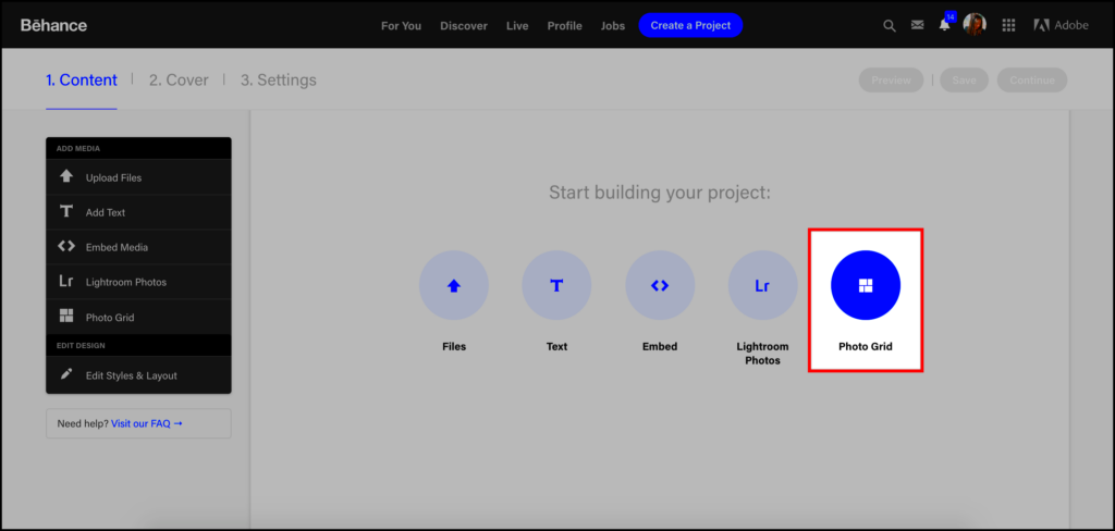
Steps to Customize the Grid Layout in Behance
Adjusting the grid arrangement on Behance may appear challenging at first, but with a little perseverance it becomes manageable. Here’s a step by step guide to help you begin.
- Log in to Your Behance Account: Of course, first things first, make sure you're logged into your account. Without logging in, there's no editing possible!
- Go to the Portfolio Section: Once logged in, navigate to your portfolio. Here, you'll see all your uploaded projects displayed in the default grid format.
- Rearrange Projects: Click on the "Edit" button, and you’ll get the option to rearrange your projects. Drag and drop them to experiment with the layout. This is where you can get creative. Try grouping similar types of work together for consistency.
- Adjust the Visual Balance: Pay attention to the size and orientation of your images. If you’ve uploaded a mix of portrait and landscape images, see how they look next to each other. A good balance keeps the viewer engaged.
- Add Text or Captions Thoughtfully: While the grid focuses on visuals, well-placed captions or titles can add context. However, avoid overcrowding the space with too much text.
- Preview Your Changes: Always preview your changes before publishing them. I can’t count the number of times I skipped this step and later found small mistakes.
So there you go! Take a moment to reflect on your progress and consider whether it truly showcases your finest efforts.
Also Read This: Understanding InMail Credits with LinkedIn Premium
Tools and Features Available for Grid Editing
Editing your Behance grid for the time can be a bit daunting but once you get the hang of it you'll discover a wealth of handy tools at your fingertips. Behance offers an array of features that let you customize and refine the presentation of your portfolio. When I began setting up my own profile I had no idea about many of the available options. However after some exploration I uncovered ways to enhance the overall appearance of my portfolio.
Check out these tools and features that are worth looking into
- Drag-and-Drop Layout: One of the simplest, yet most effective, tools is the ability to drag and drop your projects. You don’t have to stick to the order in which you uploaded your work. Rearranging them helps you tell a story, guiding viewers through your creative journey.
- Project Thumbnails: Did you know you can choose custom thumbnails for your projects? Sometimes, the default image Behance picks doesn’t do justice to your work. By selecting a custom thumbnail, you can ensure your project stands out in the grid.
- Section Dividers: If you have a variety of different types of projects, using section dividers can help categorize them. For example, I like to group my illustrations separate from my branding projects. This creates a cleaner, more organized presentation.
- Text and Captions: While Behance is primarily visual, don’t underestimate the power of a well-written caption. It gives context and background to your projects. Keep it concise, though—nobody likes to read a wall of text.
- Alignment and Spacing: Make sure the elements in your grid are evenly spaced. It might seem like a small thing, but uneven spacing can make your portfolio feel off-balance. I learned this the hard way after publishing a grid where everything seemed too crammed together!
Also Read This: How to Lower Volume on YouTube Shorts for Better Sound Control
Common Mistakes to Avoid While Editing the Grid
Oh, those blunders we all encounter them! When I began tweaking my grid I believed I was nailing it only to discover later on that I had committed a few beginner mistakes. If you’re anything like me you probably wish for your portfolio to exude a touch of professionalism and finesse. However there are pitfalls that many of us tend to stumble upon. Allow me to assist you in steering clear, of those.
Here are some mistakes to keep an eye on:
- Overcrowding the Grid: One of the biggest mistakes is trying to showcase too much in too little space. I know the temptation to upload all your best work, but a cluttered grid overwhelms viewers. Instead, focus on quality over quantity. Highlight your strongest pieces and give them room to breathe.
- Inconsistent Image Sizes: Mixing image sizes can disrupt the flow of your grid. If one image is significantly larger than the others, it draws too much attention. Stick to a uniform size or at least maintain a sense of balance with the varying dimensions.
- Ignoring Visual Hierarchy: Just like in design, your portfolio needs a clear visual hierarchy. If everything in your grid screams for attention, nothing truly stands out. I once made the mistake of having all my projects bold and big, and it ended up being overwhelming. Use contrast sparingly to draw attention to key projects.
- Overuse of Text: As much as I love explaining my work, too much text can turn people away. I’ve learned to keep my descriptions short and sweet. Let the visuals do the talking and keep written content as a subtle addition.
- Not Testing on Different Devices: Your Behance grid might look great on a desktop, but what about mobile? Make sure to test how your portfolio looks on different devices to ensure it's responsive and still visually appealing.
Also Read This: Create App Designs with Canva App Design Template
Best Practices for Creating a Cohesive Portfolio Layout
Designing a portfolio layout is a blend of creativity and strategy. Throughout my journey I’ve discovered that it’s not solely about the specific projects you present but also about how they interweave to convey a cohesive narrative. Whether you’re at the beginning of your path or giving your portfolio a fresh look there are essential principles to consider.
Here are a few tips and tricks that I’ve learned throughout my journey.
- Consistency is Key: Keep a consistent style throughout your portfolio. This doesn’t mean all your work needs to look the same, but there should be a thread that ties everything together—whether it's color schemes, fonts, or layout choices. I find that using similar borders or spacing gives my portfolio a sense of unity.
- Tell a Story: Arrange your projects in a way that tells a story. Start with an introduction, show the process, and end with the result. This approach helps viewers understand your thinking and gives context to your work. When I started doing this, I noticed that people stayed longer on my profile.
- Balance Visual Weight: Make sure that no one section of your grid is too heavy. Spread out projects evenly across the grid so the viewer’s eye moves naturally from one project to another. Sometimes, I step back and look at my grid as a whole to check if anything feels off-balance.
- Group Similar Work Together: If you’ve got several types of work, try grouping them. For instance, all my branding projects are placed together, and my digital art is in another section. This helps the viewer navigate your portfolio more easily.
- Use White Space Wisely: Don’t be afraid of white space. It gives your portfolio breathing room and highlights your work. I’ve often found that leaving some blank areas makes my projects pop more.
By adopting these strategies you can build a collection that not only highlights your abilities but also makes a memorable impact on anyone who comes across your profile.
Also Read This: Ultimate Guide to Downloading Videos from Dailymotion Online
How to Use Image Panda’s Behance Image Downloader
Have you ever come across a stunning image on Behance and wished you could download it instantly without jumping through hoops? That’s where Image Panda’s Behance Image Downloader comes in handy. Trust me, I’ve been there—seeing a visual masterpiece that I wanted to keep for inspiration or even to learn from—but Behance doesn't provide a straightforward download option. That’s why this tool is a game-changer.
Here’s a simple way to grab images with Image Panda.
- Visit Image Panda’s Behance Downloader Page: Start by heading over to the Image Panda Behance Image Downloader page. The interface is super simple, and you won’t get lost.
- Copy the URL of the Behance Project: Go to the Behance project you wish to download from and copy the URL. I remember feeling relieved that I didn’t need to navigate through a maze of menus to find the download link!
- Paste the URL: Paste the copied link into the downloader’s input box. Just click on the "Download" button, and you're done.
- Select the Desired Images: Once processed, the images will appear for you to choose from. You can download one or several—whatever you need.
- Save the Images to Your Device: Click “Download” and voila! The images are saved directly to your device, without any fuss. I’ve used this tool to build my personal reference library, and it has been a lifesaver for projects and inspiration.
I really like how easy Image Panda is to use. It cuts out all the hassle with no extra steps or bothersome ads. You can get the images you want exactly when you need them.
Also Read This: How to Download Dailymotion Videos on Jio Phones Without Additional Apps
FAQs About Editing the Behance Grid
Whenever I chat with other designers I notice they tend to ask similar questions about editing Behance grids. When I first started out I had quite a few of these inquiries too. So lets tackle some of the questions that often come up.
| Question | Answer |
|---|---|
| Can I edit my grid after publishing a project? | Yes, you can edit your grid anytime. Just click on the "Edit" button, and you can rearrange or modify the layout as needed. I do this often to keep my portfolio fresh. |
| Is there a limit to how many projects I can feature? | No, Behance doesn’t limit the number of projects, but remember to prioritize quality over quantity. A well-curated portfolio always makes a better impression. |
| Does grid layout affect how my projects are seen? | Absolutely! A well-organized grid helps viewers navigate through your work smoothly. An erratic layout can confuse and overwhelm potential clients or employers. |
| Will my projects look different on mobile? | Yes, Behance automatically adjusts the grid for mobile, but it’s a good idea to check how it looks on both desktop and mobile to ensure consistency. |
| Can I hide specific projects from the grid? | You can mark projects as private, which keeps them off your public grid, but still allows you to showcase them selectively. |
Conclusion: Mastering the Art of Grid Customization
Adjusting the grid layout on Behance might appear trivial but it plays a crucial role in shaping the perception of your portfolio. I’ve come to realize that it’s not merely about showcasing projects; it’s about presenting them in a manner that weaves together a cohesive narrative, enabling viewers to grasp your evolution as an artist or designer.
By carefully curating your grid steering clear of pitfalls and utilizing tools such as Image Panda for sourcing inspiration you not only exhibit your creations but also highlight your meticulousness, inventiveness and professionalism. While editing your grid may require an investment of time the rewards are significant. When I dedicated moments to thoughtfully arrange my portfolio I noticed a shift in how people reacted to it. Increased interaction and more opportunities all stemmed from a straightforward reorganization.
Feel free to seize the reins of your own narrative and showcase your efforts in the most favorable way. Consider your collection of work as a platform—ensure its a memorable one for the audience.