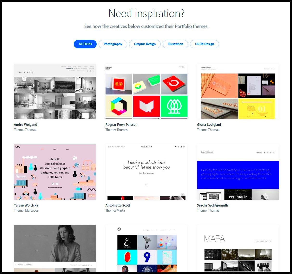
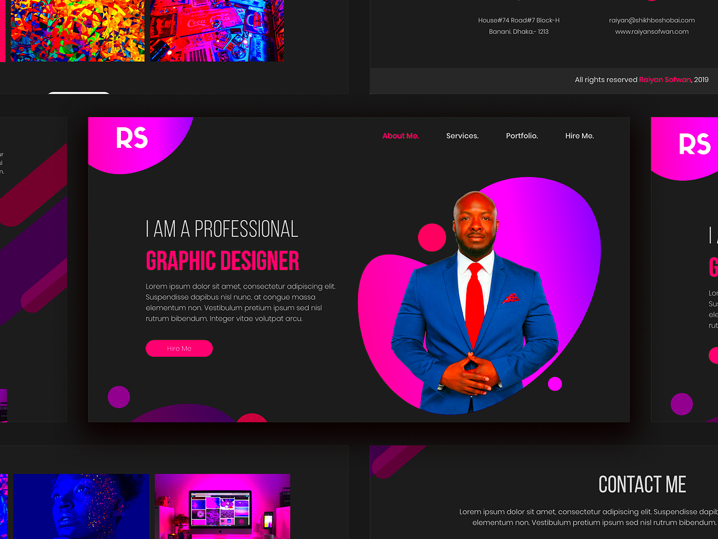
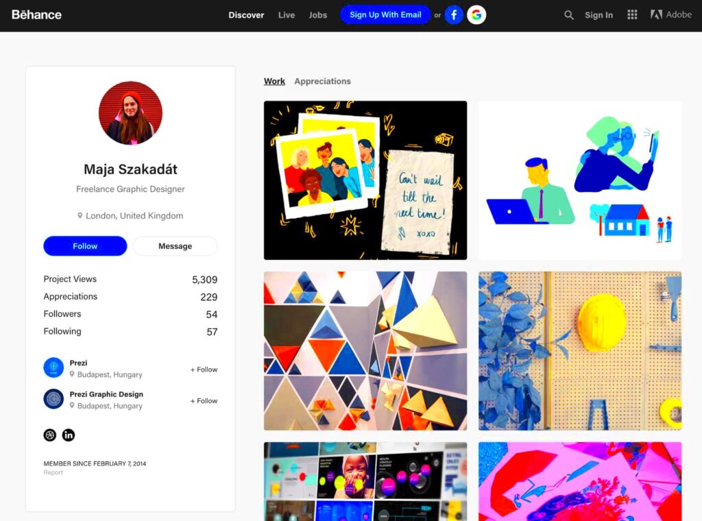
In this era, an online portfolio for your designs goes beyond being a mere showcase of your creations; it serves as a pathway to new possibilities. At the beginning of my design journey I didn’t fully grasp the importance of presenting my projects in a compelling way. I recall feeling a sense of pride in my work yet being reluctant to share it. As time passed I came to understand that a well crafted portfolio has the potential to lead to freelance opportunities, permanent job offers and collaborations with fellow creatives.
A portfolio for website design serves as a representation of your work. It highlights your abilities, inventiveness and distinct flair to attract potential clients or job opportunities. Heres why its important.
- First Impressions Count: Your portfolio is often the first thing people see. Make it count!
- Demonstrates Your Skills: It’s a tangible way to show what you can do.
- Reflects Your Style: Each project tells a story, showcasing your personality and approach to design.
- Builds Credibility: A well-curated portfolio builds trust with your audience.
At the end of the day a portfolio is all about building connections. Its a tool that allows potential clients and employers to get a glimpse of your true self beyond just your resume. By showcasing your work and experiences you forge relationships that can open doors to exciting opportunities.
Getting Started with Behance

Behance is an amazing platform for artists to display their creations and network with fellow professionals. When I joined initially I felt somewhat daunted by the abundance of skilled designers present. However I soon recognized that Behance provides a distinctive community where we can uplift one another.
To get started, follow these simple steps:
- Create an Account: Sign up for a free account on Behance. Use a professional username that reflects your brand.
- Set Up Your Profile: Add a professional photo and a brief bio. Share your design philosophy and interests.
- Explore the Platform: Take some time to browse through projects from other designers. This can inspire your own work and help you understand what resonates with viewers.
Feel free to reach out to fellow creators. I’ve made some of my closest friends and collaborators on Behance by simply connecting and exchanging ideas about our work. It’s all about creating a community that helps you thrive as a designer.
Also Read This: How to Upload Content on Dailymotion and Gain More Views
Choosing the Right Projects to Showcase

Choosing the projects to showcase in your portfolio can feel overwhelming. I recall going through a sea of designs, questioning which ones genuinely reflected my abilities and aesthetic. It’s not merely about having a selection; it’s about the significance and alignment with your unique vision.
Here are some tips to help you choose:
- Highlight Your Best Work: Pick projects that showcase your strongest skills. Quality over quantity is key.
- Show Variety: Include different types of designs to demonstrate your versatility. For instance, feature web design, branding, and UI/UX projects.
- Include Personal Projects: Sometimes, your passion projects can shine brighter than client work. They show your creativity and dedication.
- Tell a Story: Choose projects that tell a narrative. Discuss the challenges you faced and how you overcame them.
When putting together your portfolio keep in mind that it represents your identity as a designer. Embrace your true self and dont hesitate to showcase your experiences and the insights you’ve gained throughout your journey.
Also Read This: How to Create a Scrapbook for Your School Project
Creating Eye-Catching Project Covers
When I began showcasing my creations on the internet I soon realized the importance of making a impression. The cover of your project is the first thing that catches a persons eye and it can significantly impact their level of interest in your work. I remember dedicating time to perfecting a design only to realize that I hadn’t put enough consideration into the cover. An eye catching cover can captivate an audience while a lackluster one may prompt them to scroll past.
Check out these suggestions to make your project covers stand out and grab attention.
- Use Bold Colors: Vibrant colors can attract attention. Experiment with color palettes that reflect your style and evoke emotion.
- Incorporate Typography: The right font can make a huge difference. Choose fonts that complement your design but also remain legible.
- Keep It Simple: A cluttered cover can be overwhelming. Focus on one key element that represents the project.
- Showcase Key Elements: Include the most striking aspects of your work. This could be a unique feature or a standout image.
Think of your cover as a poster. It needs to reflect the core of your work and make people curious to learn more. I often pose the question, “Would I be inclined to click on this?” If the response is negative its time to brainstorm new ideas!
Also Read This: How to Create a Good Portfolio on Behance
Writing Compelling Project Descriptions
An excellent project description allows you to narrate the story behind your creation. Personally, I believe that individuals resonate more with the narrative than with visuals alone. When crafting descriptions I strive to convey not the technical details but also the feelings and obstacles encountered throughout the journey.
Here are some tips for creating captivating descriptions of your projects.
- Start with a Hook: Grab attention with an interesting fact or a question. Something like, “What if your website could tell a story?” can pique interest.
- Explain Your Process: Share the journey of how you arrived at the final design. This can include brainstorming, sketching, and any hurdles you faced.
- Highlight Key Features: Discuss what makes the project unique. Whether it’s innovative use of color or a clever layout, make it shine.
- Include Your Inspiration: Tell readers what inspired you. This can create a deeper connection to your work.
I aim to keep things casual and friendly in my writing. It’s like I’m having a chat with a buddy about my experiences. A thoughtfully written portrayal not highlights your abilities but also makes readers feel connected to your story.
Also Read This: Delete DVR Recordings on YouTube TV for Better Organization
Organizing Your Portfolio for Easy Navigation
Once your projects are set to go it's important to consider their arrangement. I discovered this lesson through presenting a messy portfolio to a prospective client and quickly losing their attention. A neatly arranged portfolio can improve the experience for users and simplify the process of finding what they seek.
Here are some suggestions to help you get your portfolio in order.
- Use Categories: Group your projects by type, such as web design, branding, or illustrations. This helps viewers navigate easily.
- Create a Clear Menu: Make sure your navigation menu is straightforward. A simple layout keeps things user-friendly.
- Prioritize Featured Work: Highlight your best projects at the top. They set the tone for what viewers can expect.
- Include a Search Function: If your portfolio is extensive, a search feature can help users find specific projects.
When you’re putting things together consider how the user will perceive it. What can you do to make it easier for them to navigate through your work? I often try to see things from their viewpoint making tweaks to ensure a seamless experience. A well arranged portfolio not appears polished but also showcases your meticulousness.
Also Read This: Artistic Adventures: Create and Share Art on DeviantArt
Promoting Your Behance Portfolio
Once you’ve poured your heart into crafting an impressive portfolio on Behance you might experience a moment of pride. However as I discovered early on in my journey the creation process is only the tip of the iceberg. To make sure your efforts resonate with the audience it’s crucial to promote your portfolio. I recall sharing my project and feeling a bit down when it didn’t receive the attention I had hoped for. That was the moment I understood the significance of taking steps to showcase my work.
Here are some strategies to showcase your Behance portfolio effectively.
- Leverage Social Media: Share your projects on platforms like Instagram, Facebook, and Twitter. Use relevant hashtags to increase visibility.
- Engage with the Community: Join design groups or forums where you can share your work and seek feedback. I found that connecting with fellow designers can lead to valuable exposure.
- Collaborate with Others: Partner with other creatives for joint projects. This not only diversifies your portfolio but also exposes your work to their audience.
- Participate in Challenges: Behance often hosts design challenges. Entering these can increase your visibility and showcase your skills to a broader audience.
Dont forget that showcasing your work is not something you do once; it’s a continuous effort. Keep your social media profiles fresh and interact with your audience to maintain the momentum. By sharing your experiences and thoughts you not only enhance your own growth but also create a sense of belonging, within the design community.
Also Read This: Recovering Deleted Videos from YouTube Is It Possible
Common Questions about Creating a Portfolio on Behance
When you begin your adventure on Behance you may find yourself wondering about things. I know I had my fair share of questions too! Whether its glitches or artistic dilemmas it's completely normal to want some answers. Getting familiar with inquiries can alleviate your worries and assist you in maximizing the potential of your showcase.
Here are some frequently asked questions:
- How many projects should I include? It’s better to have a few strong projects than many mediocre ones. Aim for quality over quantity.
- Should I include personal projects? Absolutely! Personal projects showcase your creativity and passion, often resonating more with viewers.
- How do I get feedback on my work? Engage with the Behance community by commenting on others’ projects. This often leads to reciprocation and valuable feedback.
- What’s the best way to write descriptions? Share your process, challenges, and inspirations. Make it personal and relatable, as if telling a story to a friend.
Feel free to ask people in the community for help. I’ve discovered that many designers are happy to assist newcomers in getting acquainted with the platform. Embrace the journey of learning and keep in mind that every question you ask brings you closer to personal development.
Wrapping Up Your Website Design Journey
As we wrap up this discussion on building a portfolio on Behance its important to take a moment to reflect on your path. Each stage, from selecting your projects to sharing them plays a role in shaping both your abilities and your unique identity as a designer. I often reminisce about my early doubts and the thrill I experienced with every new project I presented.
Think of your portfolio as a work in progress. It grows and changes alongside your journey, reflecting your experiences and unique flair. Here are a few parting reminders to consider.
- Stay True to Yourself: Your work should reflect your unique voice. Don’t be afraid to experiment and express your individuality.
- Keep Learning: The design world is ever-changing. Stay curious and seek new knowledge to keep your skills sharp.
- Engage with Your Audience: Building relationships with your viewers can lead to opportunities. Respond to comments and show appreciation for feedback.
- Be Patient: Success doesn’t happen overnight. Enjoy the journey and trust that your efforts will pay off.
As you put the finishing touches on your portfolio keep in mind that this is only the start. Approach every project as a milestone in your creative path and keep spreading your enthusiasm to the world. You never know who might find inspiration in what you do!
